Scale-Free Network
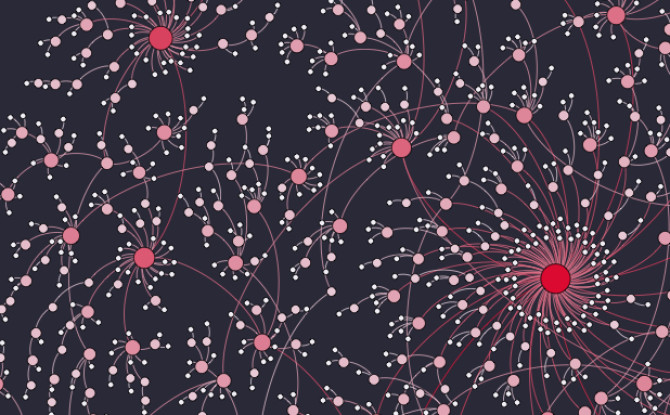
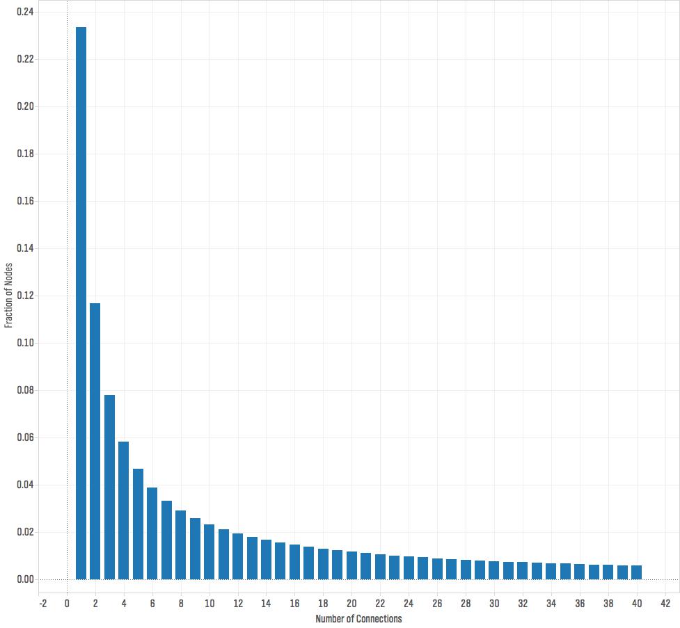
I made this visualization of a scale-free network for a recent talk at the 2015 KIN Global conference. Scale-free networks have a power law degree distribution. This means that if you count the fraction of nodes in the network that have one connection, two connections, three connections, and so on, and plot that distribution the graph looks roughly like this:

What this graph tells us is that most of the nodes have few connections — in this plot, around fifty percent of the nodes have four or fewer connections — but a few nodes have lots of connections. This distribution is called a power law and is described by the equation f(x)=cxα. It's very different from the more commonly known normal distribution. When something follows a normal distribution, most of the time that quantity is pretty close to the average value. For example, the height of the average American man is 5' 9", and most men are not that far from this average. Only 3.9% of men are 6' 2" or taller. With a power law distribution, most of the time our quantity is small — in our network most of the nodes have few connections — but occasionally we see really large values. Many quantities follow a power law distribution including wealth, the size of firms, the magnitude of earthquakes, the diameter of craters on the moon, and sales of books. Networks often have power law distributions for the number of connections.
You can generate a network with a power law degree distribution through a process known as preferential attachment. In this process, you add nodes to the network one at a time. Each time a node is added to the network it forms a connection with an existing node in the network. With some probability p the node chooses which of the existing nodes to connect to completely at random. With probability 1-p the new node selects which existing node to connect to in proportion to the nodes' existing number of connections, so it is more likely to connect to nodes that already have many connections.
The scale free network below was generated using this process as implemented in the R package i.graph (the R code is available here.) I exported an edge list for the network (which you can download here), and then created the visualization using Gephi.

Great visualization! I hope it's okay I used your image in a presentation (cited of course).
Have you tried scaling this to larger numbers of vertices? It seems almost unavoidable to get something that looks a hairball at larger sizes.