Modeling

Recruiting for Postdoctoral Scholar

UPDATE: This position is now closed.

I recently received in NIH R01 grant for $1.74m to fund a project examining how team communication networks impact collaboration success. Part of this funding will support a postdoctoral scholar to work with me at UCLA on building a computational model of team collaboration. (For related models see Hong and Page, 2001 and 2004; Lazer and Friedman, 2007.) See below for the complete position description and application instructions (downloadable here).

The Department of Communication Studies at UCLA is recruiting for a Postdoctoral Scholar to help develop a computational model of team networks and collaboration.

The successful candidate will collaborate with Professor PJ Lamberson on an NIH funded project examining the characteristics of successful teams, the leading indicators of impending team failure, and potential policies for increasing the productivity of team science and problem solving. The project will employ a computational agent-based modeling approach. In addition to collaborating with Professor Lamberson, the postdoc will also have the opportunity to work closely with other members of the project team including Nosh Contractor, Leslie DeChurch, and Brian Uzzi from Northwestern University’s School of Communication, Kellogg School of Management, and the Northwestern Institute on Complex Systems (NICO). A wide variety of disciplinary backgrounds will be considered. Key qualifications are experience with computational modeling, complex systems, and network analysis.

To apply, please send:

1. A cover letter explaining your interests and qualification for the position

2. A CV, and

3. At least two letters of recommendation

to pj@social-dynamics.org.

Applications will be considered as they are received, and the position will remain open until filled.

The University of California is an Equal Opportunity/Affirmative Action Employer. All qualified applicants will receive consideration for employment without regard to race, color, religion, sex, national origin, disability, age or protected veteran status. For the complete University of California nondiscrimination and affirmative action policy see:

http://policy.ucop.edu/doc/4000376/NondiscrimAffirmAct

A Scientist's Take on the Princeton Facebook Paper

Spechler and Cannarella's paper predicting the death of Facebook has been taking a lot of flak. While I do think there are some issues applying their model to Facebook and MySpace, they're not the ones that most people are citing.

The most common complaint about the Princeton Facebook paper that I've seen is that Facebook is not a disease. Facebook may not be a disease, but that doesn't mean a model that describes how diseases spread isn't a good model for how Facebook spreads. Models based on the disease spread analogy have been used for decades in marketing. The famous "Bass Model" is just a relabeled disease model. Frank Bass's original paper has been cited thousands of times and was named one of the ten most influential papers in Management Science. While it's received its fair share of criticism, the entirety of The Tipping Point is based on the disease spread analogy. Gladwell even writes, "... ideas and behavior and messages and products sometimes behave just like outbreaks of infectious disease."

Interestingly, one of the major points of Spechler and Cannarela's paper is that online social networks do NOT spread just like a disease, that's why they had to modify the original SIR disease model in the first place. (See an explanation here.)

But, the critics have missed this point and are fixated on particulars of the disease analogy. For example, Lance Ulanoff at Mashable (who has one of the more evenhanded critiques) says, "How can you recover from a disease you never had?" He's referring to the fact that in Spechler and Cannarella's model, some people start off in the Recovered population before they've ever been infected. These are people who have never used Facebook and never will. It is a bit confusing that they're referred to as "recovered" in the paper, but if we just called them "people not using Facebook that never will in the future" that would solve the issue. Ulanoff has the same sort of quibble with the term recovery writing, "The impulse to leave a social network probably does spread like a virus. But I wouldn’t call it “recovery.” It's leaving that's the infection." Ok, fine, call it leaving, that doesn't change the model's predictions. Confusing terminology doesn't mean the model is wrong.

All of this brings up another interesting point, how could we test if the model is right? First off, this is a flawed question. To quote the statistician George E. P. Box, "... all models are wrong, but some are useful." Models, by definition, are simplified representations of the real world. In the process of simplification we leave things out that matter, but we try to make sure that we leave the most important stuff in, so that the model is still useful. Maps are a good analogy. Maps are simplified representations of geography. No map completely reproduces the land it represents, and different maps focus on different features. Topographic maps show elevation changes and road maps show highways. One kind is good for hiking the Appalachian trail, another is good for navigating from New York City to Boston. Models are the same — they leave out some details and focus on others so that we can have a useful understanding of the phenomenon in question. The SIR model, and Spechler and Cannarela's extension leave out all sorts of details of disease spread and the spread of social networks, but that doesn't mean they're not useful or they can't make accurate predictions.

myspace

Spechler and Cannarela fit their model to data on MySpace users (more specifically, Google searches for MySpace), and the model fits pretty well. But this is a low bar to pass. It just means that by changing the model parameters, we can make the adoption curve in the model match the same shape as the adoption curve in the data. Since both go up and then down, and there are enough model parameters so that we can change the speed of the up and down fairly precisely, it's not surprising that there are parameter values for which the two curves match pretty well.

There are two better ways that the model could be tested. The first method is easier, but it only tests the predictive power of the model, not how well it actually matches reality. For this test, Spechler and Cannarela could fit the model to data from the first few years of MySpace data, say from 2004 to 2007, and see how well it predicts MySpace's future decline.

The second test is a higher bar to clear, but provides real validation of the model. The model has several parameters — most importantly there is an "infectivity" parameter (β in the paper) and a recovery parameter (γ). These parameters could be estimated directly by estimating how often people contact each other with messages about these social networks and how likely it is for any given message to result in someone either adopting or disadopting use of the network. For diseases, this is what epidemiologists do. They measure how infectious a disease is and how long ti takes for someone to recover, on average. Put these two parameters together with how often people come into contact (where the definition of "contact" depends on the disease — what counts as a contact for the flu is different from HIV, for example), and you can predict how quickly a disease is likely to spread or die out. (Kate Winslet explains it all in this clip from Contagion.) So, you could estimate these parameters for Facebook and MySpace at the individual level, and then plug those parameters into the model and see if the resulting curves match the real aggregate adoption curves.

Collecting data on the individual model parameters is tough. Even for diseases, which are much simpler than social contagions, it takes lab experiments and lots of observation to estimate these parameters. But even if we knew the parameters, chances are the model wouldn't fit very well. There are a lot of things left out of this model (most notably in my opinion, competition from rival networks.)

Spechler and Cannarella's model is wrong, but not for the reasons most critics are giving. Is it useful? I think so, but not for predicting when Facebook will disappear. Instead it might better capture the end of the latest fashion trend or Justin Bieber fever. 


Don't Wait for the Government's Economic Data

Unemployment numbers and the consumer price index (CPI) are among the most important economic indicators used by both Wall Street traders and government policy makers. During the government shutdown those statistics weren't be collected or calculated and now that the government is up and running again it will be a while before the latest numbers are released.

According to the New York Times, the October 4 unemployment report will be released October 22, and the October 16th CPI will come out on Halloween Eve. But, you don't have to wait for those numbers to come out. In fact, these numbers are always slow — CPI takes about a month to calculate so even if it had come out on October 6, the number still would have been out of date. Luckily, there are already other good tools for anticipating what these numbers will be even before they're released. For CPI, there's the Billion Prices Project developed at MIT (now at PriceStats). For more on the Billion Prices Project, check out this post. And for unemployment, we worked through how a model based on search trends can be used to forecast the yet to be released official number in the last post on this blog.

cpi

PriceStats (based on MIT's Billion Prices Project) already knows what the CPI number will be.

This is a great opportunity for investors and policy makers to reduce their dependence on glacial paced antiquated statistics and start incorporating information from newer faster tools into their decision making.


Obesity Epidemic?

Today on Slate there is a nice little GIF (that originally appeared on The Atlantic) that shows how obesity rates have changed over time by state. Slate seems to suggest that the geographic progression of obesity rates might indicate some sort of social contagion. But, ss many others (and here) before me have pointed out, we have to be very careful when trying to draw inferences about social contagion. If we take a look at a map of household income by state, we see that there is a lot of overlap between the poorest states and those with the highest obesity rates.

Household Income

There are lot's of potential causal connections here. For example, income might affect the types of stores and restaurants available, which in turn affects obesity rates. For a more careful look at some data on the social contagion of obesity, have a look at our paper that examines obesity rates, screen time, and social networks in adolescents.


As a side note, it's interesting to compare the map of the "obesity epidemic" to a map of something we know spreads through person to person contagion, like the swine flu (image from the New York Times).

H1N1

Unlike the obesity epidemic, swine flu jumps all over the place, which obviously has to do with air travel.

New paper on social contagion of obesity

Along with a team of researchers led by epidemiologist David Shoham from Loyola University, I recently published a paper in PLoS One examining the social contagion of obesity. As many of you know, this is a hotly debated topic of research that was kicked off by work of James Fowler and Nicholas Christakis published in the New England Journal of Medicine.  (See this post for my two cents on the debate.) The central criticism of this research surrounds the issue of separating friendship selection from influence, which in some sense was laid to rest by Cosma Shalizi and Andrew Thomas.

One alternative approach is to use a "generative model," which is exactly what my coauthors and I do. Specifically, we use the SIENA program developed by Tom Snijders and colleagues. Essentially, this model assumes that people make choices about their friendships and behavior just like economists and marketers assume people make choices about where to live or what car to buy.

In our paper, we apply the model to data from two high schools from the AddHeath study. We use the model to understand social influences on body size, physical activity, and "screen time" (time spent watching TV, playing video games, or on the computer). In short, here's what we find:

  • In both schools students are more likely to select friends that have a similar BMI (body mass index), that is there is homophily on BMI.
  • In both schools there is evidence that students are influenced by their friends' BMI.
  • There is no evidence for homophily on screen time in either school, and there is evidence that students are subject to influence from their friends'  on screen time in only one of the two schools.
  • In one of the two schools there was evidence for homophily on playing sports, but in both schools there was evidence that students influenced their friends when it comes to playing sports.

What it takes to "Go Viral"

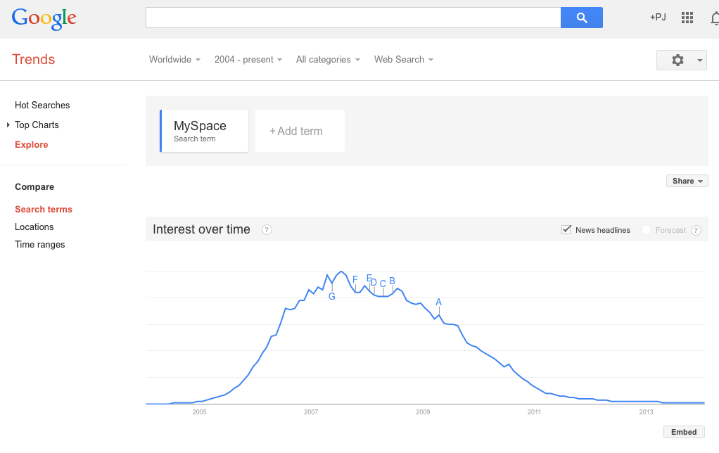
It seems like we hear a new story every week: a video, or a rumor, or a song, or a commercial has "gone viral," spreading across the web like wildfire, racing to the top of the most tweeted list, and grabbing headlines in real old fashioned news media. These memes can be disgusting (like the Domino's pizza video), controversial (like the recent Kony 2012 video), and entertaining ("Friday" ?). They can be disasters for companies (see Domino's above), or marketing campaigns that reach hundreds of thousand, or even millions, of viewers for relatively little investment (1300 foot drop, the Old Spice Guy). Given the potential impact of these "memes," there is a lot of interest in what exactly determines whether or not a video, or a message, or a rumor goes viral. Here's a simple model that explains why some things do and some things don't.

Let's consider the example of a YouTube video. Suppose that on average, every person that views the video tells of their friends about it per day (stands for contacts), and suppose that some fraction of the people that hear about the video actually watch it and start telling other people about it themselves (i stands for infectivity, and captures something like how interesting the video is.) Finally, suppose that on average, each person that is actively spreading word of the video does so for d days before they get bored and stop telling people about the video (d stands for duration).

To keep things simple, suppose that there are a total of N people in the population, and every one of these people is either actively spreading the video, or not actively spreading the video, but susceptible to becoming a video spreader. Let I denote the number of people currently spreading (i.e. infected) and S the number of people that are susceptible, but not currently spreading the video. So, I+S=N.

To see if the video goes viral or not, we just have to compare the rate at which people are becoming infected to the rate at which people are discontinuing sharing the video. It helps to think of a bath tub — the level of water in the bath tub represents the number of people spreading the video. The rate that water flows in through the faucet is the rate at which new people are becoming infected with the video spreading virus; the rate at which water drains out is the rate at which people are stopping spreading the video. If the rate at which water flows in is higher than the rate at which it drains out, the tub will keep filling up. On the other hand, if the drain is more open than the faucet, the bath tub will never fill up.

So, we have to figure out the rate at which new people are starting to spread the video and the rate at which people currently sharing the video are stopping. The second one is easier. If I people are currently sharing the video and each one of them shares it for d days on average, then each day we expect I/D people to stop spreading the video. For the first rate, we have I people actively sharing the video. On average, each one of them shares the video with c contacts per day, resulting in a total of cI contacts for the whole population. But, not all of these contacts results in a new person sharing the video. First, some of these people will already be sharing the video. The probability that a given person is not currently sharing the video is S/N, the fraction of "susceptible" people in the population. So, we expect cIS/N instances in which a person shares the video with someone that is currently spreading the video. Given such a contact, we said that a fraction i of these will result in a new person sharing the video. Putting it all together, the rate at which new people are becoming infected with the video sharing virus is ciIS/N.

Now we have to compare our two rates. The video will go viral if ciIS/N>I/d. Dividing both sides by I and multiplying both sides by d, this becomes, cidS/N>1. Finally, we can make life a little simpler by assuming that initially almost no one knows about the video, so the number of susceptible people S and the total population N are about the same. Then S/N is approximately 1, so the equation simplifies to just cid>1.

This simple equation tells us whether or not the video will go viral. It says if the average number of contacts, times the infectivity, times the duration is greater than one, the video will spread, otherwise it will die out. Right at cid=1 there is a tipping point; crossing this threshold causes a discontinuous jump in the future.

This model makes a lot of assumptions that don't really hold (big ones are that people have roughly the same # of contacts on average, and the people basically interact at random), but it gives us a basic understanding of the process. Even in more complicated models, where we make fewer simplifying assumptions, there is typically a similar tipping point, and increasing either contacts, infectivity, or duration increases the chance of crossing that threshold.

So, there you have it — everything you need to go viral: a network with enough contacts (c); a product, or message, that sounds interesting enough to be infectious (i), and with enough staying power so that people keep telling their friends about it for a long time (d).

You don't need "Big Data"

The Wall Street Journal recently ran an interesting article about the rise of "Big Data" in business decision making.  The author, Dennis Berman, makes the case for using big data  by pointing out that human decision making is prone to all sorts of errors and biases (referencing Daniel Kahneman's fantastic new book, Thinking, Fast and Slow). There's anchoring, hindsight bias, availability bias, overconfidence, loss aversion, status quo bias, and the list goes on and on. Berman suggests that big data — crunching massive data sets looking for patterns and making predictions — may be the solution to overcoming these flaws in our judgement.

I agree with Berman that big data offers tremendous opportunities, and he's also right to emphasize the ever increasing speed with which we can gather and analyze all that data. But you don't need terabytes of data or a self-organizing fuzzy neural network to improve your decisions. In many cases, all you need is a simple model.

Consider this example from the classic paper, "Clinical versus Actuarial Judgement" by Dawes, Faust and Meehl (1989). Twenty-nine judges with varying ranges of experience were presented with the scores of 861 patients on the Minnesota Multiphasic Personality Inventory (MMPI), which scores patients on 11 different dimensions and is commonly used to diagnose psychopathologies. The judges were asked diagnosis the patients as either psychotic or neurotic and their answers were compared with diagnoses from more extensive examinations that occurred over a much longer period of time. On average the judges were correct 62% of the time, and the best individual judge correctly diagnosed 67% of the patients. But known of the judges performed as well as the "Goldberg Rule". The Goldberg Rule is not a fancy model based on reams of data — it's not even a simple linear regression. The rule is just the following simple formula: add three specific dimensions from the test, subtract two others and compare the result to 45. If the answer is greater than 45 the diagnosis is neurosis, if it less, then psychosis. The Goldberg Rule correctly diagnosed 70% of the patients.

It's impressive that this simple non-optimal rule beat every single individual judge, but Dawes and company didn't stop there. The judges were provided with additional training on 300 more samples in which they were given the MMPI scores and the correct diagnosis. After the training, still no single judge beat the Goldberg Rule. Finally, the judges were given not just the MMPI scores, but also the prediction of the Goldberg Rule along with statistical information on the average accuracy of the formula, and still the rule outperformed every judge. This means that the judges were more likely to override the rule based on their personal judgement when the rule was actually correct than when it was incorrect.

This is just one of many studies that have shown time and time again that simple models outperform individual judgement. In his book, "Expert Political Judgement," Phillip Tetlock examined 28,000 forecasts of political and economic outcomes by experts and concludes, “It is impossible to find any domain in which humans clearly outperformed crude extrapolation algorithms, less still sophisticated statistical ones.”

And the great thing is, you don't have to be a mathematician or statistician to benefit from the decision making advantage of models. As Robyn Dawes has shown, even the wrong model typically outperforms individual judgement. So the next time you face an important decision before you fire up the supercomputer, write down the factors that you think are the most important, assign them weights and add them up. Even something as simple as making a pro and con list and adding the pros and subtracting the cons is likely to result in a better decision. As Dawes writes, “The whole trick is to know what variables to look at and then know how to add.”

Training Computers with Crowds

Computers are awesome, but they don't know how to do much on their own; you have to train them. Crowdsourcing turns out to be a great way to do this. Suppose you would like to have an algorithm to measure something — like whether a tweet about a movie is positive or negative. You might want to know this so you can count positive and negative tweets about a particular movie and use that information to predict box office success (like Asur and Huberman do in this paper). You could try and think of all of the positive and negative words that you know and then only count tweets that include those words, but you'd probably miss a lot. You could categorize all of the tweets yourself, or hire a student to do it, but by the time you finished the movie would be on late night cable TV. You need a computer algorithm so you can pull thousands of tweets and count them quick, but a computer just doesn't know the difference between a positive tweet and negative tweet until you train it.

That's where the crowd comes in. People can easily judge the tone of a tweet, and you don't have to be an expert to do it. So, what you can do is gather a pile of tweets — say a few thousand — put them up on Amazon Mechanical Turk, and let the crowd label them as positive or negative. At a few cents per tweet you can do this for something in the ballpark of a hundred bucks. Now that you have a pile of labeled tweets, you can train the computer. There's lots of fancy terms for it — language model classifiers, self organizing fuzzy neural networks, ... — but basically, you run a regression.  The independent variable is stuff the computer can measure, like how many times certain words appear, and the dependent variable is whether the tweet is positive or negative. You estimate the regression (a.k.a train the classifier) on the tweets labeled by the crowd, and now you have an algorithm that can label new tweets that the crowd hasn't labeled.When the next movie is coming out, you harvest the unlabeled tweets and feed them through the computer to see how many are positive and negative.

This is exactly how Hany Farid at Dartmouth trained his algorithm for detecting how much digital photographs have been altered.  On it's own the computer can measure lots of fancy statistical features of the image, but judging how significant the alteration of the image is requires a human. So, he gave lots of pairs of original and altered images to people on MTurk and had them rate how altered the images were.  Then he essentially let the computer figure out what image characteristics for the altered images correlate with high alteration scores (but in a much fancier way then just a regular regression).  Now, he has a trained algorithm that can read in photographs where we don't have the original and predict how altered the image is.

Free online complex systems course by Scott Page!

Yesterday I talked with Scott E. Page from the University of Michigan and Santa Fe Institute and he pointed me to an amazing opportunity. He will be teaching a free online course on complex systems and modeling. The course is called Model Thinking and will start in mid to late January. Scott has a short video introduction to the course on the site.

This seems almost too good to be true. Scott is a fantastic teacher — I have been lucky to co-teach course with him at the University of Michigan and in the ICPSR summer program. He's the author of The Difference, Diversity and Complexity, and Complex Adaptive Systems: An Introduction to Computational Models of Social Life. He's a member of the American Academy of Arts and Sciences. The list goes on and on. He is a super clear thinker and has an infectious enthusiasm for modeling and complex systems.

I would recommend this course to anyone who isn't on the verge of finding a cure for cancer or solving world hunger, because otherwise whatever your doing probably won't be more impactful than taking this course.