Social Media

#socialDNA at Kellogg

One of the cool things about the Social Dynamics and Network Analytics (Social-DNA) course that I teach at Kellogg is that there are lots of new research articles, news stories, magazine articles, and blog entries coming out all of the time that are relevant to the course content. To help facilitate conversation about these current events, this quarter we're introducing #socialDNA on Twitter. Anytime you come across something relevant to the course topics (which you can read more about here), tweet about it with the hashtag #socialDNA. We're asking all of the current students to tweet a #socialDNA tweet at least once during the quarter (just retweeting someone else's #socialDNA tweet doesn't count!) We also hope that former Social DNA students will get involved too and this will provide a way for alumni of the course to stay connected with the latest Social Dynamics research and current events.

If you don’t have a Twitter account, the first thing you need to do is go to https://twitter.com/ and start one. Once you’ve started an account, you’ll want to follow some people. Here are few suggestions to get you started:
@pjlamberson — of course
@KelloggSchool — self explanatory
@SallyBlount — Dean of Kellogg School of Management
@gephi — you know you’re a social dynamics dork when … you follow @gephi on Twitter
@NICOatNUNorthwestern Institute on Complex Systems (NICO)
@James_H_Fowler — professor of political science at UCSD and author of seminal studies of social contagion in social networks
@noshir — Noshir Contractor, Northwestern network scientist
@erikbryn — Sloan prof. with lot’s of stuff on economics of information
@jeffely — Northwestern economics / Kellogg prof. and blogger: http://cheaptalk.org/
@RepRules — Kellogg prof. Daniel Diermeier
@sinanaral — Stern prof. who did the active/passive viral marketing study and other cool network research
@duncanjwatts — Duncan Watts research scientist and Yahoo, big time social networks scholar
@ladamic — Michigan prof. who did the viral marketing study and made the political blogs network

And don’t forget to post a tweet! If you are a serious Twitter beginner, check out Twitter 101.

Big Data and the Wisdom of Crowds are not the same

I was surprised this week to find an article on Big Data in the New York Times Men's Fashion Edition of the Style Magazine. Finally! Something in the Fashion issue that I can relate to I thought. Unfortunately, the article by Andrew Ross Sorkin (author of Too Big To Fail) made one crucial mistake. The downfall of the article was conflating two distinct concepts that are both near and dear to my research, Big Data and the Wisdom of Crowds, which led to a completely wrong conclusion.

Big Data is what it sounds like — using very large datasets for ... well for whatever you want. How big is Big depends on what you're doing.  At a recent workshop on Big Data at Northwestern University, Luís Amaral defined Big Data to be basically any data that is too big for you to handle using whatever methods are business as usual for you. So, if you're used to dealing with data in Excel on a laptop, then data that needs a small server and some more sophisticated analytics software is Big for you. If you're used to dealing with data on a server, then your Big might be data that needs a room full of servers.

The Wisdom of Crowds is the idea that, as collectives, groups of people can make more accurate forecasts or come up with better solutions to problems than the individuals in them could on their own. A different recent New York Times articles has some great examples of the Wisdom of Crowds. The article talks about how the Navy has used groups to help make forecasts, and in particular forecasts for the locations of lost items like "sunken ships, spent warheads and downed pilots in vast, uncharted waters." The article tells one incredible story of how they used this idea to locate a missing submarine, the Scorpion:

"... forecasters draw on expertise from diverse but relevant areas — in the case of finding a submarine, say, submarine command, ocean salvage, and oceanography experts, as well as physicists and engineers. Each would make an educated guess as to where the ship is ... This is how Dr. Craven located the Scorpion.

“I knew these guys and I gave probability scores to each scenario they came up with,” Dr. Craven said. The men bet bottles of Chivas Regal to keep matters interesting, and after some statistical analysis, Dr. Craven zeroed in on a point about 400 miles from the Azores, near the Sargasso Sea, according to a detailed account in “Blind Man’s Bluff,” by Christopher Drew and Sherry Sontag. The sub was found about 200 yards away."

This is a perfect example of the Wisdom of Crowds: by pooling the forecasts of a diverse group, they came up with an accurate collective forecast.

So, how do Big Data and The Wisdom of Crowds get mixed up? The mixup comes from the fact that a lot of Big Data is data on the behavior of crowds. The central example in Sorkin's article is data from Twitter, and in particular data that showed a lot of people on Twitter were very unhappy with antigay comments made by Phil Robertson, the star of A&E's Duck Dynasty. The short version of the story is that A&E initially terminated Robertson in response to the Twitter data, but Sorkin argues this was a business mistake because Twitter users are "not exactly regular watchers of the camo-wearing Louisiana clan whose members openly celebrate being 'rednecks'." He also cites evidence that data from Twitter does not provide accurate election predictions for essentially the same reason — the people that are tweeting are not a representative sample of the people that are voting. All of this is correct. Using a big dataset does not mean that you don't have to worry about having a biased sample. No matter how big your dataset, a biased sample can lead to incorrect conclusions. A classic example is the prediction by The Literary Digest in 1936 that Alf Landon would be the overwhelming winner of the presidential election that year. In fact, Franklin Roosevelt carried 46 of the 48 states. The prediction was based on a huge poll with 2.4 million respondents, but the problem with the prediction was that the sample for the poll drew primarily on Literary Digest subscribers, automobile and telephone owners. This sample tended to be more affluent than the average voter, and thus favored Landon's less progressive policies.

So, Sorkin is on the right track to write a great article on how sample bias is still important even when you have Big Data. This is a really important point that a lot of people don't appreciate. But unfortunately the article veers off that track when it starts talking about the Wisdom of Crowds. The Wisdom of Crowds is not about combining data on large groups, but about combining the predictions, forecasts, or ideas of groups (they don't even have to be that large). If you want to use the Wisdom of Crowds to predict an election winner, you don't collect data on who they're tweeting about, you ask them who they think is going to win. If you want to use the Wisdom of Crowds to decide whether or not you should fire Phil Robertson, you ask them, "Do you think A&E will be more profitable if they fire Phil Robertson or not?" As angry as all of those tweets were, many of those angry voices on Twitter would probably concede that Robertson's remarks wouldn't damage the show's standing with its core audience.

The scientific evidence shows that using crowds is a pretty good way to make a prediction, and it often outperforms forecasts based on experts or Big Data. For example, looking at presidential elections from 1988 to 2004, relatively small Wisdom of Crowds forecasts outperformed the massive Gallup Poll by .3 percentage points (Wolfers and Zitzewitz, 2006). This isn't a huge margin, but keep in mind that the Gallup presidential poles are among the most expensive, sophisticated polling operations in history, so the fact that the crowd forecasts are even in the ballpark, let alone better, is pretty significant.

The reason the Wisdom of Crowds works is because when some people forecast too high and others forecast too low, their errors cancel out and bring the average closer to the truth. The accuracy of a crowd forecast depends both on the accuracy of the individuals in the crowd and on their diversity — how likely are their errors to be in opposite directions. The great thing about it is that you can make up for low accuracy with high diversity, so even crowds in which the individual members are not that great on their own can make pretty good predictions as collectives. In fact, as long as some of the individual predictions are on both sides of the true answer, the crowd forecasts will always be closer to the truth than the average individual in the crowd. It's a mathematical fact that is true 100% of the time. Sorkin concludes his article, based on the examples of inaccurate predictions from Big Data with biased samples, by writing, "A crowd may be wise, but ultimately, the crowd is no wiser than the individuals in it." But this is exactly backwards. A more accurate statement would be, "A crowd may or may not be wise, but ultimately, it's always at least as wise as the individuals in it. Most of the time it's wiser."

A Scientist's Take on the Princeton Facebook Paper

Spechler and Cannarella's paper predicting the death of Facebook has been taking a lot of flak. While I do think there are some issues applying their model to Facebook and MySpace, they're not the ones that most people are citing.

The most common complaint about the Princeton Facebook paper that I've seen is that Facebook is not a disease. Facebook may not be a disease, but that doesn't mean a model that describes how diseases spread isn't a good model for how Facebook spreads. Models based on the disease spread analogy have been used for decades in marketing. The famous "Bass Model" is just a relabeled disease model. Frank Bass's original paper has been cited thousands of times and was named one of the ten most influential papers in Management Science. While it's received its fair share of criticism, the entirety of The Tipping Point is based on the disease spread analogy. Gladwell even writes, "... ideas and behavior and messages and products sometimes behave just like outbreaks of infectious disease."

Interestingly, one of the major points of Spechler and Cannarela's paper is that online social networks do NOT spread just like a disease, that's why they had to modify the original SIR disease model in the first place. (See an explanation here.)

But, the critics have missed this point and are fixated on particulars of the disease analogy. For example, Lance Ulanoff at Mashable (who has one of the more evenhanded critiques) says, "How can you recover from a disease you never had?" He's referring to the fact that in Spechler and Cannarella's model, some people start off in the Recovered population before they've ever been infected. These are people who have never used Facebook and never will. It is a bit confusing that they're referred to as "recovered" in the paper, but if we just called them "people not using Facebook that never will in the future" that would solve the issue. Ulanoff has the same sort of quibble with the term recovery writing, "The impulse to leave a social network probably does spread like a virus. But I wouldn’t call it “recovery.” It's leaving that's the infection." Ok, fine, call it leaving, that doesn't change the model's predictions. Confusing terminology doesn't mean the model is wrong.

All of this brings up another interesting point, how could we test if the model is right? First off, this is a flawed question. To quote the statistician George E. P. Box, "... all models are wrong, but some are useful." Models, by definition, are simplified representations of the real world. In the process of simplification we leave things out that matter, but we try to make sure that we leave the most important stuff in, so that the model is still useful. Maps are a good analogy. Maps are simplified representations of geography. No map completely reproduces the land it represents, and different maps focus on different features. Topographic maps show elevation changes and road maps show highways. One kind is good for hiking the Appalachian trail, another is good for navigating from New York City to Boston. Models are the same — they leave out some details and focus on others so that we can have a useful understanding of the phenomenon in question. The SIR model, and Spechler and Cannarela's extension leave out all sorts of details of disease spread and the spread of social networks, but that doesn't mean they're not useful or they can't make accurate predictions.

myspace

Spechler and Cannarela fit their model to data on MySpace users (more specifically, Google searches for MySpace), and the model fits pretty well. But this is a low bar to pass. It just means that by changing the model parameters, we can make the adoption curve in the model match the same shape as the adoption curve in the data. Since both go up and then down, and there are enough model parameters so that we can change the speed of the up and down fairly precisely, it's not surprising that there are parameter values for which the two curves match pretty well.

There are two better ways that the model could be tested. The first method is easier, but it only tests the predictive power of the model, not how well it actually matches reality. For this test, Spechler and Cannarela could fit the model to data from the first few years of MySpace data, say from 2004 to 2007, and see how well it predicts MySpace's future decline.

The second test is a higher bar to clear, but provides real validation of the model. The model has several parameters — most importantly there is an "infectivity" parameter (β in the paper) and a recovery parameter (γ). These parameters could be estimated directly by estimating how often people contact each other with messages about these social networks and how likely it is for any given message to result in someone either adopting or disadopting use of the network. For diseases, this is what epidemiologists do. They measure how infectious a disease is and how long ti takes for someone to recover, on average. Put these two parameters together with how often people come into contact (where the definition of "contact" depends on the disease — what counts as a contact for the flu is different from HIV, for example), and you can predict how quickly a disease is likely to spread or die out. (Kate Winslet explains it all in this clip from Contagion.) So, you could estimate these parameters for Facebook and MySpace at the individual level, and then plug those parameters into the model and see if the resulting curves match the real aggregate adoption curves.

Collecting data on the individual model parameters is tough. Even for diseases, which are much simpler than social contagions, it takes lab experiments and lots of observation to estimate these parameters. But even if we knew the parameters, chances are the model wouldn't fit very well. There are a lot of things left out of this model (most notably in my opinion, competition from rival networks.)

Spechler and Cannarella's model is wrong, but not for the reasons most critics are giving. Is it useful? I think so, but not for predicting when Facebook will disappear. Instead it might better capture the end of the latest fashion trend or Justin Bieber fever. 


Joshua Spechler and John Cannarella's Facebook is Dying Paper

This morning my email is blowing up with links to articles describing research by Joshua Spechler and John Cannarella, two Princeton PhD students, that predicts Facebook will lose 80% of its user base between 2015 and 2017. Are they right?

The paper is getting plenty of criticism, but as far as I can tell most of the critics haven't read or didn't understand the math in the paper. Let's take a closer look. Spechler and Cannarella's starting point is a basic model of disease spread called the SIR model. The SIR model (and its marketing variant the Bass model) have been applied to study the spread of innovations for decades. Without calling it by its name, I discussed applying the SIR model to the spread of memes online in the previous post on "What it Takes to Go Viral".

The SIR model is pretty simple. Imagine everyone in the world is in one of three states, Susceptible, Infected, or Recovered. Every time a Susceptible person bumps into an Infected person, there is a chance they become Infected too. Once a person is Infected, they stay Infected for awhile, but eventually they get better and become Recovered. The whole model is summed up by this "stock and flow" diagram.

SIR.001


Spechler and Cannarella update this model by making the recovery rate proportional to the number of recovered individuals. In other words, as more "recover" there is an increasing rate of recovery. In terms of Facebook, this would be interpreted as an increasing social pressure to leave Facebook as more other people leave Facebook. In our diagram, this amounts to adding another feedback loop — the "abandonment" feedback loop in red below:

SIRr.001.001


The effect of adding this loop is that recovery is slower in the beginning, because few people have recovered so there isn't much social pressure to recover, but then to accelerate recovery as the recovered population grows. For Facebook, it would mean once people start leaving, they'll leave in droves. When Specheler and Cannarella fit this model to the data, the best fit predicts that this mass exodus for Facebook will occur between 2015 and 2017.

To test their model they fit it to data on MySpace (they use Google Search data, which is a cool idea) and find that it fits pretty well. But, here's where we need to start being skeptical. First, just because the model fits the data well doesn't mean that the model captures what's really happening. It just means that you can manipulate the parameters of the model to produce a curve that goes up and down with a shape similar to the up and down curve that describes the users of MySpace over time. This isn't too surprising.

More problematic is that the model doesn't account for what is most likely the biggest single reason that people left MySpace — Facebook. In this model, the reason people leave MySpace is that everyone else is leaving MySpace — MySpace becomes uncool and there is a social pressure to not be on MySpace. But in reality, people probably didn't feel pressure to not be on MySpace, they left MySpace because they felt pressure to be on Facebook because that's where everyone else was.

I think this is an interesting model, but it's probably better suited to other phenomenon. When I was in junior high, it was cool to "tight roll" your jeans as demonstrated by these ladies.

tight-rolled-pants-3By the time I was in high school, no one would be caught dead tight rolling their jeans. This is the kind of dynamic that Spechler and Cannarella's model captures.

It's quite possible that Facebook will pass away, but probably only if something new comes along to displace it, not because people are embarrassed if someone finds out they still have an account.


Why Some Stories Go Viral (Maybe)

I read a(nother) article on Fast Company today about why some stories "go viral." (Mathematically speaking, why some things go viral and others don't boils down to a  simple equation.)

The article cites research by Jonah Berger and Katherine Milkman that finds articles with more emotional content, especially positive emotional content, are more likely to spread. A quick read of the article seems to promise an easy path to getting your own content on your blog, YouTube, or Twitter to take off. For example, the article cites Gawker editor Neetzan Zimmerman's success, pointing out his posts generate about 30 million views per month — the kind of statistics that get marketers salivating. The scientific research by Berger and Milkman is interesting and well done, but we have to be careful about how far we take the conclusions.

There are two interrelated issues. The first has to do with the "base rate." Part of Berger and Milkman's paper looks at what factors make articles on the New York Times online more likely to wind up on the "most emailed" list. They find, for example, that "a one standard deviation increase in the amount of anger an article evokes increases the odds that it will make the most e-mailed list by 34%."  In this case, the base rate is the percent of articles overall that make the most emailed list. When we hear that writing an especially angry article makes it 34% more likely to get on the most emailed list, it sounds like angry articles have a really good chance of being shared, but this isn't necessarily the case. What we know is that the probability of making the most emailed list given that the article is especially angry equal 1.34 times the base rate — but if the base rate is really low, 1.34 times it will be small too. Suppose for example that only 1 out of every 1000 articles makes the most emailed list, then what the result says is that 1.34 out of every thousand angry articles makes the most emailed list. 1.34 out of a thousand doesn't sound nearly as impressive as "34% more likely."

The second issue has to do with the overall predictability of making the most emailed list. The model that shows the 34% boost for angry content has an R-squared of .28. This model has more than 20 variables including things like article word count, topic, and where the article appeared on the webpage. But even knowing all of these variables, we still can't accurately predict if an article will make the most emailed list or not. All we know is that on average articles with some features are more likely to make the list than articles with other features. But for any particular article, we really can't do a very good job of predicting what's going to happen.

To get a better understanding of this idea, here's another example. In Ohio, 37% of registered voters are registered as Republicans and 36% are registered as Democrats. In Missouri, 39% are registered as Republicans and 37% are registered as Democrats. On average, registered voters in Missouri are more likely to be Republican than registered voters in Ohio, but just because someone is from Missouri doesn't mean we can confidently say they're a Republican. If we only looked at people from Ohio and Missouri, knowing which state a person is from wouldn't be a very good predictor of their party affiliation.

Gun Control and Homophily in Social Networks

Last week the website of The Atlantic had a nice network visualization of the top tweets linking to articles on gun politics. You should go check out their site where the network visualization is interactive, but here is a static picture so you get the idea. Homophily in the network of gun politics tweets

Each node in this network is one of the top 100 most tweeted weblinks on gun politics during the week from Sunday 2/17 to Sunday 2/24. The creator of the network visualization collected all of the tweets that mentioned terms like "gun rights," "gun control," "gun laws," etc. and then looked for the most popular links in those tweets. (One thing I wonder about is how they dealt with shortened URLs. Since tweets are limited to 140 characters or less, when most people post a link on Twitter they shorten the URL using a service like bit.ly. This means that two people that are ultimately linking to the same article might post different URLs. Many news services have a built in "Tweet this" button, which may give the same shortened URL to everyone who clicks it, so those articles would get many consistent links, where articles or posts without a "Tweet this" button might have many links pointing to them, but all with different URLs coming from each time a person shortened the link individually. All of this is just a technical aside though, because I am a 100% sure the main point of the network visualization, which I haven't even gotten to yet, would still show up.)

The edges in the network visualization connect two pages if the same Twitter account posted links to both pages. The point is that we see two very distinct clusters with lots of edges within the clusters and not too many between them. Of course, taking a loser look at the network visualization we see that one of the groups consists of pro gun control articles and the other contains anti gun control pages. The network science term for this phenomenon is homophily i.e. nodes are more likely to connect to other nodes that are similar to them. Homophily shows up in lots and lots of networks. Political network visualizations almost always exhibit extreme homophily. For example, take a look at this network of political blogs created by Lada Adamic and Natalie Glance (they have generously made the data available here).

Homophily in political blogsIn this network the nodes are blogs about politics and two blogs are connected if there is a hyperlink from one blog to another. Blue blogs are liberal blogs and red blogs are conservative.

Or, take a look at this network of senators created by a group in the Human-computer Interaction Lab at the University of Maryland.

Homophily in the Senate

Here, the nodes are senators and two senators are connected if they voted the same way on a threshold number of roll call votes.

Homophily shows up in other types of social networks as well, not only political networks. For example, take a look at this network of high school friendships from James Moody's paper "Race, school integration, and friendship segregation in America," American Journal of Sociology 107, 679-716 (2001).

Homophily in high school friendships

Here the nodes are students in a high school and two nodes are connected if one student named the other student as friend (the data was collected as part of the Add Health study). The color of the nodes corresponds to the race of the students. As we can see, "yellow" students are much more likely to be friends with other yellow students and "green" students are more likely to connect to other green students. (Interestingly, the "pink" students, who are in the vast minority seem to be distributed throughout the network. I once heard Matt Jackson say that this is the norm in many high schools — if there are two large groups and one small one, the members of the small group end up identifying with one or the other of the two large groups.)

Homophily is actually a more subtle concept than it appears at first. The thorny issue, as is often the case, is causality. Why do similar nodes tend to be connected to one another? The problem is so deeply ingrained in the concept of homophily that it sometimes leads to ambiguity in the use of the term itself. Some people use the word homophily to refer to the observation that nodes in a network are more likely to connect to similar nodes in the network than we would expect due to chance. In this case, there is no mention of the underlying reason why similar nodes are connected to one another, just that they are.  When other people use the term homophily, they mean the tendency for nodes in a network to select similar nodes in the network to form connections with. To keep the distinction clear, some people even refer to the former definition as observed homophily. 

To understand the difference it helps to think about other reasons why we might see similar nodes preferentially connected to one another. The casual stories fall into three basic categories: influence, network dynamics, and exogenous covariates. For many people, the influence story is the most interesting. In this explanation, we imagine that the network of connections already exists, and then nodes that are connected to one another affect each other's characteristics so that network neighbors end up being similar to one another. For example, in a series of papers looking at a network of friends, relatives, and geographic neighbors from the Framingham Heart study, Christakis and Fowler argue that network neighbors influence one another's weight, tendency to smoke, likelihood to divorce, and depression. While not everyone is convinced by Christakis and Fowler's evidence for a contagion effect, we can all agree that in their data obese people are more likely to be connected to other obese people, smokers tend to be friends with smokers, people that divorce are more likely to be connected to others that divorce, and depressed folks are more likely to be connected to other depressed people than we would expect due to chance.

In the network dynamics story, nodes form or break ties in a way that shows a preference for a particular attribute. Our intuition is that liberal blogs like to link to other liberal blogs more than they like to link to conservative blogs. This is what some people take as the definition of homophily. Since the word literally means "love of the same" this makes some sense.

But, just because we see observed homophily doesn't mean people are preferentially linking to other people that are like them. This is reassuring when we see homophily on dimensions like race as in the high school friendship network above. Clearly, the students are not influencing the race of their friends, but this doesn't mean the fact that we observe racial homophily doesn't imply the students are racist — there could be what we call an exogenous covariate that is leading to the observation of homophily. For example, it could be that these students leave in a racially segregated city and students are more likely to be friends with other students that live close to them. In this case, students prefer to be friends with other students that live near them, and living near one another just happens to increase the likelihood that the students share the same race.   One particularly tricky covariate is having a friend in common. Another common observation in social networks is what is called triadic closure. In lay terms, triadic closure means that two people with a friend in common are likely to be friends with each other — the triangle closes instead of remaining an open like a V. It could be that, in the high school friendship network, there is a sight tendency for some students to choose others of their same race as friends; either because of another variable like location or because of an actual racial bias, but the appearance of racial homophily could be significantly amplified by triadic closure. If one student chooses two friends that are of the same race, triadic closure is likely to result in third same race tie. It turns out that, at least in some cases where scholars have been able to untangle these various stories, triadic closure and homophily on other covariates explains a lot of observed racial homophily (see e.g. Wimmer and Lewis or Kossinets and Watts).

So, what about the gun control network? In this case, we can rule out influence, since the articles had to already exist and have a stance on gun control before someone can tweet a link to them. That is, the "state" of the node as pro or anti gun control precedes the formation of a tie connecting them in the Atlantic's network. But as far as the other explanations go, it's probably a mix. An obvious exogenous covariate is source. If I read news on the website of MSNBC and you go to the Fox website, I'm more likely to tweet links to pro gun control articles and your more likely to to tweet anti gun control links, even if we are both just tweeting links to every gun control article we read. Undoubtedly though, many people are using Twitter as a way to spread information that supports their own political opinions, so someone that is pro gun control will tweet pro gun control links and vice versa. This however doesn't mean that gun control advocates aren't reading 2nd amendment arguments and gun rights supporters aren't reading what the gun control folks have to say — it just means that they aren't broadcasting it to the rest of the world when they do.

Gephi FAQ

Students in my Kellogg MBA and EMBA Social Dynamics and Networks classes do a lot of work using the network analysis and visualization software package Gephi. As with any unfamiliar software, there are often a few bumps along the road. I thought it would be helpful to compile a Gephi FAQ, so I scanned through my old emails looking for Gephi questions and have posted some of the most common ones here along with their answers.

Q1. How can I filter the network so that I only see the largest connected component?

A. In the statistics window, click the run button next to connected components. Then, switch to the filters window. Select the Attributes folder, then the Partition folder. Then drag the "Component ID (Node)" filter down to the Queries window where it says "Drag filter here". You can select which component(s) you want to see by clicking on the check boxes next to the component numbers where it says "Partition (Component ID) Settings" You can see what fraction of the nodes belong to each component as a percentage next to each component number, so if you only want to see the largest connected component, chose the one with the highest percentage. Then click Filter.

Q2. When I try to export my graph as a pdf, Gephi clips the node labels so that I can't see all of them. How do I fix this?

A. When Gephi exports the image, it only pays attention to nodes and links, not the labels, when it decides where to clip the image. As a result, sometimes labels near the edge of the image get clipped off. To make sure you get the full image, after you have clicked the export button, look for the Options... button at the bottom of the Export popup window. Click it and then increase the margins. Click OK and proceed to export your image. If the labels are still clipped, go back and increase the margins again until the full labels appear.

Q3. I imported a graphml data file and I'm trying to use eignevector centrality (PageRank, HITS, …) to identify important nodes, but when I try to run the eigenvector centrality calculation from the Statistics window nothing happens. How do I fix this?

A. The problem is that the graphml file that you imported already has (empty) columns corresponding to the measures that you want to calculate and Gephi won't overwrite them. To fix this, you first have to delete those columns. Go into the data laboratory tab and delete any of the columns that have to do with measures of centrality like eigenvector centrality, closeness centrality, betweeness centrality, page rank, anything that looks like that.  Once you have done that go back to the overview window and then run the calculation that you want under the statistics tab. If the little window pops up with the graphs, then everything is working, if it doesn't then you need to go back to the data laboratory and delete some more columns.

Q4. I imported a node attribute that I want to use to resize my nodes, but it isn't showing up under the ranking tab. How do I fix this?

A. The most likely problem is that the node attribute is identified as the wrong type of data — probably a String, when it needs to be a numeric type such as BigInteger. The easiest way to fix this is to click Duplicate column in the data laboratory and then be sure to select a numeric type (e.g. BigInteger or BigDecimal) for the duplicated column. Once you're done you can delete the original node attribute column. The duplicated numeric column should now be accessible in the rankings window.

Q5. I'm trying to import an adjacency matrix that I have in a csv file, but I keep getting the  java runtime error “java.lang.RuntimeException: java.lang.NullPointerException” What do I do?

A. For some reason, when importing an adjacency matrix Gephi expects a csv file with semicolon separators, not commas. Just open your csv file using a simple text editor like NotePad or TextEdit and then use the Find/replace command to change all of the commas to semicolons.

Q6. I have a network in which there are different types of nodes (e.g. doctors and patients) and I would like to color the different types using different colors. How do I do this?

A. You need to import a new node attribute that gives the type for each node. To add a node attribute, create a spreadsheet with one column labeled Id that contains a list of all of the names of the nodes in your network. Be sure these are the same names that appear under the ID column in the Data Laboratory in Gephi. Then add additional columns to the spreadsheet that give the node attributes for each node. For example, you might have a column called "type" with entries like "doctor" or "patient" that tells whether the corresponding node is a doctor or a patient. Once you have created your spreadsheet, export it as a csv. Now, go back to Gephi with your existing network file open. Under Data Laboratory, select Import Spreadsheet, and choose Nodes Table. Make sure that the button “Force Nodes to be Created as New Ones” is not checked. and import the spreadsheet. This should add a new column to the nodes table in the data laboratory. Then, using the partition tab, you can color the nodes according to this attribute.

Q7. I'm trying to import an adjacency matrix from a csv file, but I'm getting the error "java.lang.RuntimeException: java.lang.Exception: Inconsistent number of matrix lines compared to the number of labels” What do I do?

A. One thing to try is removing any extra spaces from your csv file. Sometimes these trip up the import. Open the csv file using a simple text editor like NotePad or TextEdit, and then use find/replace to remove any spaces. Save the adjacency matrix and then try importing it again.

Q8. I'm trying to import an edge list, but I just get a bunch of nodes with no edges. What's going wrong?

A. Make sure that when you're importing the edge list from the data laboratory that you select  "Edges Table" in the drop down menu and not "Nodes Table." Otherwise it just thinks your bringing in a list of nodes.

Q9. I want to add labels to my network, but when I click the little black T, no labels show up (or the label isn't what I want it to be). How do I get the (right) labels?

A. You need to feel Gephi which column you want it to use for the labels. By default, Gephi uses the data in the column "Labels." To change which column is used, from the over view screen, click the small triangle in the lower right hand corner of the Graph window, which will reveal an extra settings pane. Then choose the Labels tab. On the far right hand side of this window, click "Configure…" then put a check mark next to any of the attributes that you would like to show up as labels. Alternatively, in the Data Laboratory, you can just copy the column that you want to use as labels in to the labels column.

Q10. When I try and import an edge list, Gephi says I need Source and Target columns, but I already have Source and Target columns. What's going on?

A. There are probably extra spaces after the words Source and Target in your column headers. If you delete these spaces you should be able to import the edge list.

Visualizing Contagious Twitter Memes with NodeXL and Gephi

In the last post we explored how to use NodeXL to collect a Twitter user's network data. Now, I'll describe how to collect data on a trending topic.

To get started, follow steps 0 and 1 here to setup a Twitter account and download the NodeXL software. Then, to download the network data, click on Import and select From Twitter Search Network… In the first dialog box, enter the search term that you want to look for. Any account that recently posted a tweet containing this phrase will end up being a node in your network.  In the book, "Analyzing Social Media Networks with NodeXL," there is some good advice on choosing an appropriate trending topic to look at:

"First, the search phrase has to concern a recent event. Though Twitter has been around for several years, the volume of information being produced every second is so huge that the search interface has limits on how many tweets it will return for a given query, or how old tweets can be. Searching for "2008 Election" may in theory produce a valuable set of tweets about the election cycle, but in practice those tweets are too far back in time for the search interface to collect them efficiently. The second criterion is that the search phrase has to relate to a piece of news, promotion, event, and so on that is u contagious" (i.e., Twitter users who see the message will, at least in principle, want to pass it on to their followers). A search phrase like "Thanksgiving" is a trending topic on Twitter (shortly before and on Thanksgiving) but lacks a contagious property-there is no need to pass on the message because a large fraction of the population already knows about it, so tweets about Thanksgiving are independent events rather than the sign of a "Thanksgiving meme" spreading throughout the Twitter population."

One good way to do this is look through the recent tweets of a popular user for something that you think would be sufficiently interesting that other people would retweet the message. For example, in the network below, I gathered data on tweets containing the phrase "Who Googled You?" This Twitter meme originated with Pete Cashmore, of @mashable, and links to a Mashable article that describes a way to find out who has been searching for you on Google. The article generated a flurry of interest and many other people tweeted links to the article, generally repeating the original article title, "Who Googled You?" Since this meme spread from person to person, it was a good candidate for visualizing as a Twitter search network. Untitled

You can select what relationships you want to use to define the edges of your network by selecting any combination of the following choices:

Follows relationship — two accounts are connected if one account follows the other.
"Replies-to" relationship in tweet — two accounts are connected if one account replies to the other in its tweet.
"Mentions" relationship in tweet — two accounts are connected if one account mentions the other account in its tweet.

As discussed in the previous post, because of Twitter rate limits, it is advisable to limit your request to a fixed number of people. Unless you are especially patient, I recommend starting with just 300 people.

Once you download the data using NodeXL, I like to export it as a graphml file and then visualize it in Gephi. In this example, I did a few things to make the visualization more meaningful, which I describe below.

Before getting started with manipulating the network in Gephi, it is a good idea to go into the Data Laboratory and delete some of the columns that NodeXL created. You should delete anything having to do with the color or size of the nodes or edges, or centrality measures such as PageRank and eigenvector centrality. These columns are generally empty, but unless you delete them, Gephi won't overwrite them when you ask it to calculate these measures, so you won't be able to calculate and make use of them in your analysis. For some general tips on using Gephi, check out the FAQ here.

First, I filtered out all of the accounts except those that belong to the largest connected component of the network. This makes the network much more readable, and allows us to focus only on those nodes involved in a large cascade. After trying a few options, I choose the Force Atlas layout algorithm to arrange the nodes. For Twitter networks, I have found Force Atlas to generally give the best layout. Usually, I have to increase the repulsion strength from the default setting of 200 to 2000 or more. Then I resized the nodes according to their degree so we can get a sense for who the most important nodes in the network are. I also tried sizing the nodes by PageRank and eigenvector centrality for comparison. For the most part these different centrality measures didn't make much difference, although one account, @darrenmcd, appears significantly more important according to PageRank or Eigenvector centrality than degree centrality. The Twitter accounts @briansois and @armano standout as the most influential in the network. I colored the nodes according to which community they belong to as identified using Gephi's implementation of the Girvan-Newman modularity based clustering algorithm, and I colored the edges according to the type of relationship between the Twitter accounts. Blue edges are "followed" relationships, green edges are "mentions" and purple edges are "replies to." We can see that almost all of the links to @armano mention the relationship explicitly, and about half of those to @briansois do.

WhoGoogledYou

Collecting and Visualizing Twitter Network Data with NodeXl and Gephi

NodeXL is a freely available Excel template that makes it super easier to collect Twitter network data. Once you have the Twitter network data, you can visualize the network with Gephi. Here's how to do it.

Step 0: Start a Twitter account

If you don’t have a Twitter account, the first thing you need to do is go to https://twitter.com/ and start one. Besides the fact that having an account will make getting data faster, it’s good for you to have a little Twitter experience before you dive into the exercise. Once you’ve started an account, you’ll want to follow some people. Here are few suggestions to get you started:
@pjlamberson — of course
@KelloggSchool — self explanatory
@gephi — you know you’re a social dynamics dork when ... you follow @gephi on Twitter
@James_H_Fowler — professor of political science at UCSD and author of seminal studies of social contagion in social networks
@noshir — Noshir Contractor, Northwestern network scientist
@erikbryn — Sloan prof. with lot’s of stuff on economics of information
@jeffely — Northwestern economics / Kellogg prof. and blogger: http://cheaptalk.org/
@RepRules — Kellogg prof. Daniel Diermeier
@sinanaral — Stern prof. who did the active/passive viral marketing study and other cool network research
@duncanjwatts — Duncan Watts research scientist and Yahoo, big time social networks scholar
@ladamic — Michigan prof. who did the viral marketing study and made the political blogs network

And don’t forget to post a tweet! If you are a serious Twitter beginner, check out Twitter 101.

Step 1: Getting the Software

We will be using the software NodeXL to gather the data from Twitter. Besides downloading the data, you can also use NodeXL to visualize and analyze network data, but I prefer to export the data and use another program like Gephi to do the visualization and analysis. NodeXL is an Excel template, but it unfortunately only runs on Excel for Windows. You can download it at: http://nodexl.codeplex.com/ Once you have downloaded and installed the software, open it up by selecting NodeXL Excel Template in the NodeXL folder under All Programs.

Once the program is open, select the NodeXL ribbon.

Step 2: Getting the Data

Now we want to get some Twitter network data. We’re going to collect data on people that follow a person, company, or product, or if you want you can use yourself (this will only be interesting if you have a healthy Twitter presence).

Click on Import and select From Twitter User’s Network. You’ll want to authorize NodeXL to access your Twitter account by selecting the radio button at the bottom and following the onscreen instructions. Once your account is authorized, you should find a company or product on Twitter that you’re interested in (you can do this inside Twitter via a browser). Enter that Twitter username in the dialog box labeled "Get the Twitter network of the user with this username:" For example, if you wanted to collect data on my Twitter account (@pjlamberson) you would enter "pjlamberson" (you don't need the @). For the remaining choices in the pop-up window, select the following options:

Add a vertex for each: Both
Add an edge for each: Followed/following relationship
Levels to include: 1.5
Limit to XXX people — This is a key variable to set and really depends on your level of patience (see Warning: Twitter Rate Limiting below). If this is your first time, I suggest limiting to 200 people. With Twitter's new rate limits, even 200 people will take several hours to collect.

Click OK and wait for the data to download. This may take a while. Be sure that computer is set so that it does not go to sleep during the data collection.

Warning: Twitter Rate Limiting

Twitter limits the number of times per hour fifteen minutes that you can query the API (Application Programming Interface). You may be tempted to request more data — for example the level 2.0 network — or request one set, change your mind and request another etc... This can quickly put you up against the rate limit and you will have to wait an hour before any more data can be downloaded. NodeXL will automatically pause when you reach the Twitter rate limit and wait for an hour to begin downloading data again. If you have time to let your computer run all night (or for several days), then you can increase the limit to more people. However, if you do this you should set your computer so that it does not go to sleep.

Step 3: Exporting the Data

Once you have the data, you can either analyze it within NodeXL or export it to analyze using another program. For example, if you want to analyze the data using Gephi, click on Export and choose the GraphML format. This will create a file that Gephi can open.

Step 4: Visualizing and Analyzing the Network with Gephi

Now that we have the data, we want to create a visualization in Gephi. To open the network data in Gephi, just choose Open from the File menu and select the file that you exported from NodeXL. Initially the network will be a bit of a mess.

To get a better (and more useful) picture we will do four things — size the nodes by eigenvector centrality, color the nodes using a network community finding algorithm, add labels, and change the layout.

Sizing the nodes by Eigenvector Centrality

Eigenvector centrality is one measure of how important a node in a network is (network scientists use the word "centrality" to mean network importance). The simplest measure of centrality is degree centrality: the degree centrality of a node is the number of links that connect to that node divided by the number of nodes in the network minus one (we divide by n-1 because this is the maximum number of connections any node can have and thus rescales degree centrality to lie between 0 and 1). Eigenvector centrality not only takes into account the number of connections a given node has (its degree) but also the "importance" of the nodes on the other ends of those connections.

To size the nodes by eigenvector centrality, we first have to calculate the eigenvector centrality for all of the nodes. One minor annoyance is that NodeXL created an empty column for eigenvector centrality and until we delete that column, Gephi won't be able to do the calculation. To get rid of this column, click on the Data Laboratory tab at the top of Gephi. This will take you to a spreadsheet view of the network data. At the bottom of the window you will see a series of buttons that allow you to manipulate this spreadsheet. Click the "Delete Column" button and choose "Eigenvector Centrality." Now, go back to the Overview view by clicking Overview at the top left of the window. In the Statistics panel, click the Run button next to Eigenvector Centrality (if the Statistics panel is not showing, select it under the Window menu). Click Ok from the pop window that appears. A graph should appear showing the distribution of eigenvector centrality across the nodes in your network. You can just close this window.

Then go to the Ranking panel and select the symbol that looks like a little red diamond (this symbol is used to mean size in Gephi, I have no idea why). From the drop down menu that says "---Choose a rank parameter" select "Eigenvector Centrality." You can adjust the Min/Max size range for the nodes (I use 10 and 50) and then click the Apply button.

The nodes should now be resized so that the largest nodes have the highest eigenvector centrality.

Coloring the Nodes with a Community Finding Algorithm

One of the most interesting things you can look at in a Twitter network are different communities of Twitter accounts. We're going to use a "Modularity based community finding algorithm" to group the network nodes so that the groups have lots of connections within the groups but relatively few between groups.

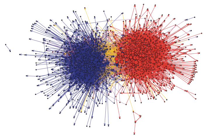
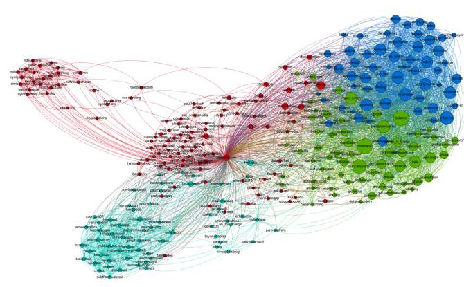
The first step is to hit the Run button next to Modularity in the Statistics pane. Click OK on the pop-up window and then close the distribution graph that appears. Now, go to the Partition window and hit the refresh button (it looks like two little green arrows pointing in a circle). Choose "Modularity Class" from the "---Choose a partition parameter" drop down menu. Notice that there are several other ways that you can group the nodes (e.g. by time zone) that you may want to come back and explore later. Gephi will show you the different communities it has identified along with the percentage of nodes that belong to each of those communities. For example, Gephi split my Twitter network into four communities. The largest community consist of 38.54% of the nodes and the smallest community contains 18.94% of the nodes.

If you click the Apple button, Gephi will color the communities in the network. If you want to change the colors, just click on the color square in the Partition window. Here's what my network looks like now:

Adding Labels

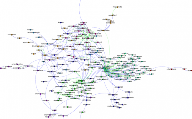
The next step is to add labels to our network so that we can identify different accounts. This will help us to understand who the important nodes in our network are and what ties together the nodes within the different communities. To show the labels, click the black T at the bottom of the Graph pane. You can resize the labels with the right slider at the bottom of the graph pane. At the moment you probably will have a hard time reading the labels because they overlap one another, but we will fix that in a second.

Using a layout algorithm to rearrange the nodes

To reposition the nodes into a more useful arrangement we will use one of Gephi's built-in layout algorithms. I find that the Force Atlas algorithm works well for Twitter network, but you should play around with the other algorithms as well to find one that works best for the particular network that you have collected. You can select the algorithm from the drop down menu in the Layout pane, and try changing the various layout specific parameters to see what works best. Here's what I'm using:

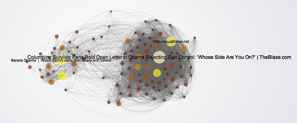
Hit the Run button to run the algorithm. If your network has a lot of nodes/links (or if your computer is slow), it may take awhile for the algorithm to move them around. Once you've found a nice arrangement, use the "Label Adjust" layout algorithm to move the nodes so that the labels don't cover one another up. Here's what i have now:

The only thing left to do is go over to the Preview window where Gephi will render a nice image for you once you click the Refresh button. You can make final adjustments such as hiding/showing labels and adjusting the label sizes in the Preview Settings Pane. You may have to iterate back and forth a bit between the Overview layout and the Preview to get everything just right.

Here's my finished product:

Of Monsters and Men — How an Icelandic Band Exploded using the Web

Bo Olafsson, a Kellogg student that took Social Dynamics and Networks with me this past fall quarter, put together a nice slideshow explaining how a little known Icelandic band, Of Monsters and Men, became a huge US success without ever visiting the country. Check it out:

Interestingly, Bo's slides have become a mini viral phenomenon themselves garnering press attention in both Iceland and the US: