pj

Projecting a Bipartite Network in Gephi

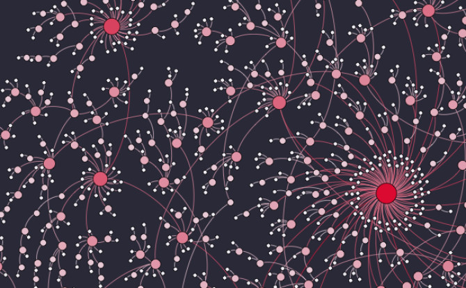
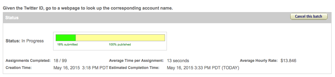
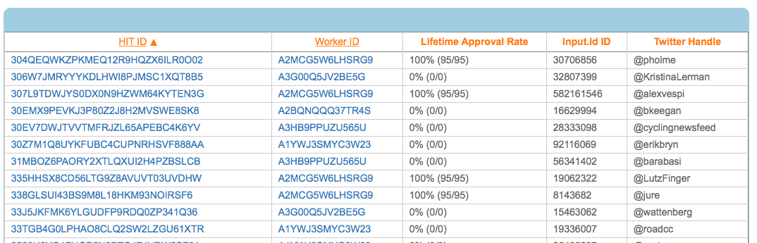
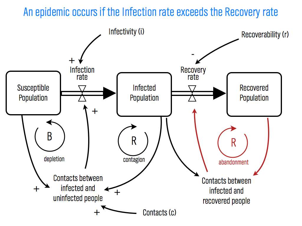
A bipartite network is one in which the nodes can be split into two groups, A and B, such that all of the links join nodes from group A with nodes from group B. There are no edges connecting two group A nodes with each other  or connecting two group B nodes with each other. This network of HBO shows and the actors that appeared in them is a nice example (originally posted here).

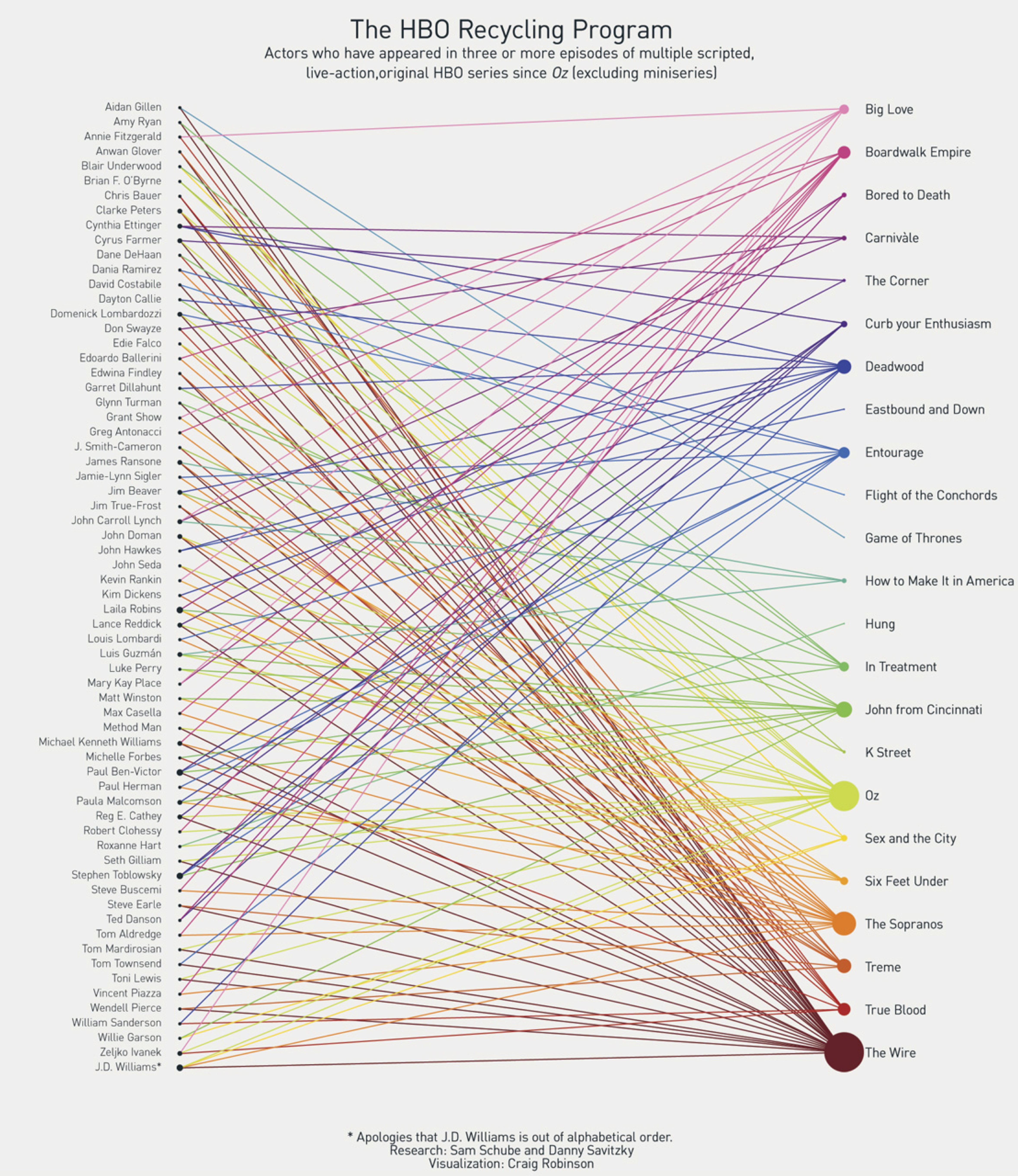
In this network the nodes are either actors or shows. Actors are connected to the shows they starred in, but there are no links connecting two actors to each other or two shows to each other because, of course, actors can't start in other actors and shows can't star in other shows. Other examples might include doctors and patients with doctors connected to the patients that they see, or students and clubs with students connected to the clubs that they are members of.

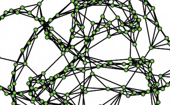
Every bipartite network can be projected to give two networks that have only one type of node. For example, our HBO network could be projected to give a a network of just actors, where two actors are connected if they stared in the same show; and the bipartite HBO network can also be projected to a network of just shows, where two shows are connected if the same actor starred in both of them. Projecting a bipartite network loses information, but sometime highlights specific features of a network that we want to focus on.

If you have a bipartite network in Gephi, there is a tool for automatically creating a projection. First, you need to add an attribute to the nodes that describes what type each node is, e.g. is it an actor or a movie. You do this by importing a nodes table with one column the node Ids and a second column giving the node type. So, you now have a new node attribute, maybe called nodeType, with values "actor" or "movie". At this point, I recommend saving a copy before proceeding.

The next thing you are going to do is install a plugin to Gephi called MultiMode Networks Transformation. Under the tools menu, choose plugins. Then under available plugins, select MultiModeNetworks TransformationPlugin. (If you have trouble installing the plugin this way, instead you can download the plugin here. Then in Gephi go to Tools... Plugins...Downloaded plugins, and select the downloaded file.) Once you have the plugin installed, under Window you should have a new window available called MultiMode Projections. Open this up, and hit the Load attributes button. Select nodeType for your Attribute type and click the Removed Edges and Remove Nodes buttons. Finally, you have to choose which projection you want to make. It's important that you have saved your work here, because Gephi does not have an undo button, and this next step will permanently change your network. You have to choose the left and right matrix to get the projection that you want. This works like matrix multiplication. If you want to project to an actor to actor network, choose "actor-movie" as your left matrix and "movie – actor" as your right matrix and hit run. If you want a movie to movie network, choose "movie – actor" as your left matrix and "actor – movie" as the right matrix and hit run. You should be left with the appropriate projected network.


Recruiting for Postdoctoral Scholar

UPDATE: This position is now closed.

I recently received in NIH R01 grant for $1.74m to fund a project examining how team communication networks impact collaboration success. Part of this funding will support a postdoctoral scholar to work with me at UCLA on building a computational model of team collaboration. (For related models see Hong and Page, 2001 and 2004; Lazer and Friedman, 2007.) See below for the complete position description and application instructions (downloadable here).

The Department of Communication Studies at UCLA is recruiting for a Postdoctoral Scholar to help develop a computational model of team networks and collaboration.

The successful candidate will collaborate with Professor PJ Lamberson on an NIH funded project examining the characteristics of successful teams, the leading indicators of impending team failure, and potential policies for increasing the productivity of team science and problem solving. The project will employ a computational agent-based modeling approach. In addition to collaborating with Professor Lamberson, the postdoc will also have the opportunity to work closely with other members of the project team including Nosh Contractor, Leslie DeChurch, and Brian Uzzi from Northwestern University’s School of Communication, Kellogg School of Management, and the Northwestern Institute on Complex Systems (NICO). A wide variety of disciplinary backgrounds will be considered. Key qualifications are experience with computational modeling, complex systems, and network analysis.

To apply, please send:

1. A cover letter explaining your interests and qualification for the position

2. A CV, and

3. At least two letters of recommendation

to pj@social-dynamics.org.

Applications will be considered as they are received, and the position will remain open until filled.

The University of California is an Equal Opportunity/Affirmative Action Employer. All qualified applicants will receive consideration for employment without regard to race, color, religion, sex, national origin, disability, age or protected veteran status. For the complete University of California nondiscrimination and affirmative action policy see:

http://policy.ucop.edu/doc/4000376/NondiscrimAffirmAct

Scale-Free Network

I made this visualization of a scale-free network for a recent talk at the 2015 KIN Global conference. Scale-free networks have a power law degree distribution. This means that if you count the fraction of nodes in the network that have one connection, two connections, three connections, and so on, and plot that distribution the graph looks roughly like this:

What this graph tells us is that most of the nodes have few connections — in this plot, around fifty percent of the nodes have four or fewer connections — but a few nodes have lots of connections. This distribution is called a power law and is described by the equation f(x)=cxα. It's very different from the more commonly known normal distribution. When something follows a normal distribution, most of the time that quantity is pretty close to the average value. For example, the height of the average American man is 5' 9", and most men are not that far from this average. Only 3.9% of men are 6' 2" or taller. With a power law distribution, most of the time our quantity is small — in our network most of the nodes have few connections — but occasionally we see really large values. Many quantities follow a power law distribution including wealth, the size of firms, the magnitude of earthquakes, the diameter of craters on the moon, and sales of books. Networks often have power law distributions for the number of connections.

You can generate a network with a power law degree distribution through a process known as preferential attachment. In this process, you add nodes to the network one at a time. Each time a node is added to the network it forms a connection with an existing node in the network. With some probability p the node chooses which of the existing nodes to connect to completely at random. With probability 1-p the new node selects which existing node to connect to in proportion to the nodes' existing number of connections, so it is more likely to connect to nodes that already have many connections.

The scale free network below was generated using this process as implemented in the R package i.graph (the R code is available here.) I exported an edge list for the network (which you can download here), and then created the visualization using Gephi.

Crowdsourcing Web Data with Amazon Mechanical Turk Example

The amount of data available on the web is astounding, and if you have the computer programming skills you can often write simple "web scrapping" code to automatically harvest that data. But what if you don't have the computer programming skills? You could spend a lot of time learning those skills, or you could hire someone else to write the code for you, but these options cost time and money. A faster and cheaper solution is to use crowdsourcing. In this post I will walk through an example of using Amazon Mechanical Turk for collecting data from the web.

In this example I have a list of Twitter IDs and I want to find the Twitter account name associated with each of those IDs. Every Twitter account has a unique ID number that never changes, but the Twitter account name, or "handle," is the more commonly used way of identifying a Twitter user. For example, my Twitter ID is 16016329 and my Twitter account name is @pjlamberson. (You can find your Twitter ID here.) You could use this same procedure to have workers look up any data on the web — for example, to collect online reviews, telephone numbers, addresses, or any other type of online data.

The first thing to do is go to Amazon Mechanical Turk and click on Get Started on the Get Results side of the screen. Click Create an Account and register as a Requester. Once you're back to the main requester screen click Create, then click New Project.

create

There are many types of tasks (aka HITs=Human Intelligence Tasks) that Amazon Mechnical Turk workers (aka "Turkers") can do. In this example, we are going to use the Data Collection task. So, click on Data Collection and then click Create Project.

datacollection


On the next screen you enter the properties for your project including how much you want to pay per HIT and how many people you want to complete each task. You can see the properties I chose below, but you may want to change your properties if you expect your task to take longer or if you want multiple workers to complete each HIT to ensure higher quality data.

When you're finished specifying your project properties, click on Design Layout.

For my data collection task I have a spreadsheet full of Twitter IDs. You can see a sample of the spreadsheet at: http://bit.ly/mTurkData

For each row in the spreadsheet, I need the Turker to go to the web address https://twitter.com/intent/user?user_id=XXXXXXXXXXX where XXXXXXXXXXX is replaced with the Twitter ID in that row of the spreadsheet. The corresponding instructions for this task to the Turker are shown below.

To refer to the variable ID that shows up in my spreadsheet I use the syntax ${Id}. The name of the variable Id matches the header of the corresponding column in my spreadsheet. Mechanical Turk will automatically create one HIT for each row of my spreadsheet. If I have multiple variables that change for each HIT, you can have multiple columns in the spreadsheet and refer to a column with column header "ColumnX" with ${ColumnX} in your instructions. For each HIT, the placeholder ${ColumnX} will be replaced with the content of the variable ColumnX from the spreadsheet from a given row of your spreadsheet.

The HTML source code for the HIT design shown above is available at http://bit.ly/mTurkSource If you click on the Source button on your Design Layout page, you can replace the example source code with this to reproduce my HIT.

Once you have entered your instructions to the Turkers, hit Preview. If the instructions look like you want them to (note the variable placeholder will still be just a placeholder until you upload your spreadsheet later), hit Finish.

Now you need to upload the spreadsheet containing the variables that change for each HIT and open up the job to the Turkers. To do this click Publish Batch and then click Choose File. Your spreadsheet should be in csv format, have one row for each HIT, and one column for each variable that changes from HIT to HIT. In my case, there is just the one variable, Id. Once you have selected your file, click Upload.

Now you will see a preview of your HITs with the variable(s) filled in with values from your spreadsheet. In my case, I have this:

Now, instead of ${Id} showing up in the web address, the first Twitter Id from my spreadsheet, 23779644, has been substituted. By clicking on Next HIT, you can see the other HITs that have been created using the data from the spreadsheet. Take a look at a few to make sure everything looks like you want to and then click Next.

On the next page you will see how much your batch of HITs is going to cost, which is a combination of the per HIT fee you set to pay the Turkers and the fee Amazon charges you to use the service. You may need to add funds to your account through Amazon payments in order to pay for the work. Once you have done that click Publish HITs and wait for the magic to happen.

This is the fun part. While you surf the web aimlessly, go grab a coffee, play solitaire, or get some really important work done, the tasks you posted are being completed by members of the thousands of Turkers that you are connected to through the platform. It's as if you're the CEO of a major company with a massive workforce waiting to do your bidding at a moments notice. You can watch the progress the Turkers are making on the results page.

In short order your tasks will be complete and you can see what the Turkers came up with by clicking the Results button. Here is a portion of my results:

If you're satisfied with the results you can approve them so that the Turkers get paid, or if a Turker did not do a satisfactory job you can reject the work. If you do nothing, the HITs will automatically be approved after a set time that you specified when setting up the HITs. To download the results just click on Download CSV and then right click and select Download linked file... on the here link and you're all set!

#socialDNA at Kellogg

One of the cool things about the Social Dynamics and Network Analytics (Social-DNA) course that I teach at Kellogg is that there are lots of new research articles, news stories, magazine articles, and blog entries coming out all of the time that are relevant to the course content. To help facilitate conversation about these current events, this quarter we're introducing #socialDNA on Twitter. Anytime you come across something relevant to the course topics (which you can read more about here), tweet about it with the hashtag #socialDNA. We're asking all of the current students to tweet a #socialDNA tweet at least once during the quarter (just retweeting someone else's #socialDNA tweet doesn't count!) We also hope that former Social DNA students will get involved too and this will provide a way for alumni of the course to stay connected with the latest Social Dynamics research and current events.

If you don’t have a Twitter account, the first thing you need to do is go to https://twitter.com/ and start one. Once you’ve started an account, you’ll want to follow some people. Here are few suggestions to get you started:
@pjlamberson — of course
@KelloggSchool — self explanatory
@SallyBlount — Dean of Kellogg School of Management
@gephi — you know you’re a social dynamics dork when … you follow @gephi on Twitter
@NICOatNUNorthwestern Institute on Complex Systems (NICO)
@James_H_Fowler — professor of political science at UCSD and author of seminal studies of social contagion in social networks
@noshir — Noshir Contractor, Northwestern network scientist
@erikbryn — Sloan prof. with lot’s of stuff on economics of information
@jeffely — Northwestern economics / Kellogg prof. and blogger: http://cheaptalk.org/
@RepRules — Kellogg prof. Daniel Diermeier
@sinanaral — Stern prof. who did the active/passive viral marketing study and other cool network research
@duncanjwatts — Duncan Watts research scientist and Yahoo, big time social networks scholar
@ladamic — Michigan prof. who did the viral marketing study and made the political blogs network

And don’t forget to post a tweet! If you are a serious Twitter beginner, check out Twitter 101.

Crowdsourcing and Open Innovation Examples

When I teach about Crowdsourcing and Open Innovation in my Social Dynamics course at Kellogg we look at a ton of examples of how innovative organizations are using these tools to connect with a  global network of problem solvers, innovators, and regular people to make more accurate predictions, find better problem solutions, and speed the pace of innovation. One of my students recently suggested that I compile a list of these examples so that the class could have all of the links in one place. So, here is a roughly annotated list of some of my favorite examples. Some of these are platforms you can use and others are organizations that are using or have used crowds in innovative ways. If you have others, I would love to hear about them.

Processing unstructured data

Many organizations today have more data than they know what to do with. Much of this data is what we call “unstructured” — it’s not a nice spreadsheet that we can feed into a regression or even in to a fancy machine learning algorithm. Instead the data is in the form of images or massive amounts of text that we don’t really know how to handle. Crowdsourcing has proven to be a very effective way to process this kind of unstructured data into something usable.

The New York Times and the Sarah Palin Emails

The New York Times asked to crowd to help comb through the thousands of pages of Sarah Palin’s email released by court order and flag newsworthy content. Then the professional editors would take a closer look at flagged items and do the background research to put together a real new story.

Galaxy Zoo

The crowd helps process the hundreds of thousands of pictures of galaxies taken by the Hubble Space Telescope by categorizing galaxies by shape, color, and other features.

Phylo

Workers help process data on gene sequence alignment.

reCaptcha

You know those online security questions where you have to enter some fuzzy text or a blurry number? Sometimes you are actually helping to process scanned text that was too muddled for a computer to read.

Duolingo

Duolingo is an awesome FREE language learning app. It’s secret to staying free is that while people are using the app to learn a language, Duolingo makes money from the documents that they translate. Started by the same people that came up with reCaptcha.

How photoshopped is an image?

This is an academic study that used crowdsourcing to help form a rating system for how much an image has been digitally altered. Outstanding example of how crowds can be used to “train computers” to process unstructured data.

Microtask

Focused particularly on document processing, like reading handwritten form responses.

Clickworker

Workers process text, do research, tag, and categorize your data.

Expert tasks that are inefficient to bring in house

Often times we have jobs to be done where we could really use a little bit of an expert, but we don’t really need a whole employee. After all, hiring people is expensive. Any time you hire someone it costs money to find them, you have to give them a desk, and a phone, and a computer, and benefits, and usually you’re stuck with them for a while. Sometimes it would be nice to have just a part of an employee - say, 1/4 of a marketer, 1/10 of a graphic designer, 1/10 of a web designer, and 1/3 of a data scientist. Crowdsourcing effectively lets you do this.

99 designs

Designers compete for your logo or web design. I have heard many, many stories of students having great experiences with this platform.

Elance

Find freelance programmers, developers, designers, writers, and marketers.

TopCoder

Teams from across the globe compete to deliver the best code. Used by companies like Google, Pfizer, Microsfot, Intel, Geico, and ESPN.

Threadless

The crowd both submits and chooses clever T-shirt designs like the now famous “Communist Party” shirt.

redbubble

Similar to Threadless, but more art focused. Designs can be printed on T-shirts, mugs, posters, etc.

iStockPhoto

Buy or submit stock photo images.

Quirky

Have an idea for a great product? Submit it on Quirky. Used by companies like Bed, Bath, and Beyond, Target, Toys R Us, and Ace Hardware.

Crowdfunding

Crowdfunding allows us to distribute the risk of funding new projects across a huge number of people. It’s also a great way of using a “Measure and React Strategy” because in many cases, like on Kickstarter, people effectively commit to buy your product before you have to take the risk of producing it.

Kickstarter

The most prominent crowdfunding platform on the Web, Kickstarted started to fund arts projects but has grown to much, much more, raising millions of dollars in startup capital for projects like the Pebble smart watch.

GoFundMe

Crowdfunding for personal causes things like medical expenses.

CommonBond

Raises money to fund MBA students by connecting students and alumni.

CrowdCube

Designed to let regular people try their hand at being a venture capitalist.

GrowVC

Another crowd funding tool focused on funding startups, which has now expanded into a whole group of crowd funding and investment companies.

OurCrowd

Startup funding specifically aimed at Israeli companies.

Open innovation

One of the most powerful uses of the crowd is through open innovation platforms. This application is designed to take advantage of the super additive benefits of diversity. For more on how the power of diversity leads to better problem solving, I highly recommend Scott E. Page’s book The Difference, which was once aptly described as “an airplane book if you’re on a flight to Singapore."

Innocentive

The largest, most developed open innovation platform hosts challenges of all sorts, but especially problems in chemistry and engineering. Prizes for solutions often extended into the tens of thousands.

Kaggle

Like TopCoder, but for data analytics.

Uncategorized

Many of the examples above overlap across multiple categories. These ones do to, and I gave up on trying to label them.

The NetFlix Prize

One of the first and all time greatest examples of a prize contest incentivizing diverse problem solvers to come together to solve a difficult question.

MechanicalTurk

Amazon Mechanical Turk is a platform for all of the above. The most developed and effective crowdsourcing platform on the web, with a massive population of workers (aka Turkers), Mechanical Turk can be used for processing data, running experiments, disseminating surveys, … you name it.

FoldIt

Instead of playing solitaire or minesweeper, why not kill time by helping to solve protein folding puzzles with implications for combatting diseases like Parkinsons and HIV?

Big Data and the Wisdom of Crowds are not the same

I was surprised this week to find an article on Big Data in the New York Times Men's Fashion Edition of the Style Magazine. Finally! Something in the Fashion issue that I can relate to I thought. Unfortunately, the article by Andrew Ross Sorkin (author of Too Big To Fail) made one crucial mistake. The downfall of the article was conflating two distinct concepts that are both near and dear to my research, Big Data and the Wisdom of Crowds, which led to a completely wrong conclusion.

Big Data is what it sounds like — using very large datasets for ... well for whatever you want. How big is Big depends on what you're doing.  At a recent workshop on Big Data at Northwestern University, Luís Amaral defined Big Data to be basically any data that is too big for you to handle using whatever methods are business as usual for you. So, if you're used to dealing with data in Excel on a laptop, then data that needs a small server and some more sophisticated analytics software is Big for you. If you're used to dealing with data on a server, then your Big might be data that needs a room full of servers.

The Wisdom of Crowds is the idea that, as collectives, groups of people can make more accurate forecasts or come up with better solutions to problems than the individuals in them could on their own. A different recent New York Times articles has some great examples of the Wisdom of Crowds. The article talks about how the Navy has used groups to help make forecasts, and in particular forecasts for the locations of lost items like "sunken ships, spent warheads and downed pilots in vast, uncharted waters." The article tells one incredible story of how they used this idea to locate a missing submarine, the Scorpion:

"... forecasters draw on expertise from diverse but relevant areas — in the case of finding a submarine, say, submarine command, ocean salvage, and oceanography experts, as well as physicists and engineers. Each would make an educated guess as to where the ship is ... This is how Dr. Craven located the Scorpion.

“I knew these guys and I gave probability scores to each scenario they came up with,” Dr. Craven said. The men bet bottles of Chivas Regal to keep matters interesting, and after some statistical analysis, Dr. Craven zeroed in on a point about 400 miles from the Azores, near the Sargasso Sea, according to a detailed account in “Blind Man’s Bluff,” by Christopher Drew and Sherry Sontag. The sub was found about 200 yards away."

This is a perfect example of the Wisdom of Crowds: by pooling the forecasts of a diverse group, they came up with an accurate collective forecast.

So, how do Big Data and The Wisdom of Crowds get mixed up? The mixup comes from the fact that a lot of Big Data is data on the behavior of crowds. The central example in Sorkin's article is data from Twitter, and in particular data that showed a lot of people on Twitter were very unhappy with antigay comments made by Phil Robertson, the star of A&E's Duck Dynasty. The short version of the story is that A&E initially terminated Robertson in response to the Twitter data, but Sorkin argues this was a business mistake because Twitter users are "not exactly regular watchers of the camo-wearing Louisiana clan whose members openly celebrate being 'rednecks'." He also cites evidence that data from Twitter does not provide accurate election predictions for essentially the same reason — the people that are tweeting are not a representative sample of the people that are voting. All of this is correct. Using a big dataset does not mean that you don't have to worry about having a biased sample. No matter how big your dataset, a biased sample can lead to incorrect conclusions. A classic example is the prediction by The Literary Digest in 1936 that Alf Landon would be the overwhelming winner of the presidential election that year. In fact, Franklin Roosevelt carried 46 of the 48 states. The prediction was based on a huge poll with 2.4 million respondents, but the problem with the prediction was that the sample for the poll drew primarily on Literary Digest subscribers, automobile and telephone owners. This sample tended to be more affluent than the average voter, and thus favored Landon's less progressive policies.

So, Sorkin is on the right track to write a great article on how sample bias is still important even when you have Big Data. This is a really important point that a lot of people don't appreciate. But unfortunately the article veers off that track when it starts talking about the Wisdom of Crowds. The Wisdom of Crowds is not about combining data on large groups, but about combining the predictions, forecasts, or ideas of groups (they don't even have to be that large). If you want to use the Wisdom of Crowds to predict an election winner, you don't collect data on who they're tweeting about, you ask them who they think is going to win. If you want to use the Wisdom of Crowds to decide whether or not you should fire Phil Robertson, you ask them, "Do you think A&E will be more profitable if they fire Phil Robertson or not?" As angry as all of those tweets were, many of those angry voices on Twitter would probably concede that Robertson's remarks wouldn't damage the show's standing with its core audience.

The scientific evidence shows that using crowds is a pretty good way to make a prediction, and it often outperforms forecasts based on experts or Big Data. For example, looking at presidential elections from 1988 to 2004, relatively small Wisdom of Crowds forecasts outperformed the massive Gallup Poll by .3 percentage points (Wolfers and Zitzewitz, 2006). This isn't a huge margin, but keep in mind that the Gallup presidential poles are among the most expensive, sophisticated polling operations in history, so the fact that the crowd forecasts are even in the ballpark, let alone better, is pretty significant.

The reason the Wisdom of Crowds works is because when some people forecast too high and others forecast too low, their errors cancel out and bring the average closer to the truth. The accuracy of a crowd forecast depends both on the accuracy of the individuals in the crowd and on their diversity — how likely are their errors to be in opposite directions. The great thing about it is that you can make up for low accuracy with high diversity, so even crowds in which the individual members are not that great on their own can make pretty good predictions as collectives. In fact, as long as some of the individual predictions are on both sides of the true answer, the crowd forecasts will always be closer to the truth than the average individual in the crowd. It's a mathematical fact that is true 100% of the time. Sorkin concludes his article, based on the examples of inaccurate predictions from Big Data with biased samples, by writing, "A crowd may be wise, but ultimately, the crowd is no wiser than the individuals in it." But this is exactly backwards. A more accurate statement would be, "A crowd may or may not be wise, but ultimately, it's always at least as wise as the individuals in it. Most of the time it's wiser."

@EconDailyCharts Network Visualization of World Economic Forum Attendees

The Economist has a chart showing a network visualization of several world economic forum attendees. It's interesting to see how connected the attendees are, but it's hard to get much else out of the visualizations. It would be a lot easier if the edges and labels showed up before you hovered over the nodes. It's really hard to pull out meaningful insights from the graphs as they are. For example, the article says, "Among the findings that the data-visualisation reveals is the degree to which Catalyst, a New York-based charity that helps women in the workplace, has links to many Davos goers," but to see this you have to hover over the nodes one by one until you find that charity, and even then you can't compare it to other nodes without hovering over all of them too.

Thanks to Ed Brenninkmeyer for sending me the link.


A Scientist's Take on the Princeton Facebook Paper

Spechler and Cannarella's paper predicting the death of Facebook has been taking a lot of flak. While I do think there are some issues applying their model to Facebook and MySpace, they're not the ones that most people are citing.

The most common complaint about the Princeton Facebook paper that I've seen is that Facebook is not a disease. Facebook may not be a disease, but that doesn't mean a model that describes how diseases spread isn't a good model for how Facebook spreads. Models based on the disease spread analogy have been used for decades in marketing. The famous "Bass Model" is just a relabeled disease model. Frank Bass's original paper has been cited thousands of times and was named one of the ten most influential papers in Management Science. While it's received its fair share of criticism, the entirety of The Tipping Point is based on the disease spread analogy. Gladwell even writes, "... ideas and behavior and messages and products sometimes behave just like outbreaks of infectious disease."

Interestingly, one of the major points of Spechler and Cannarela's paper is that online social networks do NOT spread just like a disease, that's why they had to modify the original SIR disease model in the first place. (See an explanation here.)

But, the critics have missed this point and are fixated on particulars of the disease analogy. For example, Lance Ulanoff at Mashable (who has one of the more evenhanded critiques) says, "How can you recover from a disease you never had?" He's referring to the fact that in Spechler and Cannarella's model, some people start off in the Recovered population before they've ever been infected. These are people who have never used Facebook and never will. It is a bit confusing that they're referred to as "recovered" in the paper, but if we just called them "people not using Facebook that never will in the future" that would solve the issue. Ulanoff has the same sort of quibble with the term recovery writing, "The impulse to leave a social network probably does spread like a virus. But I wouldn’t call it “recovery.” It's leaving that's the infection." Ok, fine, call it leaving, that doesn't change the model's predictions. Confusing terminology doesn't mean the model is wrong.

All of this brings up another interesting point, how could we test if the model is right? First off, this is a flawed question. To quote the statistician George E. P. Box, "... all models are wrong, but some are useful." Models, by definition, are simplified representations of the real world. In the process of simplification we leave things out that matter, but we try to make sure that we leave the most important stuff in, so that the model is still useful. Maps are a good analogy. Maps are simplified representations of geography. No map completely reproduces the land it represents, and different maps focus on different features. Topographic maps show elevation changes and road maps show highways. One kind is good for hiking the Appalachian trail, another is good for navigating from New York City to Boston. Models are the same — they leave out some details and focus on others so that we can have a useful understanding of the phenomenon in question. The SIR model, and Spechler and Cannarela's extension leave out all sorts of details of disease spread and the spread of social networks, but that doesn't mean they're not useful or they can't make accurate predictions.

myspace

Spechler and Cannarela fit their model to data on MySpace users (more specifically, Google searches for MySpace), and the model fits pretty well. But this is a low bar to pass. It just means that by changing the model parameters, we can make the adoption curve in the model match the same shape as the adoption curve in the data. Since both go up and then down, and there are enough model parameters so that we can change the speed of the up and down fairly precisely, it's not surprising that there are parameter values for which the two curves match pretty well.

There are two better ways that the model could be tested. The first method is easier, but it only tests the predictive power of the model, not how well it actually matches reality. For this test, Spechler and Cannarela could fit the model to data from the first few years of MySpace data, say from 2004 to 2007, and see how well it predicts MySpace's future decline.

The second test is a higher bar to clear, but provides real validation of the model. The model has several parameters — most importantly there is an "infectivity" parameter (β in the paper) and a recovery parameter (γ). These parameters could be estimated directly by estimating how often people contact each other with messages about these social networks and how likely it is for any given message to result in someone either adopting or disadopting use of the network. For diseases, this is what epidemiologists do. They measure how infectious a disease is and how long ti takes for someone to recover, on average. Put these two parameters together with how often people come into contact (where the definition of "contact" depends on the disease — what counts as a contact for the flu is different from HIV, for example), and you can predict how quickly a disease is likely to spread or die out. (Kate Winslet explains it all in this clip from Contagion.) So, you could estimate these parameters for Facebook and MySpace at the individual level, and then plug those parameters into the model and see if the resulting curves match the real aggregate adoption curves.

Collecting data on the individual model parameters is tough. Even for diseases, which are much simpler than social contagions, it takes lab experiments and lots of observation to estimate these parameters. But even if we knew the parameters, chances are the model wouldn't fit very well. There are a lot of things left out of this model (most notably in my opinion, competition from rival networks.)

Spechler and Cannarella's model is wrong, but not for the reasons most critics are giving. Is it useful? I think so, but not for predicting when Facebook will disappear. Instead it might better capture the end of the latest fashion trend or Justin Bieber fever. 


Joshua Spechler and John Cannarella's Facebook is Dying Paper

This morning my email is blowing up with links to articles describing research by Joshua Spechler and John Cannarella, two Princeton PhD students, that predicts Facebook will lose 80% of its user base between 2015 and 2017. Are they right?

The paper is getting plenty of criticism, but as far as I can tell most of the critics haven't read or didn't understand the math in the paper. Let's take a closer look. Spechler and Cannarella's starting point is a basic model of disease spread called the SIR model. The SIR model (and its marketing variant the Bass model) have been applied to study the spread of innovations for decades. Without calling it by its name, I discussed applying the SIR model to the spread of memes online in the previous post on "What it Takes to Go Viral".

The SIR model is pretty simple. Imagine everyone in the world is in one of three states, Susceptible, Infected, or Recovered. Every time a Susceptible person bumps into an Infected person, there is a chance they become Infected too. Once a person is Infected, they stay Infected for awhile, but eventually they get better and become Recovered. The whole model is summed up by this "stock and flow" diagram.

SIR.001


Spechler and Cannarella update this model by making the recovery rate proportional to the number of recovered individuals. In other words, as more "recover" there is an increasing rate of recovery. In terms of Facebook, this would be interpreted as an increasing social pressure to leave Facebook as more other people leave Facebook. In our diagram, this amounts to adding another feedback loop — the "abandonment" feedback loop in red below:

SIRr.001.001


The effect of adding this loop is that recovery is slower in the beginning, because few people have recovered so there isn't much social pressure to recover, but then to accelerate recovery as the recovered population grows. For Facebook, it would mean once people start leaving, they'll leave in droves. When Specheler and Cannarella fit this model to the data, the best fit predicts that this mass exodus for Facebook will occur between 2015 and 2017.

To test their model they fit it to data on MySpace (they use Google Search data, which is a cool idea) and find that it fits pretty well. But, here's where we need to start being skeptical. First, just because the model fits the data well doesn't mean that the model captures what's really happening. It just means that you can manipulate the parameters of the model to produce a curve that goes up and down with a shape similar to the up and down curve that describes the users of MySpace over time. This isn't too surprising.

More problematic is that the model doesn't account for what is most likely the biggest single reason that people left MySpace — Facebook. In this model, the reason people leave MySpace is that everyone else is leaving MySpace — MySpace becomes uncool and there is a social pressure to not be on MySpace. But in reality, people probably didn't feel pressure to not be on MySpace, they left MySpace because they felt pressure to be on Facebook because that's where everyone else was.

I think this is an interesting model, but it's probably better suited to other phenomenon. When I was in junior high, it was cool to "tight roll" your jeans as demonstrated by these ladies.

tight-rolled-pants-3By the time I was in high school, no one would be caught dead tight rolling their jeans. This is the kind of dynamic that Spechler and Cannarella's model captures.

It's quite possible that Facebook will pass away, but probably only if something new comes along to displace it, not because people are embarrassed if someone finds out they still have an account.