Networks

Recruiting for Postdoctoral Scholar

UPDATE: This position is now closed.

I recently received in NIH R01 grant for $1.74m to fund a project examining how team communication networks impact collaboration success. Part of this funding will support a postdoctoral scholar to work with me at UCLA on building a computational model of team collaboration. (For related models see Hong and Page, 2001 and 2004; Lazer and Friedman, 2007.) See below for the complete position description and application instructions (downloadable here).

The Department of Communication Studies at UCLA is recruiting for a Postdoctoral Scholar to help develop a computational model of team networks and collaboration.

The successful candidate will collaborate with Professor PJ Lamberson on an NIH funded project examining the characteristics of successful teams, the leading indicators of impending team failure, and potential policies for increasing the productivity of team science and problem solving. The project will employ a computational agent-based modeling approach. In addition to collaborating with Professor Lamberson, the postdoc will also have the opportunity to work closely with other members of the project team including Nosh Contractor, Leslie DeChurch, and Brian Uzzi from Northwestern University’s School of Communication, Kellogg School of Management, and the Northwestern Institute on Complex Systems (NICO). A wide variety of disciplinary backgrounds will be considered. Key qualifications are experience with computational modeling, complex systems, and network analysis.

To apply, please send:

1. A cover letter explaining your interests and qualification for the position

2. A CV, and

3. At least two letters of recommendation

to pj@social-dynamics.org.

Applications will be considered as they are received, and the position will remain open until filled.

The University of California is an Equal Opportunity/Affirmative Action Employer. All qualified applicants will receive consideration for employment without regard to race, color, religion, sex, national origin, disability, age or protected veteran status. For the complete University of California nondiscrimination and affirmative action policy see:

http://policy.ucop.edu/doc/4000376/NondiscrimAffirmAct

Scale-Free Network

I made this visualization of a scale-free network for a recent talk at the 2015 KIN Global conference. Scale-free networks have a power law degree distribution. This means that if you count the fraction of nodes in the network that have one connection, two connections, three connections, and so on, and plot that distribution the graph looks roughly like this:

What this graph tells us is that most of the nodes have few connections — in this plot, around fifty percent of the nodes have four or fewer connections — but a few nodes have lots of connections. This distribution is called a power law and is described by the equation f(x)=cxα. It's very different from the more commonly known normal distribution. When something follows a normal distribution, most of the time that quantity is pretty close to the average value. For example, the height of the average American man is 5' 9", and most men are not that far from this average. Only 3.9% of men are 6' 2" or taller. With a power law distribution, most of the time our quantity is small — in our network most of the nodes have few connections — but occasionally we see really large values. Many quantities follow a power law distribution including wealth, the size of firms, the magnitude of earthquakes, the diameter of craters on the moon, and sales of books. Networks often have power law distributions for the number of connections.

You can generate a network with a power law degree distribution through a process known as preferential attachment. In this process, you add nodes to the network one at a time. Each time a node is added to the network it forms a connection with an existing node in the network. With some probability p the node chooses which of the existing nodes to connect to completely at random. With probability 1-p the new node selects which existing node to connect to in proportion to the nodes' existing number of connections, so it is more likely to connect to nodes that already have many connections.

The scale free network below was generated using this process as implemented in the R package i.graph (the R code is available here.) I exported an edge list for the network (which you can download here), and then created the visualization using Gephi.

#socialDNA at Kellogg

One of the cool things about the Social Dynamics and Network Analytics (Social-DNA) course that I teach at Kellogg is that there are lots of new research articles, news stories, magazine articles, and blog entries coming out all of the time that are relevant to the course content. To help facilitate conversation about these current events, this quarter we're introducing #socialDNA on Twitter. Anytime you come across something relevant to the course topics (which you can read more about here), tweet about it with the hashtag #socialDNA. We're asking all of the current students to tweet a #socialDNA tweet at least once during the quarter (just retweeting someone else's #socialDNA tweet doesn't count!) We also hope that former Social DNA students will get involved too and this will provide a way for alumni of the course to stay connected with the latest Social Dynamics research and current events.

If you don’t have a Twitter account, the first thing you need to do is go to https://twitter.com/ and start one. Once you’ve started an account, you’ll want to follow some people. Here are few suggestions to get you started:
@pjlamberson — of course
@KelloggSchool — self explanatory
@SallyBlount — Dean of Kellogg School of Management
@gephi — you know you’re a social dynamics dork when … you follow @gephi on Twitter
@NICOatNUNorthwestern Institute on Complex Systems (NICO)
@James_H_Fowler — professor of political science at UCSD and author of seminal studies of social contagion in social networks
@noshir — Noshir Contractor, Northwestern network scientist
@erikbryn — Sloan prof. with lot’s of stuff on economics of information
@jeffely — Northwestern economics / Kellogg prof. and blogger: http://cheaptalk.org/
@RepRules — Kellogg prof. Daniel Diermeier
@sinanaral — Stern prof. who did the active/passive viral marketing study and other cool network research
@duncanjwatts — Duncan Watts research scientist and Yahoo, big time social networks scholar
@ladamic — Michigan prof. who did the viral marketing study and made the political blogs network

And don’t forget to post a tweet! If you are a serious Twitter beginner, check out Twitter 101.

@EconDailyCharts Network Visualization of World Economic Forum Attendees

The Economist has a chart showing a network visualization of several world economic forum attendees. It's interesting to see how connected the attendees are, but it's hard to get much else out of the visualizations. It would be a lot easier if the edges and labels showed up before you hovered over the nodes. It's really hard to pull out meaningful insights from the graphs as they are. For example, the article says, "Among the findings that the data-visualisation reveals is the degree to which Catalyst, a New York-based charity that helps women in the workplace, has links to many Davos goers," but to see this you have to hover over the nodes one by one until you find that charity, and even then you can't compare it to other nodes without hovering over all of them too.

Thanks to Ed Brenninkmeyer for sending me the link.


A Scientist's Take on the Princeton Facebook Paper

Spechler and Cannarella's paper predicting the death of Facebook has been taking a lot of flak. While I do think there are some issues applying their model to Facebook and MySpace, they're not the ones that most people are citing.

The most common complaint about the Princeton Facebook paper that I've seen is that Facebook is not a disease. Facebook may not be a disease, but that doesn't mean a model that describes how diseases spread isn't a good model for how Facebook spreads. Models based on the disease spread analogy have been used for decades in marketing. The famous "Bass Model" is just a relabeled disease model. Frank Bass's original paper has been cited thousands of times and was named one of the ten most influential papers in Management Science. While it's received its fair share of criticism, the entirety of The Tipping Point is based on the disease spread analogy. Gladwell even writes, "... ideas and behavior and messages and products sometimes behave just like outbreaks of infectious disease."

Interestingly, one of the major points of Spechler and Cannarela's paper is that online social networks do NOT spread just like a disease, that's why they had to modify the original SIR disease model in the first place. (See an explanation here.)

But, the critics have missed this point and are fixated on particulars of the disease analogy. For example, Lance Ulanoff at Mashable (who has one of the more evenhanded critiques) says, "How can you recover from a disease you never had?" He's referring to the fact that in Spechler and Cannarella's model, some people start off in the Recovered population before they've ever been infected. These are people who have never used Facebook and never will. It is a bit confusing that they're referred to as "recovered" in the paper, but if we just called them "people not using Facebook that never will in the future" that would solve the issue. Ulanoff has the same sort of quibble with the term recovery writing, "The impulse to leave a social network probably does spread like a virus. But I wouldn’t call it “recovery.” It's leaving that's the infection." Ok, fine, call it leaving, that doesn't change the model's predictions. Confusing terminology doesn't mean the model is wrong.

All of this brings up another interesting point, how could we test if the model is right? First off, this is a flawed question. To quote the statistician George E. P. Box, "... all models are wrong, but some are useful." Models, by definition, are simplified representations of the real world. In the process of simplification we leave things out that matter, but we try to make sure that we leave the most important stuff in, so that the model is still useful. Maps are a good analogy. Maps are simplified representations of geography. No map completely reproduces the land it represents, and different maps focus on different features. Topographic maps show elevation changes and road maps show highways. One kind is good for hiking the Appalachian trail, another is good for navigating from New York City to Boston. Models are the same — they leave out some details and focus on others so that we can have a useful understanding of the phenomenon in question. The SIR model, and Spechler and Cannarela's extension leave out all sorts of details of disease spread and the spread of social networks, but that doesn't mean they're not useful or they can't make accurate predictions.

myspace

Spechler and Cannarela fit their model to data on MySpace users (more specifically, Google searches for MySpace), and the model fits pretty well. But this is a low bar to pass. It just means that by changing the model parameters, we can make the adoption curve in the model match the same shape as the adoption curve in the data. Since both go up and then down, and there are enough model parameters so that we can change the speed of the up and down fairly precisely, it's not surprising that there are parameter values for which the two curves match pretty well.

There are two better ways that the model could be tested. The first method is easier, but it only tests the predictive power of the model, not how well it actually matches reality. For this test, Spechler and Cannarela could fit the model to data from the first few years of MySpace data, say from 2004 to 2007, and see how well it predicts MySpace's future decline.

The second test is a higher bar to clear, but provides real validation of the model. The model has several parameters — most importantly there is an "infectivity" parameter (β in the paper) and a recovery parameter (γ). These parameters could be estimated directly by estimating how often people contact each other with messages about these social networks and how likely it is for any given message to result in someone either adopting or disadopting use of the network. For diseases, this is what epidemiologists do. They measure how infectious a disease is and how long ti takes for someone to recover, on average. Put these two parameters together with how often people come into contact (where the definition of "contact" depends on the disease — what counts as a contact for the flu is different from HIV, for example), and you can predict how quickly a disease is likely to spread or die out. (Kate Winslet explains it all in this clip from Contagion.) So, you could estimate these parameters for Facebook and MySpace at the individual level, and then plug those parameters into the model and see if the resulting curves match the real aggregate adoption curves.

Collecting data on the individual model parameters is tough. Even for diseases, which are much simpler than social contagions, it takes lab experiments and lots of observation to estimate these parameters. But even if we knew the parameters, chances are the model wouldn't fit very well. There are a lot of things left out of this model (most notably in my opinion, competition from rival networks.)

Spechler and Cannarella's model is wrong, but not for the reasons most critics are giving. Is it useful? I think so, but not for predicting when Facebook will disappear. Instead it might better capture the end of the latest fashion trend or Justin Bieber fever. 


Gephi on Mac OS X Mavericks Quick Fix

I use the network visualization software Gephi almost everyday, especially when I am teaching  Social Dynamics and Network Analytics at Kellogg. So, I was pretty concerned when I realized after upgrading my Mac laptop and desktop to the new Mac OS X Mavericks that Gephi was no longer working on either. Luckily, there is a solution: Installing this Java update from Apple seems to fix everything up.

Obesity Epidemic?

Today on Slate there is a nice little GIF (that originally appeared on The Atlantic) that shows how obesity rates have changed over time by state. Slate seems to suggest that the geographic progression of obesity rates might indicate some sort of social contagion. But, ss many others (and here) before me have pointed out, we have to be very careful when trying to draw inferences about social contagion. If we take a look at a map of household income by state, we see that there is a lot of overlap between the poorest states and those with the highest obesity rates.

Household Income

There are lot's of potential causal connections here. For example, income might affect the types of stores and restaurants available, which in turn affects obesity rates. For a more careful look at some data on the social contagion of obesity, have a look at our paper that examines obesity rates, screen time, and social networks in adolescents.


As a side note, it's interesting to compare the map of the "obesity epidemic" to a map of something we know spreads through person to person contagion, like the swine flu (image from the New York Times).

H1N1

Unlike the obesity epidemic, swine flu jumps all over the place, which obviously has to do with air travel.

Gun Control and Homophily in Social Networks

Last week the website of The Atlantic had a nice network visualization of the top tweets linking to articles on gun politics. You should go check out their site where the network visualization is interactive, but here is a static picture so you get the idea. Homophily in the network of gun politics tweets

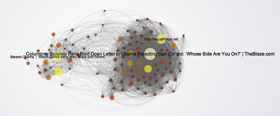
Each node in this network is one of the top 100 most tweeted weblinks on gun politics during the week from Sunday 2/17 to Sunday 2/24. The creator of the network visualization collected all of the tweets that mentioned terms like "gun rights," "gun control," "gun laws," etc. and then looked for the most popular links in those tweets. (One thing I wonder about is how they dealt with shortened URLs. Since tweets are limited to 140 characters or less, when most people post a link on Twitter they shorten the URL using a service like bit.ly. This means that two people that are ultimately linking to the same article might post different URLs. Many news services have a built in "Tweet this" button, which may give the same shortened URL to everyone who clicks it, so those articles would get many consistent links, where articles or posts without a "Tweet this" button might have many links pointing to them, but all with different URLs coming from each time a person shortened the link individually. All of this is just a technical aside though, because I am a 100% sure the main point of the network visualization, which I haven't even gotten to yet, would still show up.)

The edges in the network visualization connect two pages if the same Twitter account posted links to both pages. The point is that we see two very distinct clusters with lots of edges within the clusters and not too many between them. Of course, taking a loser look at the network visualization we see that one of the groups consists of pro gun control articles and the other contains anti gun control pages. The network science term for this phenomenon is homophily i.e. nodes are more likely to connect to other nodes that are similar to them. Homophily shows up in lots and lots of networks. Political network visualizations almost always exhibit extreme homophily. For example, take a look at this network of political blogs created by Lada Adamic and Natalie Glance (they have generously made the data available here).

Homophily in political blogs
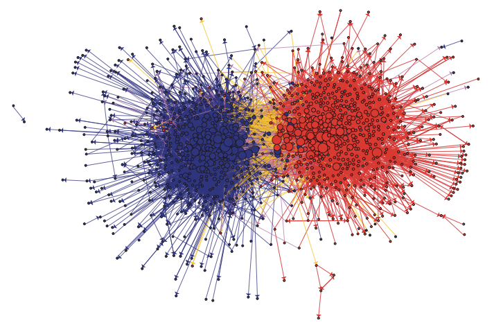
In this network the nodes are blogs about politics and two blogs are connected if there is a hyperlink from one blog to another. Blue blogs are liberal blogs and red blogs are conservative.

Or, take a look at this network of senators created by a group in the Human-computer Interaction Lab at the University of Maryland.

Homophily in the Senate

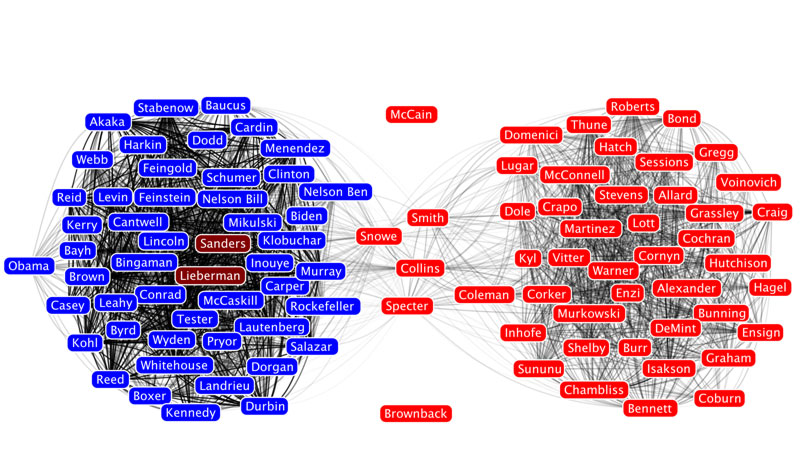
Here, the nodes are senators and two senators are connected if they voted the same way on a threshold number of roll call votes.

Homophily shows up in other types of social networks as well, not only political networks. For example, take a look at this network of high school friendships from James Moody's paper "Race, school integration, and friendship segregation in America," American Journal of Sociology 107, 679-716 (2001).

Homophily in high school friendships

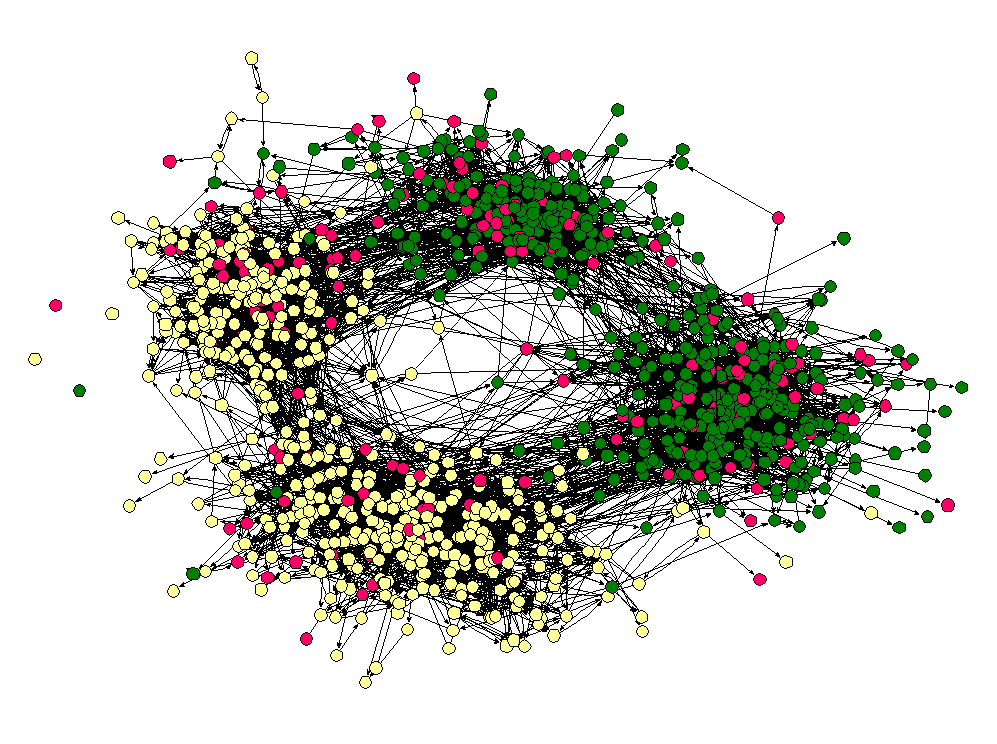
Here the nodes are students in a high school and two nodes are connected if one student named the other student as friend (the data was collected as part of the Add Health study). The color of the nodes corresponds to the race of the students. As we can see, "yellow" students are much more likely to be friends with other yellow students and "green" students are more likely to connect to other green students. (Interestingly, the "pink" students, who are in the vast minority seem to be distributed throughout the network. I once heard Matt Jackson say that this is the norm in many high schools — if there are two large groups and one small one, the members of the small group end up identifying with one or the other of the two large groups.)

Homophily is actually a more subtle concept than it appears at first. The thorny issue, as is often the case, is causality. Why do similar nodes tend to be connected to one another? The problem is so deeply ingrained in the concept of homophily that it sometimes leads to ambiguity in the use of the term itself. Some people use the word homophily to refer to the observation that nodes in a network are more likely to connect to similar nodes in the network than we would expect due to chance. In this case, there is no mention of the underlying reason why similar nodes are connected to one another, just that they are.  When other people use the term homophily, they mean the tendency for nodes in a network to select similar nodes in the network to form connections with. To keep the distinction clear, some people even refer to the former definition as observed homophily. 

To understand the difference it helps to think about other reasons why we might see similar nodes preferentially connected to one another. The casual stories fall into three basic categories: influence, network dynamics, and exogenous covariates. For many people, the influence story is the most interesting. In this explanation, we imagine that the network of connections already exists, and then nodes that are connected to one another affect each other's characteristics so that network neighbors end up being similar to one another. For example, in a series of papers looking at a network of friends, relatives, and geographic neighbors from the Framingham Heart study, Christakis and Fowler argue that network neighbors influence one another's weight, tendency to smoke, likelihood to divorce, and depression. While not everyone is convinced by Christakis and Fowler's evidence for a contagion effect, we can all agree that in their data obese people are more likely to be connected to other obese people, smokers tend to be friends with smokers, people that divorce are more likely to be connected to others that divorce, and depressed folks are more likely to be connected to other depressed people than we would expect due to chance.

In the network dynamics story, nodes form or break ties in a way that shows a preference for a particular attribute. Our intuition is that liberal blogs like to link to other liberal blogs more than they like to link to conservative blogs. This is what some people take as the definition of homophily. Since the word literally means "love of the same" this makes some sense.

But, just because we see observed homophily doesn't mean people are preferentially linking to other people that are like them. This is reassuring when we see homophily on dimensions like race as in the high school friendship network above. Clearly, the students are not influencing the race of their friends, but this doesn't mean the fact that we observe racial homophily doesn't imply the students are racist — there could be what we call an exogenous covariate that is leading to the observation of homophily. For example, it could be that these students leave in a racially segregated city and students are more likely to be friends with other students that live close to them. In this case, students prefer to be friends with other students that live near them, and living near one another just happens to increase the likelihood that the students share the same race.   One particularly tricky covariate is having a friend in common. Another common observation in social networks is what is called triadic closure. In lay terms, triadic closure means that two people with a friend in common are likely to be friends with each other — the triangle closes instead of remaining an open like a V. It could be that, in the high school friendship network, there is a sight tendency for some students to choose others of their same race as friends; either because of another variable like location or because of an actual racial bias, but the appearance of racial homophily could be significantly amplified by triadic closure. If one student chooses two friends that are of the same race, triadic closure is likely to result in third same race tie. It turns out that, at least in some cases where scholars have been able to untangle these various stories, triadic closure and homophily on other covariates explains a lot of observed racial homophily (see e.g. Wimmer and Lewis or Kossinets and Watts).

So, what about the gun control network? In this case, we can rule out influence, since the articles had to already exist and have a stance on gun control before someone can tweet a link to them. That is, the "state" of the node as pro or anti gun control precedes the formation of a tie connecting them in the Atlantic's network. But as far as the other explanations go, it's probably a mix. An obvious exogenous covariate is source. If I read news on the website of MSNBC and you go to the Fox website, I'm more likely to tweet links to pro gun control articles and your more likely to to tweet anti gun control links, even if we are both just tweeting links to every gun control article we read. Undoubtedly though, many people are using Twitter as a way to spread information that supports their own political opinions, so someone that is pro gun control will tweet pro gun control links and vice versa. This however doesn't mean that gun control advocates aren't reading 2nd amendment arguments and gun rights supporters aren't reading what the gun control folks have to say — it just means that they aren't broadcasting it to the rest of the world when they do.

New paper on social contagion of obesity

Along with a team of researchers led by epidemiologist David Shoham from Loyola University, I recently published a paper in PLoS One examining the social contagion of obesity. As many of you know, this is a hotly debated topic of research that was kicked off by work of James Fowler and Nicholas Christakis published in the New England Journal of Medicine.  (See this post for my two cents on the debate.) The central criticism of this research surrounds the issue of separating friendship selection from influence, which in some sense was laid to rest by Cosma Shalizi and Andrew Thomas.

One alternative approach is to use a "generative model," which is exactly what my coauthors and I do. Specifically, we use the SIENA program developed by Tom Snijders and colleagues. Essentially, this model assumes that people make choices about their friendships and behavior just like economists and marketers assume people make choices about where to live or what car to buy.

In our paper, we apply the model to data from two high schools from the AddHeath study. We use the model to understand social influences on body size, physical activity, and "screen time" (time spent watching TV, playing video games, or on the computer). In short, here's what we find:

  • In both schools students are more likely to select friends that have a similar BMI (body mass index), that is there is homophily on BMI.
  • In both schools there is evidence that students are influenced by their friends' BMI.
  • There is no evidence for homophily on screen time in either school, and there is evidence that students are subject to influence from their friends'  on screen time in only one of the two schools.
  • In one of the two schools there was evidence for homophily on playing sports, but in both schools there was evidence that students influenced their friends when it comes to playing sports.

Satellite Symposium on Economics in Networks at NetSci 2012

Anyone interested in applying tools from economics to studying networks or tools from network science to studying economics is invited to the satellite symposium on Economics in Networks to be held in conjunction with NetSci 2012 at Northwestern University in Evanston on Tuesday, June 19. We have a great line-up of speakers and registration is free.