Prediction

Big Data and the Wisdom of Crowds are not the same

I was surprised this week to find an article on Big Data in the New York Times Men's Fashion Edition of the Style Magazine. Finally! Something in the Fashion issue that I can relate to I thought. Unfortunately, the article by Andrew Ross Sorkin (author of Too Big To Fail) made one crucial mistake. The downfall of the article was conflating two distinct concepts that are both near and dear to my research, Big Data and the Wisdom of Crowds, which led to a completely wrong conclusion.

Big Data is what it sounds like — using very large datasets for ... well for whatever you want. How big is Big depends on what you're doing.  At a recent workshop on Big Data at Northwestern University, Luís Amaral defined Big Data to be basically any data that is too big for you to handle using whatever methods are business as usual for you. So, if you're used to dealing with data in Excel on a laptop, then data that needs a small server and some more sophisticated analytics software is Big for you. If you're used to dealing with data on a server, then your Big might be data that needs a room full of servers.

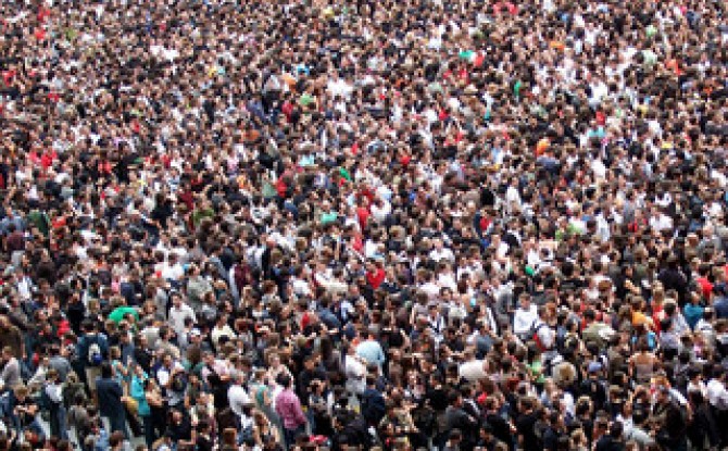
The Wisdom of Crowds is the idea that, as collectives, groups of people can make more accurate forecasts or come up with better solutions to problems than the individuals in them could on their own. A different recent New York Times articles has some great examples of the Wisdom of Crowds. The article talks about how the Navy has used groups to help make forecasts, and in particular forecasts for the locations of lost items like "sunken ships, spent warheads and downed pilots in vast, uncharted waters." The article tells one incredible story of how they used this idea to locate a missing submarine, the Scorpion:

"... forecasters draw on expertise from diverse but relevant areas — in the case of finding a submarine, say, submarine command, ocean salvage, and oceanography experts, as well as physicists and engineers. Each would make an educated guess as to where the ship is ... This is how Dr. Craven located the Scorpion.

“I knew these guys and I gave probability scores to each scenario they came up with,” Dr. Craven said. The men bet bottles of Chivas Regal to keep matters interesting, and after some statistical analysis, Dr. Craven zeroed in on a point about 400 miles from the Azores, near the Sargasso Sea, according to a detailed account in “Blind Man’s Bluff,” by Christopher Drew and Sherry Sontag. The sub was found about 200 yards away."

This is a perfect example of the Wisdom of Crowds: by pooling the forecasts of a diverse group, they came up with an accurate collective forecast.

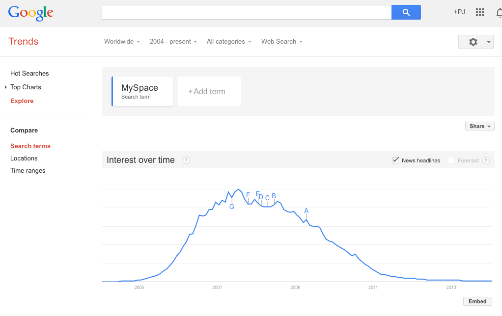
So, how do Big Data and The Wisdom of Crowds get mixed up? The mixup comes from the fact that a lot of Big Data is data on the behavior of crowds. The central example in Sorkin's article is data from Twitter, and in particular data that showed a lot of people on Twitter were very unhappy with antigay comments made by Phil Robertson, the star of A&E's Duck Dynasty. The short version of the story is that A&E initially terminated Robertson in response to the Twitter data, but Sorkin argues this was a business mistake because Twitter users are "not exactly regular watchers of the camo-wearing Louisiana clan whose members openly celebrate being 'rednecks'." He also cites evidence that data from Twitter does not provide accurate election predictions for essentially the same reason — the people that are tweeting are not a representative sample of the people that are voting. All of this is correct. Using a big dataset does not mean that you don't have to worry about having a biased sample. No matter how big your dataset, a biased sample can lead to incorrect conclusions. A classic example is the prediction by The Literary Digest in 1936 that Alf Landon would be the overwhelming winner of the presidential election that year. In fact, Franklin Roosevelt carried 46 of the 48 states. The prediction was based on a huge poll with 2.4 million respondents, but the problem with the prediction was that the sample for the poll drew primarily on Literary Digest subscribers, automobile and telephone owners. This sample tended to be more affluent than the average voter, and thus favored Landon's less progressive policies.

So, Sorkin is on the right track to write a great article on how sample bias is still important even when you have Big Data. This is a really important point that a lot of people don't appreciate. But unfortunately the article veers off that track when it starts talking about the Wisdom of Crowds. The Wisdom of Crowds is not about combining data on large groups, but about combining the predictions, forecasts, or ideas of groups (they don't even have to be that large). If you want to use the Wisdom of Crowds to predict an election winner, you don't collect data on who they're tweeting about, you ask them who they think is going to win. If you want to use the Wisdom of Crowds to decide whether or not you should fire Phil Robertson, you ask them, "Do you think A&E will be more profitable if they fire Phil Robertson or not?" As angry as all of those tweets were, many of those angry voices on Twitter would probably concede that Robertson's remarks wouldn't damage the show's standing with its core audience.

The scientific evidence shows that using crowds is a pretty good way to make a prediction, and it often outperforms forecasts based on experts or Big Data. For example, looking at presidential elections from 1988 to 2004, relatively small Wisdom of Crowds forecasts outperformed the massive Gallup Poll by .3 percentage points (Wolfers and Zitzewitz, 2006). This isn't a huge margin, but keep in mind that the Gallup presidential poles are among the most expensive, sophisticated polling operations in history, so the fact that the crowd forecasts are even in the ballpark, let alone better, is pretty significant.

The reason the Wisdom of Crowds works is because when some people forecast too high and others forecast too low, their errors cancel out and bring the average closer to the truth. The accuracy of a crowd forecast depends both on the accuracy of the individuals in the crowd and on their diversity — how likely are their errors to be in opposite directions. The great thing about it is that you can make up for low accuracy with high diversity, so even crowds in which the individual members are not that great on their own can make pretty good predictions as collectives. In fact, as long as some of the individual predictions are on both sides of the true answer, the crowd forecasts will always be closer to the truth than the average individual in the crowd. It's a mathematical fact that is true 100% of the time. Sorkin concludes his article, based on the examples of inaccurate predictions from Big Data with biased samples, by writing, "A crowd may be wise, but ultimately, the crowd is no wiser than the individuals in it." But this is exactly backwards. A more accurate statement would be, "A crowd may or may not be wise, but ultimately, it's always at least as wise as the individuals in it. Most of the time it's wiser."

A Scientist's Take on the Princeton Facebook Paper

Spechler and Cannarella's paper predicting the death of Facebook has been taking a lot of flak. While I do think there are some issues applying their model to Facebook and MySpace, they're not the ones that most people are citing.

The most common complaint about the Princeton Facebook paper that I've seen is that Facebook is not a disease. Facebook may not be a disease, but that doesn't mean a model that describes how diseases spread isn't a good model for how Facebook spreads. Models based on the disease spread analogy have been used for decades in marketing. The famous "Bass Model" is just a relabeled disease model. Frank Bass's original paper has been cited thousands of times and was named one of the ten most influential papers in Management Science. While it's received its fair share of criticism, the entirety of The Tipping Point is based on the disease spread analogy. Gladwell even writes, "... ideas and behavior and messages and products sometimes behave just like outbreaks of infectious disease."

Interestingly, one of the major points of Spechler and Cannarela's paper is that online social networks do NOT spread just like a disease, that's why they had to modify the original SIR disease model in the first place. (See an explanation here.)

But, the critics have missed this point and are fixated on particulars of the disease analogy. For example, Lance Ulanoff at Mashable (who has one of the more evenhanded critiques) says, "How can you recover from a disease you never had?" He's referring to the fact that in Spechler and Cannarella's model, some people start off in the Recovered population before they've ever been infected. These are people who have never used Facebook and never will. It is a bit confusing that they're referred to as "recovered" in the paper, but if we just called them "people not using Facebook that never will in the future" that would solve the issue. Ulanoff has the same sort of quibble with the term recovery writing, "The impulse to leave a social network probably does spread like a virus. But I wouldn’t call it “recovery.” It's leaving that's the infection." Ok, fine, call it leaving, that doesn't change the model's predictions. Confusing terminology doesn't mean the model is wrong.

All of this brings up another interesting point, how could we test if the model is right? First off, this is a flawed question. To quote the statistician George E. P. Box, "... all models are wrong, but some are useful." Models, by definition, are simplified representations of the real world. In the process of simplification we leave things out that matter, but we try to make sure that we leave the most important stuff in, so that the model is still useful. Maps are a good analogy. Maps are simplified representations of geography. No map completely reproduces the land it represents, and different maps focus on different features. Topographic maps show elevation changes and road maps show highways. One kind is good for hiking the Appalachian trail, another is good for navigating from New York City to Boston. Models are the same — they leave out some details and focus on others so that we can have a useful understanding of the phenomenon in question. The SIR model, and Spechler and Cannarela's extension leave out all sorts of details of disease spread and the spread of social networks, but that doesn't mean they're not useful or they can't make accurate predictions.

myspace

Spechler and Cannarela fit their model to data on MySpace users (more specifically, Google searches for MySpace), and the model fits pretty well. But this is a low bar to pass. It just means that by changing the model parameters, we can make the adoption curve in the model match the same shape as the adoption curve in the data. Since both go up and then down, and there are enough model parameters so that we can change the speed of the up and down fairly precisely, it's not surprising that there are parameter values for which the two curves match pretty well.

There are two better ways that the model could be tested. The first method is easier, but it only tests the predictive power of the model, not how well it actually matches reality. For this test, Spechler and Cannarela could fit the model to data from the first few years of MySpace data, say from 2004 to 2007, and see how well it predicts MySpace's future decline.

The second test is a higher bar to clear, but provides real validation of the model. The model has several parameters — most importantly there is an "infectivity" parameter (β in the paper) and a recovery parameter (γ). These parameters could be estimated directly by estimating how often people contact each other with messages about these social networks and how likely it is for any given message to result in someone either adopting or disadopting use of the network. For diseases, this is what epidemiologists do. They measure how infectious a disease is and how long ti takes for someone to recover, on average. Put these two parameters together with how often people come into contact (where the definition of "contact" depends on the disease — what counts as a contact for the flu is different from HIV, for example), and you can predict how quickly a disease is likely to spread or die out. (Kate Winslet explains it all in this clip from Contagion.) So, you could estimate these parameters for Facebook and MySpace at the individual level, and then plug those parameters into the model and see if the resulting curves match the real aggregate adoption curves.

Collecting data on the individual model parameters is tough. Even for diseases, which are much simpler than social contagions, it takes lab experiments and lots of observation to estimate these parameters. But even if we knew the parameters, chances are the model wouldn't fit very well. There are a lot of things left out of this model (most notably in my opinion, competition from rival networks.)

Spechler and Cannarella's model is wrong, but not for the reasons most critics are giving. Is it useful? I think so, but not for predicting when Facebook will disappear. Instead it might better capture the end of the latest fashion trend or Justin Bieber fever. 


Don't Wait for the Government's Economic Data

Unemployment numbers and the consumer price index (CPI) are among the most important economic indicators used by both Wall Street traders and government policy makers. During the government shutdown those statistics weren't be collected or calculated and now that the government is up and running again it will be a while before the latest numbers are released.

According to the New York Times, the October 4 unemployment report will be released October 22, and the October 16th CPI will come out on Halloween Eve. But, you don't have to wait for those numbers to come out. In fact, these numbers are always slow — CPI takes about a month to calculate so even if it had come out on October 6, the number still would have been out of date. Luckily, there are already other good tools for anticipating what these numbers will be even before they're released. For CPI, there's the Billion Prices Project developed at MIT (now at PriceStats). For more on the Billion Prices Project, check out this post. And for unemployment, we worked through how a model based on search trends can be used to forecast the yet to be released official number in the last post on this blog.

cpi

PriceStats (based on MIT's Billion Prices Project) already knows what the CPI number will be.

This is a great opportunity for investors and policy makers to reduce their dependence on glacial paced antiquated statistics and start incorporating information from newer faster tools into their decision making.


Predicting the Present with Google Trends and Google Correlate


In 2009 Google Chief Economist Hal Varian and Hyunyoung Choi wrote two papers on "Predicting the Present" using Google Trends. Their idea was to use data on search volume available through Google Trends to help "predict" time series for data that we usually only obtain with a delay.

For example, initial unemployment claims data for the previous week are released on Thursday of the following week. Even though the unemployment claims for a particular week have already happened, we won't know those numbers for another five days (or longer if it happens to be during a government shutdown!). In other words, we only see the real data that we're interested in with a delay. But, when people are getting ready to file their first claim for unemployment benefits, many of them probably get on the web and search for something like "unemployment claim" or "unemployment office," so we should expect to see some correlation between initial unemployment claims and the volume of searches for these terms.  Google Trends search data is available more quickly than the government unemployment numbers, so if we see a sudden increase or decrease in the volume of these searches, that could foreshadow a corresponding decrease or increase in unemployment claims in the data that has yet to be released. To be a little more rigorous, we could run a regression of initial unemployment claims on the volume of searches for terms like "unemployment claim" using past data and then use the results from that regression to predict unemployment claims for the current week where we know the search volume but the claims number has yet to be released.

It turns out that this isn't quite the best way to do things though, because it ignores another important predictor of this week's unemployment claims — last week's claims. Before search data came into the picture, if we wanted to forecast the new initial claims number before it's release we would typically use a standard time series regression where unemployment claims are regressed on lagged versions of the unemployment claims time series. In other words, we're projecting that the current trend in unemployment claims will continue. To be concrete, if $c_t$ are initial claims at time $t$, then we run the regression $c_t=\beta_0+\beta_1 c_{t-1}$.

In many cases this turns out to be a pretty good way to make a forecast, but this regression runs into problems if something changes so that the new number doesn't fit with the past trend. Choi and Varian suggested that rather than throw away this pretty good model and replace it with one based only on search volume, we stick with the standard time series regression but also include the search data available from Google Trends to improve it's accuracy, especially in these "turning point" cases.  Choi and Varian provided examples using this technique to forecast auto sales, initial unemployment claims, and home sales (see this post for an example of predicting the present at the CIA).

At the time that Choi and Varian wrote their paper, they simply had to guess which searches were likely to be predictive of the time series in question and then check to see if they were correct (in their paper they decided to use the volume of searches in the "Jobs" and "Welfare & Unemployment" categories as predictors). When they tested the accuracy of a model that included this search data in addition to the standard lagged time series predictor, they found that including the search data decreased forecasting error (mean absolute error) on out of sample data from 15.74% using the standard time series regression to 12.90% using the standard regression with the additional search volume predictors.

In the time since Choi and Varian's paper, Google has made using this technique even more attractive by adding Google Correlate to the Google Trends suite of tools. Google Correlate essentially takes the guess work out of choosing which search terms to include in our regression by combing through all of the billions of Google searches to find the terms for which the search volume best correlates with our time series. (The idea for doing this came from Google's efforts to use search volume to "predict" incidence of the flu, another time series for which the official government number has a significant delay.)

So, let's walk through the process for predicting the present with Google Trends and Google Correlate using the initial unemployment claims data as an example. The first step, is to head over to the US Department of Labor site to get the data. Google Correlate only goes back to January 2004, so there's no use getting data from before then. If you choose the spreadsheet option, you should get an excel file that looks something like this:

data

We'll use the not seasonally adjusted (N.S.A.) claims numbers since the search volume numbers used in Google Correlate are also not seasonally adjusted. Highlight the first two columns of the data and hit copy. Next, open Google Correlate and hit the "Enter Your Own Data" button (you will have to sign in with a Google account). There are two ways to enter your data, you can either upload a file or cut and paste your data into the spreadsheet columns in the pop window. In my experience, the cut and past method is much more reliable. Highlight the two columns of the spreadsheet in the popup and hit delete to remove the dates that are already there, then hit paste to paste the data from the unemployment claims spreadsheet. You should have something that looks like this:

correlate

Give your time series a title where it says "Time Series Name:" and then click Search Correlations. (If you're using Safari, you may have to click a button that says "Leave Page" a few times. If you're using Internet Explorer, don't, Google Correlate and IE don't work well together.) On the next page you'll see a list of the terms for which the search volume correlates most highly with the unemployment claims data along with the graph showing the time series we entered and the search volume for the most highly correlated search term. In my case this is searches for "michigan unemployment."

correlateResults

Looking at the graph, we can see that the correlation is pretty high (you can also see the correlation coefficient and look at a scatter plot comparing the two series to get a better sense for this).

You can download data directly from Google Correlate, but you won't get the most recent week's search volume (I'm not sure why this is). So, instead, we are going to take what we've learned from Google Correlate, and go back over to Google Trends to actually get the search volume data to put in our regression. We'll get data for the top three most  correlated search terms —  michigan unemployment, idaho unemployment, and pennsylvania unemployment — as well is "unemployment filing" since that may pick up events that don't happen to affect those three states. After entering the search terms at Google Trends, you should see something like this:

trends

To download the data, click the gear button in the upper right hand corner and select "Download as CSV."

Ok, now we have all the data we need to run our regression. At this point you can run the regression in whatever software you like. I'm going to walk through the steps using STATA, because that's the standard statistical package for Kellogg students. Before bringing the data into STATA, I'm going to put it together in a single csv file. To do this, open a new spreadsheet, cut and paste the search data downloaded from Google Trends and then cut and past a single column of the original unemployment claims data alongside the search data so that the weeks match up. Note that the actual days won't match up because Google uses the first Sunday to represent a given week, while the claims data is released on Thursdays. You will have to change the week labels from the Google Trends dates from a week range to a single day. You should also convert the claims data to a number format (no commas), or else STATA  will treat it like a string. You can see a sample of the data I used in this Google Doc.

Here is a snapshot of my STATA code

stata

I bring the data in using insheet, and then reformat the date variable. I also add a new variable "dataset" which I will use to separate the sample that I fit the regression to from the sample for my out of sample testing of the model fit. In this case, I just split the dataset right in two. You can think of dataset 1 as being "the past" and dataset 2 "the future" that we're trying to predict. I then run my two regressions only using dataset 1 and predict the unemployment claims based on the fitted models. Finally, I measure the error of my predictions by looking at the absolute percentage error, which is just the absolute difference between the actual unemployment and my forecast divided by the actual unemployment level. The collapse command averages these errors by dataset. I can see my results in the Data Editor:

resultsWe can see that for the out of sample data (dataset 2), the MAPE (=Mean Absolute Percent Error) in 8.48% without the search data and 7.85% with the search data.

Finally, let's make a forecast for the unemployment claims numbers that have yet to come out. To do this, we want to go back and fit the model to all of the data (not just dataset 1). When we look at the results, we see that the full model prediction (p3) for the next unemployment claims number on 9/14 is 278583, a little bit lower than what we would have predicted using the standard time series regression (p1=284620). prediction

In this case, if we go back to the Department of Labor website, we can check because the 9/14 number actually is out, it just wasn't put into the dataset we downloaded:

unemployThe actual number is 272953. In this case at least, using the search data helped us make a more accurate prediction.


Social Dynamics Videos

While I've been teaching Social Dynamics and Networks at Kellogg, I've amassed a collection of links to interesting videos on social dynamics. Here they are:

Duncan Watts TEDx talk on "The Myth of Common Sense"

Nicholas Christakis TED talk on "The hidden influence of social networks"; TED talk on "How social networks predict epidemics."

James Fowler talking about social influence on the Colbert Report.

Sinan Aral TEDx talk on "Social contagion"; at PopTech 2010 on "Social contagion"; at Nextwork on "Social contagion"; at the International Conference on Weblogs and Social Media on "Content and causality in social networks."

Scott E. Page on "Leveraging Diversity", and at TEDxUofM on "Putting Milk Crates on the Internet."

Eli Pariser TED talk on "Beware online 'filter bubbles'"

Freakonomics podcast on "The Folly of Prediction"

Damon Centola on "Network Contagion."

Jure Leskovec on "The Web as a Laboratory for Studying Humanity"

There are several good videos of talks from the Web Science Meets Network Science conference at Northwestern: Duncan Watts, Albert-Laszlo Barabasi, Jure Leskovec, and Sinan Aral.

The "Did You Know?" series of videos has some incredible information about, well, information. More info here.

You don't need "Big Data"

The Wall Street Journal recently ran an interesting article about the rise of "Big Data" in business decision making.  The author, Dennis Berman, makes the case for using big data  by pointing out that human decision making is prone to all sorts of errors and biases (referencing Daniel Kahneman's fantastic new book, Thinking, Fast and Slow). There's anchoring, hindsight bias, availability bias, overconfidence, loss aversion, status quo bias, and the list goes on and on. Berman suggests that big data — crunching massive data sets looking for patterns and making predictions — may be the solution to overcoming these flaws in our judgement.

I agree with Berman that big data offers tremendous opportunities, and he's also right to emphasize the ever increasing speed with which we can gather and analyze all that data. But you don't need terabytes of data or a self-organizing fuzzy neural network to improve your decisions. In many cases, all you need is a simple model.

Consider this example from the classic paper, "Clinical versus Actuarial Judgement" by Dawes, Faust and Meehl (1989). Twenty-nine judges with varying ranges of experience were presented with the scores of 861 patients on the Minnesota Multiphasic Personality Inventory (MMPI), which scores patients on 11 different dimensions and is commonly used to diagnose psychopathologies. The judges were asked diagnosis the patients as either psychotic or neurotic and their answers were compared with diagnoses from more extensive examinations that occurred over a much longer period of time. On average the judges were correct 62% of the time, and the best individual judge correctly diagnosed 67% of the patients. But known of the judges performed as well as the "Goldberg Rule". The Goldberg Rule is not a fancy model based on reams of data — it's not even a simple linear regression. The rule is just the following simple formula: add three specific dimensions from the test, subtract two others and compare the result to 45. If the answer is greater than 45 the diagnosis is neurosis, if it less, then psychosis. The Goldberg Rule correctly diagnosed 70% of the patients.

It's impressive that this simple non-optimal rule beat every single individual judge, but Dawes and company didn't stop there. The judges were provided with additional training on 300 more samples in which they were given the MMPI scores and the correct diagnosis. After the training, still no single judge beat the Goldberg Rule. Finally, the judges were given not just the MMPI scores, but also the prediction of the Goldberg Rule along with statistical information on the average accuracy of the formula, and still the rule outperformed every judge. This means that the judges were more likely to override the rule based on their personal judgement when the rule was actually correct than when it was incorrect.

This is just one of many studies that have shown time and time again that simple models outperform individual judgement. In his book, "Expert Political Judgement," Phillip Tetlock examined 28,000 forecasts of political and economic outcomes by experts and concludes, “It is impossible to find any domain in which humans clearly outperformed crude extrapolation algorithms, less still sophisticated statistical ones.”

And the great thing is, you don't have to be a mathematician or statistician to benefit from the decision making advantage of models. As Robyn Dawes has shown, even the wrong model typically outperforms individual judgement. So the next time you face an important decision before you fire up the supercomputer, write down the factors that you think are the most important, assign them weights and add them up. Even something as simple as making a pro and con list and adding the pros and subtracting the cons is likely to result in a better decision. As Dawes writes, “The whole trick is to know what variables to look at and then know how to add.”

Training Computers with Crowds

Computers are awesome, but they don't know how to do much on their own; you have to train them. Crowdsourcing turns out to be a great way to do this. Suppose you would like to have an algorithm to measure something — like whether a tweet about a movie is positive or negative. You might want to know this so you can count positive and negative tweets about a particular movie and use that information to predict box office success (like Asur and Huberman do in this paper). You could try and think of all of the positive and negative words that you know and then only count tweets that include those words, but you'd probably miss a lot. You could categorize all of the tweets yourself, or hire a student to do it, but by the time you finished the movie would be on late night cable TV. You need a computer algorithm so you can pull thousands of tweets and count them quick, but a computer just doesn't know the difference between a positive tweet and negative tweet until you train it.

That's where the crowd comes in. People can easily judge the tone of a tweet, and you don't have to be an expert to do it. So, what you can do is gather a pile of tweets — say a few thousand — put them up on Amazon Mechanical Turk, and let the crowd label them as positive or negative. At a few cents per tweet you can do this for something in the ballpark of a hundred bucks. Now that you have a pile of labeled tweets, you can train the computer. There's lots of fancy terms for it — language model classifiers, self organizing fuzzy neural networks, ... — but basically, you run a regression.  The independent variable is stuff the computer can measure, like how many times certain words appear, and the dependent variable is whether the tweet is positive or negative. You estimate the regression (a.k.a train the classifier) on the tweets labeled by the crowd, and now you have an algorithm that can label new tweets that the crowd hasn't labeled.When the next movie is coming out, you harvest the unlabeled tweets and feed them through the computer to see how many are positive and negative.

This is exactly how Hany Farid at Dartmouth trained his algorithm for detecting how much digital photographs have been altered.  On it's own the computer can measure lots of fancy statistical features of the image, but judging how significant the alteration of the image is requires a human. So, he gave lots of pairs of original and altered images to people on MTurk and had them rate how altered the images were.  Then he essentially let the computer figure out what image characteristics for the altered images correlate with high alteration scores (but in a much fancier way then just a regular regression).  Now, he has a trained algorithm that can read in photographs where we don't have the original and predict how altered the image is.

"Predicting the Present" at the CIA

The CIA is using tools similar to those we teach in the Kellogg Social Dynamics and Networks course to "predict the present" according to an AP article (see also this NPR On the Media interview).

While accurately predicting the future is often impossible, it can be pretty challenging just to know what's happening right now.  Predicting the present is the idea of using new tools to get a faster, better picture of what's happening in the present.  For example, the US Bureau of Labor and Statistics essentially gathers the pricing information that goes into the Consumer Price Index (CPI) by hand (no joke, read how they do it here). This means that the governments measure of CPI (and thus inflation) is always a month behind, which is not good for making policy in a world where decades old investment banks can collapse in a few days.

To speed the process up, researchers at MIT developed the Billion Prices Project, which as the name implies collects massive quantities of price data from across the Internet to get a more rapid estimate of CPI. The measure works, and is much more responsive than the governments measure. For example, in the wake of the Lehman collapse, the BPP detected deflationary movement almost immediately while it took more than a month for those changes to show up in the governments numbers.

The Internet didn't kill Borders, Borders killed Borders

There is a nice article on Slate today about the demise of the bookseller Borders.  The overall point is that, while the rise of Internet retailing created challenging circumstances for bricks and mortar bookstores, the real cause of Border's demise was its own poor strategy.  The article echoes one of the themes of the System Dynamics class that I taught at Sloan the past few years: there's no such thing as side effects, there's just effects.  What we mean by this is that when a company (or a person, or any orgaization) takes an action, and something unintended or unforeseen happens, we tend to call these outcomes "side effects" as though we were somehow not responsible for them.  But in the end, these so called side effects are still the consequences of our own actions.  The only thing that distinguishes them is that we didn't plan for them to happen.  Recognizing and taking responsibility for these effects is a first step towards anticipating and preventing them.

Diversity Trumps Accuracy in Large Groups

In a recent paper with Scott Page, forthcoming in Management Science, we show that when combining the forecasts of large numbers of individuals, it is more important to select forecasters that are different from one another than those that are individually accurate.  In fact, as the group size goes to infinity, only diversity (covariance) matters.  The idea is that in large groups, even if the individuals are not that accurate, if they are diverse then their errors will cancel each other out.  In small groups, this law of large numbers logic doesn’t hold, so it is more important that the forecasters are individually accurate.  We think this result is increasingly relevant as organizations turn to prediction markets and crowdsourced forecasts to inform their decisions.