Cascades

Visualizing Contagious Twitter Memes with NodeXL and Gephi

In the last post we explored how to use NodeXL to collect a Twitter user's network data. Now, I'll describe how to collect data on a trending topic.

To get started, follow steps 0 and 1 here to setup a Twitter account and download the NodeXL software. Then, to download the network data, click on Import and select From Twitter Search Network… In the first dialog box, enter the search term that you want to look for. Any account that recently posted a tweet containing this phrase will end up being a node in your network.  In the book, "Analyzing Social Media Networks with NodeXL," there is some good advice on choosing an appropriate trending topic to look at:

"First, the search phrase has to concern a recent event. Though Twitter has been around for several years, the volume of information being produced every second is so huge that the search interface has limits on how many tweets it will return for a given query, or how old tweets can be. Searching for "2008 Election" may in theory produce a valuable set of tweets about the election cycle, but in practice those tweets are too far back in time for the search interface to collect them efficiently. The second criterion is that the search phrase has to relate to a piece of news, promotion, event, and so on that is u contagious" (i.e., Twitter users who see the message will, at least in principle, want to pass it on to their followers). A search phrase like "Thanksgiving" is a trending topic on Twitter (shortly before and on Thanksgiving) but lacks a contagious property-there is no need to pass on the message because a large fraction of the population already knows about it, so tweets about Thanksgiving are independent events rather than the sign of a "Thanksgiving meme" spreading throughout the Twitter population."

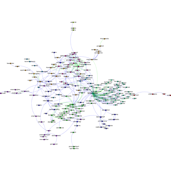
One good way to do this is look through the recent tweets of a popular user for something that you think would be sufficiently interesting that other people would retweet the message. For example, in the network below, I gathered data on tweets containing the phrase "Who Googled You?" This Twitter meme originated with Pete Cashmore, of @mashable, and links to a Mashable article that describes a way to find out who has been searching for you on Google. The article generated a flurry of interest and many other people tweeted links to the article, generally repeating the original article title, "Who Googled You?" Since this meme spread from person to person, it was a good candidate for visualizing as a Twitter search network. Untitled

You can select what relationships you want to use to define the edges of your network by selecting any combination of the following choices:

Follows relationship — two accounts are connected if one account follows the other.
"Replies-to" relationship in tweet — two accounts are connected if one account replies to the other in its tweet.
"Mentions" relationship in tweet — two accounts are connected if one account mentions the other account in its tweet.

As discussed in the previous post, because of Twitter rate limits, it is advisable to limit your request to a fixed number of people. Unless you are especially patient, I recommend starting with just 300 people.

Once you download the data using NodeXL, I like to export it as a graphml file and then visualize it in Gephi. In this example, I did a few things to make the visualization more meaningful, which I describe below.

Before getting started with manipulating the network in Gephi, it is a good idea to go into the Data Laboratory and delete some of the columns that NodeXL created. You should delete anything having to do with the color or size of the nodes or edges, or centrality measures such as PageRank and eigenvector centrality. These columns are generally empty, but unless you delete them, Gephi won't overwrite them when you ask it to calculate these measures, so you won't be able to calculate and make use of them in your analysis. For some general tips on using Gephi, check out the FAQ here.

First, I filtered out all of the accounts except those that belong to the largest connected component of the network. This makes the network much more readable, and allows us to focus only on those nodes involved in a large cascade. After trying a few options, I choose the Force Atlas layout algorithm to arrange the nodes. For Twitter networks, I have found Force Atlas to generally give the best layout. Usually, I have to increase the repulsion strength from the default setting of 200 to 2000 or more. Then I resized the nodes according to their degree so we can get a sense for who the most important nodes in the network are. I also tried sizing the nodes by PageRank and eigenvector centrality for comparison. For the most part these different centrality measures didn't make much difference, although one account, @darrenmcd, appears significantly more important according to PageRank or Eigenvector centrality than degree centrality. The Twitter accounts @briansois and @armano standout as the most influential in the network. I colored the nodes according to which community they belong to as identified using Gephi's implementation of the Girvan-Newman modularity based clustering algorithm, and I colored the edges according to the type of relationship between the Twitter accounts. Blue edges are "followed" relationships, green edges are "mentions" and purple edges are "replies to." We can see that almost all of the links to @armano mention the relationship explicitly, and about half of those to @briansois do.

WhoGoogledYou

Why Google Ripples will be a lot less cool than it sounds.

Google + now has a new feature, Ripples, that allows you to see a network visualization of the diffusion of a post (see the Gizmodo article here).  The pictures are cool, but the original post has to be public, and then it has to be shared by one Google+ user to other Google+ users.  But, the chance of interesting ripples happening very often are pretty slim; here's why.

Bakshy, Hofman, Mason, and Watts looked at exactly this kind of cascade on Twitter, which is a great platform for this kind of research for several reasons.  First, everything is effectively public, so there are none of the privacy issues of Facebook, and we don't have to limit ourselves to looking at just the messages that people choose to make public like we do on Google +.  Second, "retweeting" messages is an established part of Twitter culture, so we expect to find cascades. Finally, since tweets are limited to 140 characters, links are often shortened using services like bit.ly.  This means that if I create a link to a New York Times article and you create a link to the same page independently, those links will be different, so the researchers can tell the difference between a cascade that my post creates and one that yours creates.

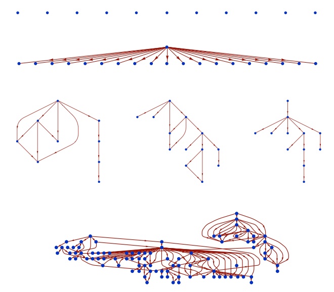
Some of the cascades that Bakshy et al. found are shown in this figure.

They looked at 74 million chains like these initiated by more than 1.6 million Twitter users during two months in 2009.  A lot of interesting things came out of the study, but the most important one for Google Ripples is that 98 percent of the URLs were never reposted.  That's not good for Ripples.  The latest number puts the entire Google plus user population at only 43.6 million users, and since only a small fraction of these users' posts will be public posts, even if people share other people's posts on Google+ as frequently as the retweet links on Twitter (which is unlikely), we still can't expect to see many Ripples that look like anything but a lonely circle.

Twitter Terrorists: False information + positive feedbacks = real panic

Another example of how false information, amplified through positive feedbacks, can lead to real panic: in Veracruz Mexico two people posted messages on twitter reporting kidnappings at a local school. The messages spread rapidly through social media leading frightened parents to rush to try and save their children. The panic caused dozens of car accidents and jammed the city's emergency phone lines.

Amnesty International was quoted saying, "The lack of safety creates an atmosphere of mistrust in which rumours that circulate on social networks are part of people's efforts to protect themselves, since there is very little trustworthy information." As with many "tipping point" phenomenon, before the spark that set off the visible cascade, there was most likely a "contextual tipping point" that made the resulting contagion possible. Governments or managers have to realize that the only way to reliably prevent these cascades is by changing the context, not by stamping out all of the sparks.

The S&P credit downgrade, turmoil in the markets, and the 1973 toilet paper shortage

On Friday, August 5, Standard & Poor's downgraded the credit rating of the U.S. long-term debt to AA+.  On Monday, the first day the markets opened since the downgrade, the Dow Jones Industrial average dropped 5.6 percent and the S&P 500 fell 6.7 percent — the biggest single day drops since the crisis in 2008.  A lot of people might be confused about this turmoil in the markets, since US debt is still considered one of the safest investments there is.  Jay Forrester, founder of the field of System Dynamics, calls puzzles like this the "counterintuitive behavior of social systems."

Undoubtedly, the world economy is incredibly complex, and no individual or organization has a complete picture of how it works or where it's headed.  Through pricing, the market is supposed to aggregate all of the pieces of partial information that we each hold and then converge to the "truth" — that is prices should reflect true underlying value.  In some situations this can actually work.  Prediction markets have been shown to be valuable tools for businesses to harvest the "wisdom of the crowds" and assess the probabilities that future events occur.  But, this mechanism works best when individuals place their trades independently based on their own private information. In the real world, market dynamics are fundamentally social dynamics and as such they are subject to cascades of panic and the accumulation of overconfidence (what Alan Greenspan famously referred to as "irrational exuberance" (see also Robert Shiller)).


The current panic illustrates how even when there is no fundamental basis for a panic, social dynamics can amplify the signal of a panic to the point where an actual crisis ensues.  The gas shortages of 1979 are a classic example of this phenomenon.  The Iranian revolution sharply cut oil imports to the US from Iran.  Nervous consumers rushed to top off their tanks and even to hoard gasoline at home.  This drained the supply of gasoline at filling stations leading to an actual gasoline shortage.  Word-of-mouth and media coverage reinforced consumer fears of shortages, leading to even more topping off and hoarding, as well as government policies such as odd/even day purchase rules that actually further incentivized consumers to top off frequently and store gasoline at home.  Surprisingly, despite the very real shortage of gasoline at filling stations, US oil imports for the year actually increased in 1979 compared 1978.  The crisis was caused by social dynamics, not an actual drop in supply. (See Sterman, Business Dynamics p. 212).

A similar but more comical crisis occurred in 1973 when Johnny Carson made a joke saying, "You know what’s disappearing from the supermarket shelves?  Toilet paper.  There’s an acute shortage of toilet paper in the United States."  Consumers rushed out to stock up on toilet paper, leading to a real toilet paper shortage in the US that lasted several days.  Even though Carson tried to correct the joke a few days later, by that time toilet paper was in fact in short supply because people were hoarding it at home.

"I mourn the loss of thousands of precious lives ... "

There is a great story on the Atlantic’s website about a fake quotation that exploded on Facebook and Twitter after Osama Bin Laden’s death.  The quote, wrongly attributed to Martin Luther King Jr. is:

“I mourn the loss of thousands of precious lives, but I will not rejoice in the death of one, not even an enemy.”

The author of the article, Megan McArdle, traces the origins of the wrongly attributed quote to a facebook post from a 24 year old Penn State graduate student (check out the article for the fascinating story).  This brings up some interesting issues about rumors and social media.  An open question regarding information and the web, is whether technologies like social media and the Internet in general increase or decrease the prevalence of false information.  On the one hand, the “wisdom of the crowd” might be able to pick out the truth from falsehoods.  True statements will be repeated and spread, while false statements will be recognized by a great enough number of people to squelch them.  On the other hand, we know that systems like this with strong positive feedbacks can converge to suboptimal solutions.  If you think of retweeting some piece of information as like casting a vote that it is true, we might expect information cascades of the sort described theoretically by Bikhchandani et al..  In this case, two things seem to have happened.  Initially, there was a sort of information cascade that led to the spread of the quote.  Then it wasn’t the wisdom of the crowds that led to the squelching of the rumor, but the efforts of knowledgable individuals tracing the quotation back to the initial post.  What the Internet provided was a way to uncover the roots of the false information for those willing to take the time to look.