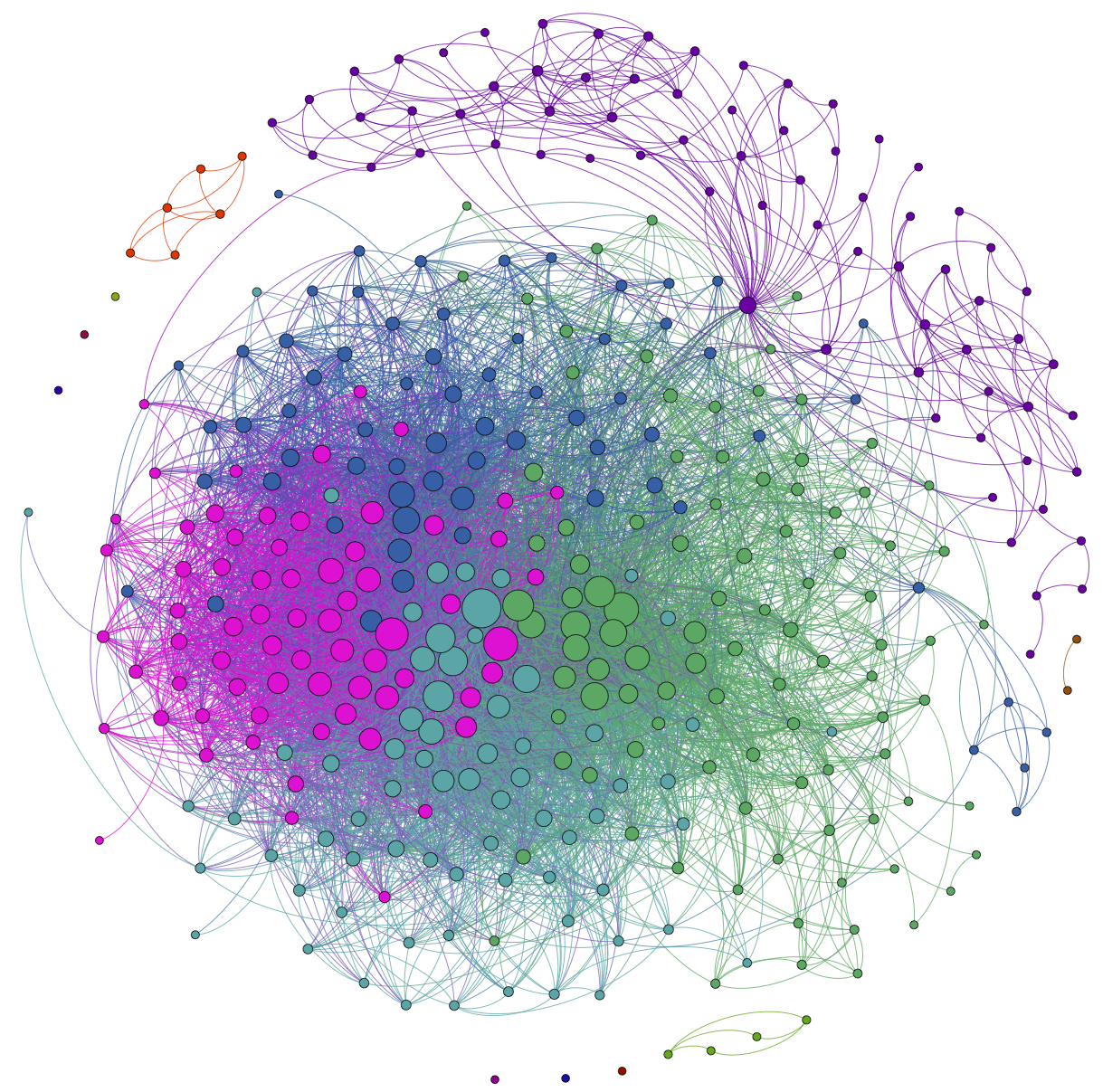
This is a visualization of my own Facebook network that I made using the (free) software Gephi and the Facebook application netvizz. Each node in the network is one of my Facebook friends, and two friends are connected to one another if they are Facebook friends with each other. The size of the node corresponds to the "degree" of the node, which means how many connections it has. In this case, that means how many of my Facebook friends that person is Facebook friends with. (Note: I deleted the names from the nodes to protect my Facebook friends' privacy).
The colors of the nodes indicate communities of friends found using a clustering algorithm based on the "modularity" of the network. Basically what the algorithm does is try to group the nodes into communities with lots of connections within each community and not too many connection between the communities. Even though the algorithm doesn't know anything about my friends, other than the web of connections (it doesn't even know they're people), it does a good job of picking identifying groups of my friends that belong to the same communities in real life. For example the purple cluster in the upper right are people I know from graduate school, the little green cluster in the lower right are people from the Northwestern Institute on Complex Systems. The big bunch in the middle are people I know from high school, with the people from the band (or band groupies) in green on the right side. My wife is the purple node that bridges the gap between my graduate school friends and my huh school friends.
We did this as an exercise in the Social Dynamics and Networks course that I teach at Kellogg. If you want to see how you can map your network, you can find instructions on my Kellogg website here.

