
In 2009 Google Chief Economist Hal Varian and Hyunyoung Choi wrote two papers on "Predicting the Present" using Google Trends. Their idea was to use data on search volume available through Google Trends to help "predict" time series for data that we usually only obtain with a delay.
For example, initial unemployment claims data for the previous week are released on Thursday of the following week. Even though the unemployment claims for a particular week have already happened, we won't know those numbers for another five days (or longer if it happens to be during a government shutdown!). In other words, we only see the real data that we're interested in with a delay. But, when people are getting ready to file their first claim for unemployment benefits, many of them probably get on the web and search for something like "unemployment claim" or "unemployment office," so we should expect to see some correlation between initial unemployment claims and the volume of searches for these terms. Google Trends search data is available more quickly than the government unemployment numbers, so if we see a sudden increase or decrease in the volume of these searches, that could foreshadow a corresponding decrease or increase in unemployment claims in the data that has yet to be released. To be a little more rigorous, we could run a regression of initial unemployment claims on the volume of searches for terms like "unemployment claim" using past data and then use the results from that regression to predict unemployment claims for the current week where we know the search volume but the claims number has yet to be released.
It turns out that this isn't quite the best way to do things though, because it ignores another important predictor of this week's unemployment claims — last week's claims. Before search data came into the picture, if we wanted to forecast the new initial claims number before it's release we would typically use a standard time series regression where unemployment claims are regressed on lagged versions of the unemployment claims time series. In other words, we're projecting that the current trend in unemployment claims will continue. To be concrete, if $c_t$ are initial claims at time $t$, then we run the regression $c_t=\beta_0+\beta_1 c_{t-1}$.
In many cases this turns out to be a pretty good way to make a forecast, but this regression runs into problems if something changes so that the new number doesn't fit with the past trend. Choi and Varian suggested that rather than throw away this pretty good model and replace it with one based only on search volume, we stick with the standard time series regression but also include the search data available from Google Trends to improve it's accuracy, especially in these "turning point" cases. Choi and Varian provided examples using this technique to forecast auto sales, initial unemployment claims, and home sales (see this post for an example of predicting the present at the CIA).
At the time that Choi and Varian wrote their paper, they simply had to guess which searches were likely to be predictive of the time series in question and then check to see if they were correct (in their paper they decided to use the volume of searches in the "Jobs" and "Welfare & Unemployment" categories as predictors). When they tested the accuracy of a model that included this search data in addition to the standard lagged time series predictor, they found that including the search data decreased forecasting error (mean absolute error) on out of sample data from 15.74% using the standard time series regression to 12.90% using the standard regression with the additional search volume predictors.
In the time since Choi and Varian's paper, Google has made using this technique even more attractive by adding Google Correlate to the Google Trends suite of tools. Google Correlate essentially takes the guess work out of choosing which search terms to include in our regression by combing through all of the billions of Google searches to find the terms for which the search volume best correlates with our time series. (The idea for doing this came from Google's efforts to use search volume to "predict" incidence of the flu, another time series for which the official government number has a significant delay.)
So, let's walk through the process for predicting the present with Google Trends and Google Correlate using the initial unemployment claims data as an example. The first step, is to head over to the US Department of Labor site to get the data. Google Correlate only goes back to January 2004, so there's no use getting data from before then. If you choose the spreadsheet option, you should get an excel file that looks something like this:

We'll use the not seasonally adjusted (N.S.A.) claims numbers since the search volume numbers used in Google Correlate are also not seasonally adjusted. Highlight the first two columns of the data and hit copy. Next, open Google Correlate and hit the "Enter Your Own Data" button (you will have to sign in with a Google account). There are two ways to enter your data, you can either upload a file or cut and paste your data into the spreadsheet columns in the pop window. In my experience, the cut and past method is much more reliable. Highlight the two columns of the spreadsheet in the popup and hit delete to remove the dates that are already there, then hit paste to paste the data from the unemployment claims spreadsheet. You should have something that looks like this:
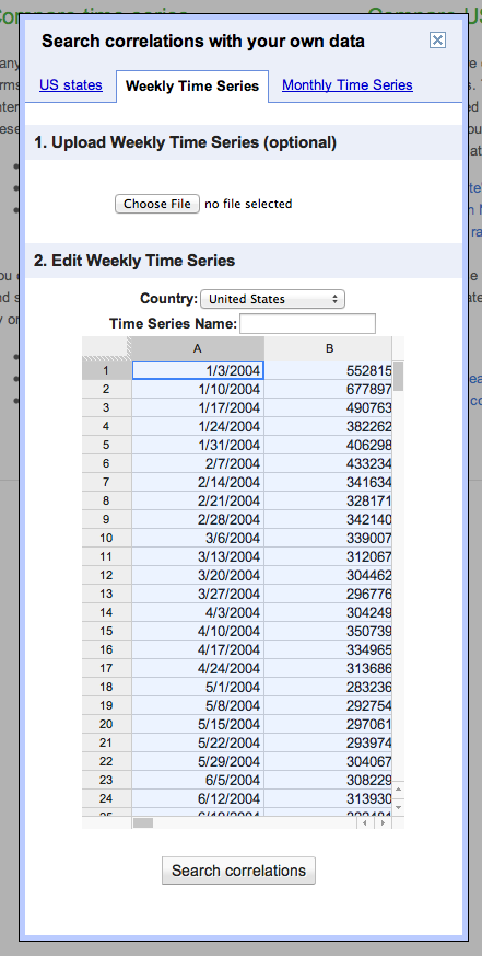
Give your time series a title where it says "Time Series Name:" and then click Search Correlations. (If you're using Safari, you may have to click a button that says "Leave Page" a few times. If you're using Internet Explorer, don't, Google Correlate and IE don't work well together.) On the next page you'll see a list of the terms for which the search volume correlates most highly with the unemployment claims data along with the graph showing the time series we entered and the search volume for the most highly correlated search term. In my case this is searches for "michigan unemployment."
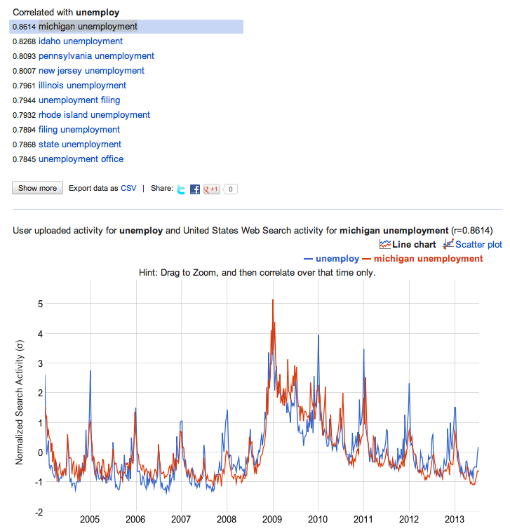
Looking at the graph, we can see that the correlation is pretty high (you can also see the correlation coefficient and look at a scatter plot comparing the two series to get a better sense for this).
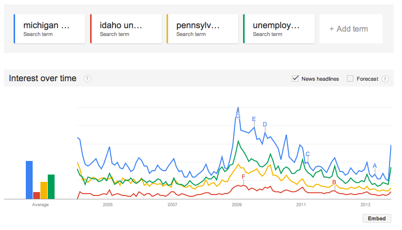
You can download data directly from Google Correlate, but you won't get the most recent week's search volume (I'm not sure why this is). So, instead, we are going to take what we've learned from Google Correlate, and go back over to Google Trends to actually get the search volume data to put in our regression. We'll get data for the top three most correlated search terms — michigan unemployment, idaho unemployment, and pennsylvania unemployment — as well is "unemployment filing" since that may pick up events that don't happen to affect those three states. After entering the search terms at Google Trends, you should see something like this:
To download the data, click the gear button in the upper right hand corner and select "Download as CSV."
Ok, now we have all the data we need to run our regression. At this point you can run the regression in whatever software you like. I'm going to walk through the steps using STATA, because that's the standard statistical package for Kellogg students. Before bringing the data into STATA, I'm going to put it together in a single csv file. To do this, open a new spreadsheet, cut and paste the search data downloaded from Google Trends and then cut and past a single column of the original unemployment claims data alongside the search data so that the weeks match up. Note that the actual days won't match up because Google uses the first Sunday to represent a given week, while the claims data is released on Thursdays. You will have to change the week labels from the Google Trends dates from a week range to a single day. You should also convert the claims data to a number format (no commas), or else STATA will treat it like a string. You can see a sample of the data I used in this Google Doc.
Here is a snapshot of my STATA code

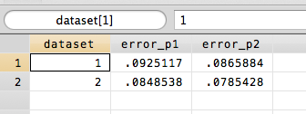
I bring the data in using insheet, and then reformat the date variable. I also add a new variable "dataset" which I will use to separate the sample that I fit the regression to from the sample for my out of sample testing of the model fit. In this case, I just split the dataset right in two. You can think of dataset 1 as being "the past" and dataset 2 "the future" that we're trying to predict. I then run my two regressions only using dataset 1 and predict the unemployment claims based on the fitted models. Finally, I measure the error of my predictions by looking at the absolute percentage error, which is just the absolute difference between the actual unemployment and my forecast divided by the actual unemployment level. The collapse command averages these errors by dataset. I can see my results in the Data Editor:
Finally, let's make a forecast for the unemployment claims numbers that have yet to come out. To do this, we want to go back and fit the model to all of the data (not just dataset 1). When we look at the results, we see that the full model prediction (p3) for the next unemployment claims number on 9/14 is 278583, a little bit lower than what we would have predicted using the standard time series regression (p1=284620).
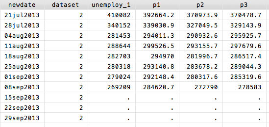
In this case, if we go back to the Department of Labor website, we can check because the 9/14 number actually is out, it just wasn't put into the dataset we downloaded:

