Influence

Gephi FAQ

Students in my Kellogg MBA and EMBA Social Dynamics and Networks classes do a lot of work using the network analysis and visualization software package Gephi. As with any unfamiliar software, there are often a few bumps along the road. I thought it would be helpful to compile a Gephi FAQ, so I scanned through my old emails looking for Gephi questions and have posted some of the most common ones here along with their answers.

Q1. How can I filter the network so that I only see the largest connected component?

A. In the statistics window, click the run button next to connected components. Then, switch to the filters window. Select the Attributes folder, then the Partition folder. Then drag the "Component ID (Node)" filter down to the Queries window where it says "Drag filter here". You can select which component(s) you want to see by clicking on the check boxes next to the component numbers where it says "Partition (Component ID) Settings" You can see what fraction of the nodes belong to each component as a percentage next to each component number, so if you only want to see the largest connected component, chose the one with the highest percentage. Then click Filter.

Q2. When I try to export my graph as a pdf, Gephi clips the node labels so that I can't see all of them. How do I fix this?

A. When Gephi exports the image, it only pays attention to nodes and links, not the labels, when it decides where to clip the image. As a result, sometimes labels near the edge of the image get clipped off. To make sure you get the full image, after you have clicked the export button, look for the Options... button at the bottom of the Export popup window. Click it and then increase the margins. Click OK and proceed to export your image. If the labels are still clipped, go back and increase the margins again until the full labels appear.

Q3. I imported a graphml data file and I'm trying to use eignevector centrality (PageRank, HITS, …) to identify important nodes, but when I try to run the eigenvector centrality calculation from the Statistics window nothing happens. How do I fix this?

A. The problem is that the graphml file that you imported already has (empty) columns corresponding to the measures that you want to calculate and Gephi won't overwrite them. To fix this, you first have to delete those columns. Go into the data laboratory tab and delete any of the columns that have to do with measures of centrality like eigenvector centrality, closeness centrality, betweeness centrality, page rank, anything that looks like that.  Once you have done that go back to the overview window and then run the calculation that you want under the statistics tab. If the little window pops up with the graphs, then everything is working, if it doesn't then you need to go back to the data laboratory and delete some more columns.

Q4. I imported a node attribute that I want to use to resize my nodes, but it isn't showing up under the ranking tab. How do I fix this?

A. The most likely problem is that the node attribute is identified as the wrong type of data — probably a String, when it needs to be a numeric type such as BigInteger. The easiest way to fix this is to click Duplicate column in the data laboratory and then be sure to select a numeric type (e.g. BigInteger or BigDecimal) for the duplicated column. Once you're done you can delete the original node attribute column. The duplicated numeric column should now be accessible in the rankings window.

Q5. I'm trying to import an adjacency matrix that I have in a csv file, but I keep getting the  java runtime error “java.lang.RuntimeException: java.lang.NullPointerException” What do I do?

A. For some reason, when importing an adjacency matrix Gephi expects a csv file with semicolon separators, not commas. Just open your csv file using a simple text editor like NotePad or TextEdit and then use the Find/replace command to change all of the commas to semicolons.

Q6. I have a network in which there are different types of nodes (e.g. doctors and patients) and I would like to color the different types using different colors. How do I do this?

A. You need to import a new node attribute that gives the type for each node. To add a node attribute, create a spreadsheet with one column labeled Id that contains a list of all of the names of the nodes in your network. Be sure these are the same names that appear under the ID column in the Data Laboratory in Gephi. Then add additional columns to the spreadsheet that give the node attributes for each node. For example, you might have a column called "type" with entries like "doctor" or "patient" that tells whether the corresponding node is a doctor or a patient. Once you have created your spreadsheet, export it as a csv. Now, go back to Gephi with your existing network file open. Under Data Laboratory, select Import Spreadsheet, and choose Nodes Table. Make sure that the button “Force Nodes to be Created as New Ones” is not checked. and import the spreadsheet. This should add a new column to the nodes table in the data laboratory. Then, using the partition tab, you can color the nodes according to this attribute.

Q7. I'm trying to import an adjacency matrix from a csv file, but I'm getting the error "java.lang.RuntimeException: java.lang.Exception: Inconsistent number of matrix lines compared to the number of labels” What do I do?

A. One thing to try is removing any extra spaces from your csv file. Sometimes these trip up the import. Open the csv file using a simple text editor like NotePad or TextEdit, and then use find/replace to remove any spaces. Save the adjacency matrix and then try importing it again.

Q8. I'm trying to import an edge list, but I just get a bunch of nodes with no edges. What's going wrong?

A. Make sure that when you're importing the edge list from the data laboratory that you select  "Edges Table" in the drop down menu and not "Nodes Table." Otherwise it just thinks your bringing in a list of nodes.

Q9. I want to add labels to my network, but when I click the little black T, no labels show up (or the label isn't what I want it to be). How do I get the (right) labels?

A. You need to feel Gephi which column you want it to use for the labels. By default, Gephi uses the data in the column "Labels." To change which column is used, from the over view screen, click the small triangle in the lower right hand corner of the Graph window, which will reveal an extra settings pane. Then choose the Labels tab. On the far right hand side of this window, click "Configure…" then put a check mark next to any of the attributes that you would like to show up as labels. Alternatively, in the Data Laboratory, you can just copy the column that you want to use as labels in to the labels column.

Q10. When I try and import an edge list, Gephi says I need Source and Target columns, but I already have Source and Target columns. What's going on?

A. There are probably extra spaces after the words Source and Target in your column headers. If you delete these spaces you should be able to import the edge list.

Visualizing Contagious Twitter Memes with NodeXL and Gephi

In the last post we explored how to use NodeXL to collect a Twitter user's network data. Now, I'll describe how to collect data on a trending topic.

To get started, follow steps 0 and 1 here to setup a Twitter account and download the NodeXL software. Then, to download the network data, click on Import and select From Twitter Search Network… In the first dialog box, enter the search term that you want to look for. Any account that recently posted a tweet containing this phrase will end up being a node in your network.  In the book, "Analyzing Social Media Networks with NodeXL," there is some good advice on choosing an appropriate trending topic to look at:

"First, the search phrase has to concern a recent event. Though Twitter has been around for several years, the volume of information being produced every second is so huge that the search interface has limits on how many tweets it will return for a given query, or how old tweets can be. Searching for "2008 Election" may in theory produce a valuable set of tweets about the election cycle, but in practice those tweets are too far back in time for the search interface to collect them efficiently. The second criterion is that the search phrase has to relate to a piece of news, promotion, event, and so on that is u contagious" (i.e., Twitter users who see the message will, at least in principle, want to pass it on to their followers). A search phrase like "Thanksgiving" is a trending topic on Twitter (shortly before and on Thanksgiving) but lacks a contagious property-there is no need to pass on the message because a large fraction of the population already knows about it, so tweets about Thanksgiving are independent events rather than the sign of a "Thanksgiving meme" spreading throughout the Twitter population."

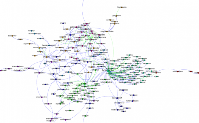
One good way to do this is look through the recent tweets of a popular user for something that you think would be sufficiently interesting that other people would retweet the message. For example, in the network below, I gathered data on tweets containing the phrase "Who Googled You?" This Twitter meme originated with Pete Cashmore, of @mashable, and links to a Mashable article that describes a way to find out who has been searching for you on Google. The article generated a flurry of interest and many other people tweeted links to the article, generally repeating the original article title, "Who Googled You?" Since this meme spread from person to person, it was a good candidate for visualizing as a Twitter search network. Untitled

You can select what relationships you want to use to define the edges of your network by selecting any combination of the following choices:

Follows relationship — two accounts are connected if one account follows the other.
"Replies-to" relationship in tweet — two accounts are connected if one account replies to the other in its tweet.
"Mentions" relationship in tweet — two accounts are connected if one account mentions the other account in its tweet.

As discussed in the previous post, because of Twitter rate limits, it is advisable to limit your request to a fixed number of people. Unless you are especially patient, I recommend starting with just 300 people.

Once you download the data using NodeXL, I like to export it as a graphml file and then visualize it in Gephi. In this example, I did a few things to make the visualization more meaningful, which I describe below.

Before getting started with manipulating the network in Gephi, it is a good idea to go into the Data Laboratory and delete some of the columns that NodeXL created. You should delete anything having to do with the color or size of the nodes or edges, or centrality measures such as PageRank and eigenvector centrality. These columns are generally empty, but unless you delete them, Gephi won't overwrite them when you ask it to calculate these measures, so you won't be able to calculate and make use of them in your analysis. For some general tips on using Gephi, check out the FAQ here.

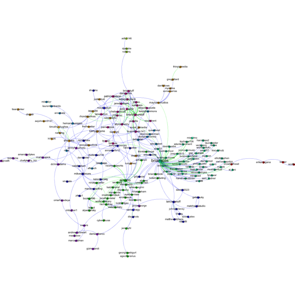
First, I filtered out all of the accounts except those that belong to the largest connected component of the network. This makes the network much more readable, and allows us to focus only on those nodes involved in a large cascade. After trying a few options, I choose the Force Atlas layout algorithm to arrange the nodes. For Twitter networks, I have found Force Atlas to generally give the best layout. Usually, I have to increase the repulsion strength from the default setting of 200 to 2000 or more. Then I resized the nodes according to their degree so we can get a sense for who the most important nodes in the network are. I also tried sizing the nodes by PageRank and eigenvector centrality for comparison. For the most part these different centrality measures didn't make much difference, although one account, @darrenmcd, appears significantly more important according to PageRank or Eigenvector centrality than degree centrality. The Twitter accounts @briansois and @armano standout as the most influential in the network. I colored the nodes according to which community they belong to as identified using Gephi's implementation of the Girvan-Newman modularity based clustering algorithm, and I colored the edges according to the type of relationship between the Twitter accounts. Blue edges are "followed" relationships, green edges are "mentions" and purple edges are "replies to." We can see that almost all of the links to @armano mention the relationship explicitly, and about half of those to @briansois do.

WhoGoogledYou

Why Google Ripples will be a lot less cool than it sounds.

Google + now has a new feature, Ripples, that allows you to see a network visualization of the diffusion of a post (see the Gizmodo article here).  The pictures are cool, but the original post has to be public, and then it has to be shared by one Google+ user to other Google+ users.  But, the chance of interesting ripples happening very often are pretty slim; here's why.

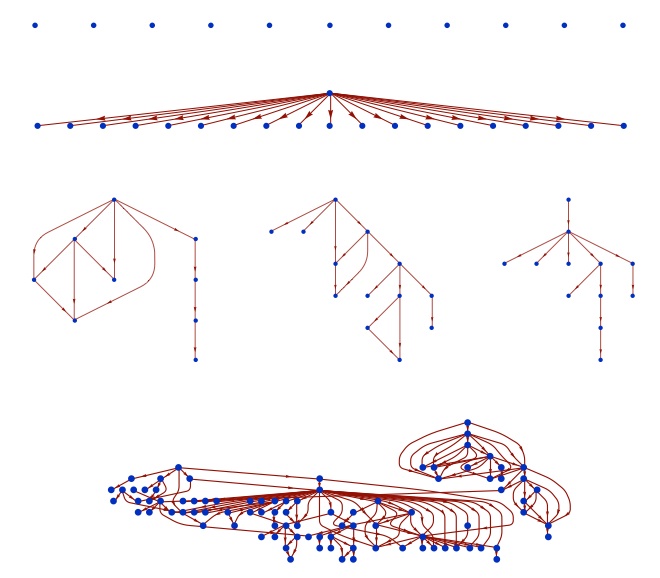
Bakshy, Hofman, Mason, and Watts looked at exactly this kind of cascade on Twitter, which is a great platform for this kind of research for several reasons.  First, everything is effectively public, so there are none of the privacy issues of Facebook, and we don't have to limit ourselves to looking at just the messages that people choose to make public like we do on Google +.  Second, "retweeting" messages is an established part of Twitter culture, so we expect to find cascades. Finally, since tweets are limited to 140 characters, links are often shortened using services like bit.ly.  This means that if I create a link to a New York Times article and you create a link to the same page independently, those links will be different, so the researchers can tell the difference between a cascade that my post creates and one that yours creates.

Some of the cascades that Bakshy et al. found are shown in this figure.

They looked at 74 million chains like these initiated by more than 1.6 million Twitter users during two months in 2009.  A lot of interesting things came out of the study, but the most important one for Google Ripples is that 98 percent of the URLs were never reposted.  That's not good for Ripples.  The latest number puts the entire Google plus user population at only 43.6 million users, and since only a small fraction of these users' posts will be public posts, even if people share other people's posts on Google+ as frequently as the retweet links on Twitter (which is unlikely), we still can't expect to see many Ripples that look like anything but a lonely circle.

The Christakis and Fowler Social Networks Influence Brouhaha

Recently there has been a spirited conversation kicked off by the publication of an article, "The Spread of Evidence-Poor Medicine via Flawed Social-Network Analysis," by Russell Lyons regarding the well-publicized work of Nicholas Christakis and James Fowler on social contagion of obesity, smoking, happiness, and divorce.  The discussion has been primarily confined to the specialized circle of social network scholars, but now that conversation has spilled out into the public arena in the form of an article by Dave Johns in Slate (Dave Johns has written about the Christakis-Fowler work in Slate before).  Christakis and Fowler's work has received a huge amount of attention, appearing on the cover of the New York Times magazine, on the Colbert Report TV program, and a ton of other places (see James's website for more links).  Many others have made detailed comments on Lyon's article and on the original Christakis-Fowler papers.  I wish to address some of the related issues raised in Slate about scientists in the media

The article seems to criticize Christakis and Fowler for their media appearances, as though this publicity is inappropriate for scientists who should be diligently but silently working in the background, leaving it up to policy makers and the media to make public commentary and recommendations.  I think this criticism is not only wrong, but dangerous.  Many if not most researchers do work silently in the background, shunning the spotlight and scrutiny of the media, not out of shyness or fear of embarrassment, but because of a pervasive misunderstanding of scientific uncertainty.  Hard science is simply much softer than many people realize.

ALL scientific conclusions — from physics to sociology come with uncertainty (this does not apply to mathematics, which is actually not a science).  A "scientific truth" is actually something that we're only pretty sure is true.  But we'll never be definitely 100% sure, that's just how science works.  When one scientist says to another, we have observed that X causes Y, it is understood that what is meant is, the probability that the observed relationship between X and Y is due to chance is very small.  But, statements like that don't make for good news stories.  Not only are they uninteresting, but for most people they're unintelligible (which is not to say that the public is stupid — the concepts of uncertainty and statistical significance are extremely subtle and often misunderstood even by well-trained scientists).  So, many scientists avoid the media because we're asked to make definitive statements where no definitive statements are possible, or we make statements that include uncertainty that are ignored or misunderstood.

But we need scientists in the media.  Only a fraction of Americans believe the planet is warming and 40% of Americans believe in creationism.  Scientists in the media can help correct these misperceptions and guide public policy.  And, maybe even more importantly, scientists in the media can make science sexy.  We already live in a world where science and politics are often at odds, and in which scientists that avoid the media are often overruled by politicians that seek it out.  Scientists are already wary of making public statements that implicitly contain uncertainty for fear of them being interpreted as definitive. Christakis and Fowler have done us a great service by taking the risk of making statements and recommendations in the public arena based on the best of their knowledge, by raising public awareness of the science of networks, and by making science fun, interesting, and relevant.