
In the last post we explored how to use NodeXL to collect a Twitter user's network data. Now, I'll describe how to collect data on a trending topic.
To get started, follow steps 0 and 1 here to setup a Twitter account and download the NodeXL software. Then, to download the network data, click on Import and select From Twitter Search Network… In the first dialog box, enter the search term that you want to look for. Any account that recently posted a tweet containing this phrase will end up being a node in your network. In the book, "Analyzing Social Media Networks with NodeXL," there is some good advice on choosing an appropriate trending topic to look at:
"First, the search phrase has to concern a recent event. Though Twitter has been around for several years, the volume of information being produced every second is so huge that the search interface has limits on how many tweets it will return for a given query, or how old tweets can be. Searching for "2008 Election" may in theory produce a valuable set of tweets about the election cycle, but in practice those tweets are too far back in time for the search interface to collect them efficiently. The second criterion is that the search phrase has to relate to a piece of news, promotion, event, and so on that is u contagious" (i.e., Twitter users who see the message will, at least in principle, want to pass it on to their followers). A search phrase like "Thanksgiving" is a trending topic on Twitter (shortly before and on Thanksgiving) but lacks a contagious property-there is no need to pass on the message because a large fraction of the population already knows about it, so tweets about Thanksgiving are independent events rather than the sign of a "Thanksgiving meme" spreading throughout the Twitter population."
One good way to do this is look through the recent tweets of a popular user for something that you think would be sufficiently interesting that other people would retweet the message. For example, in the network below, I gathered data on tweets containing the phrase "Who Googled You?" This Twitter meme originated with Pete Cashmore, of @mashable, and links to a Mashable article that describes a way to find out who has been searching for you on Google. The article generated a flurry of interest and many other people tweeted links to the article, generally repeating the original article title, "Who Googled You?" Since this meme spread from person to person, it was a good candidate for visualizing as a Twitter search network. 
You can select what relationships you want to use to define the edges of your network by selecting any combination of the following choices:
Follows relationship — two accounts are connected if one account follows the other.
"Replies-to" relationship in tweet — two accounts are connected if one account replies to the other in its tweet.
"Mentions" relationship in tweet — two accounts are connected if one account mentions the other account in its tweet.
As discussed in the previous post, because of Twitter rate limits, it is advisable to limit your request to a fixed number of people. Unless you are especially patient, I recommend starting with just 300 people.
Once you download the data using NodeXL, I like to export it as a graphml file and then visualize it in Gephi. In this example, I did a few things to make the visualization more meaningful, which I describe below.
Before getting started with manipulating the network in Gephi, it is a good idea to go into the Data Laboratory and delete some of the columns that NodeXL created. You should delete anything having to do with the color or size of the nodes or edges, or centrality measures such as PageRank and eigenvector centrality. These columns are generally empty, but unless you delete them, Gephi won't overwrite them when you ask it to calculate these measures, so you won't be able to calculate and make use of them in your analysis. For some general tips on using Gephi, check out the FAQ here.
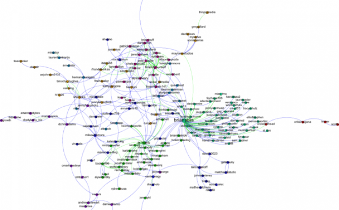
First, I filtered out all of the accounts except those that belong to the largest connected component of the network. This makes the network much more readable, and allows us to focus only on those nodes involved in a large cascade. After trying a few options, I choose the Force Atlas layout algorithm to arrange the nodes. For Twitter networks, I have found Force Atlas to generally give the best layout. Usually, I have to increase the repulsion strength from the default setting of 200 to 2000 or more. Then I resized the nodes according to their degree so we can get a sense for who the most important nodes in the network are. I also tried sizing the nodes by PageRank and eigenvector centrality for comparison. For the most part these different centrality measures didn't make much difference, although one account, @darrenmcd, appears significantly more important according to PageRank or Eigenvector centrality than degree centrality. The Twitter accounts @briansois and @armano standout as the most influential in the network. I colored the nodes according to which community they belong to as identified using Gephi's implementation of the Girvan-Newman modularity based clustering algorithm, and I colored the edges according to the type of relationship between the Twitter accounts. Blue edges are "followed" relationships, green edges are "mentions" and purple edges are "replies to." We can see that almost all of the links to @armano mention the relationship explicitly, and about half of those to @briansois do.
