Check out this cool video on a visualization of the social network of artists behind the invention of abstraction. Thanks to Merwan Ben Lamine for sharing it with me. You can explore the network here.
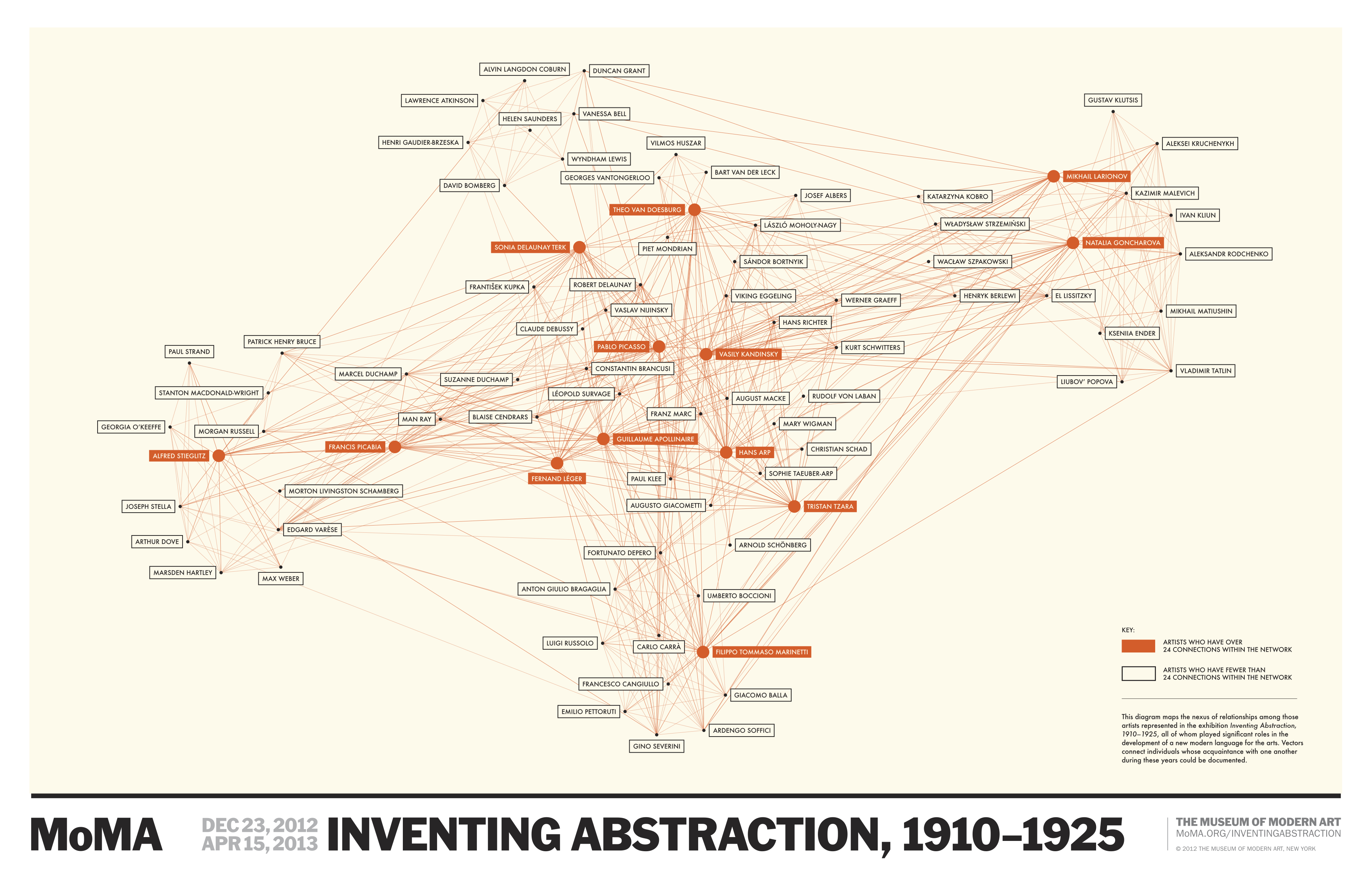

Check out this cool video on a visualization of the social network of artists behind the invention of abstraction. Thanks to Merwan Ben Lamine for sharing it with me. You can explore the network here.
I read a(nother) article on Fast Company today about why some stories "go viral." (Mathematically speaking, why some things go viral and others don't boils down to a simple equation.)
The article cites research by Jonah Berger and Katherine Milkman that finds articles with more emotional content, especially positive emotional content, are more likely to spread. A quick read of the article seems to promise an easy path to getting your own content on your blog, YouTube, or Twitter to take off. For example, the article cites Gawker editor Neetzan Zimmerman's success, pointing out his posts generate about 30 million views per month — the kind of statistics that get marketers salivating. The scientific research by Berger and Milkman is interesting and well done, but we have to be careful about how far we take the conclusions.
There are two interrelated issues. The first has to do with the "base rate." Part of Berger and Milkman's paper looks at what factors make articles on the New York Times online more likely to wind up on the "most emailed" list. They find, for example, that "a one standard deviation increase in the amount of anger an article evokes increases the odds that it will make the most e-mailed list by 34%." In this case, the base rate is the percent of articles overall that make the most emailed list. When we hear that writing an especially angry article makes it 34% more likely to get on the most emailed list, it sounds like angry articles have a really good chance of being shared, but this isn't necessarily the case. What we know is that the probability of making the most emailed list given that the article is especially angry equal 1.34 times the base rate — but if the base rate is really low, 1.34 times it will be small too. Suppose for example that only 1 out of every 1000 articles makes the most emailed list, then what the result says is that 1.34 out of every thousand angry articles makes the most emailed list. 1.34 out of a thousand doesn't sound nearly as impressive as "34% more likely."
The second issue has to do with the overall predictability of making the most emailed list. The model that shows the 34% boost for angry content has an R-squared of .28. This model has more than 20 variables including things like article word count, topic, and where the article appeared on the webpage. But even knowing all of these variables, we still can't accurately predict if an article will make the most emailed list or not. All we know is that on average articles with some features are more likely to make the list than articles with other features. But for any particular article, we really can't do a very good job of predicting what's going to happen.
To get a better understanding of this idea, here's another example. In Ohio, 37% of registered voters are registered as Republicans and 36% are registered as Democrats. In Missouri, 39% are registered as Republicans and 37% are registered as Democrats. On average, registered voters in Missouri are more likely to be Republican than registered voters in Ohio, but just because someone is from Missouri doesn't mean we can confidently say they're a Republican. If we only looked at people from Ohio and Missouri, knowing which state a person is from wouldn't be a very good predictor of their party affiliation.
I use the network visualization software Gephi almost everyday, especially when I am teaching Social Dynamics and Network Analytics at Kellogg. So, I was pretty concerned when I realized after upgrading my Mac laptop and desktop to the new Mac OS X Mavericks that Gephi was no longer working on either. Luckily, there is a solution: Installing this Java update from Apple seems to fix everything up.
Unemployment numbers and the consumer price index (CPI) are among the most important economic indicators used by both Wall Street traders and government policy makers. During the government shutdown those statistics weren't be collected or calculated and now that the government is up and running again it will be a while before the latest numbers are released.
According to the New York Times, the October 4 unemployment report will be released October 22, and the October 16th CPI will come out on Halloween Eve. But, you don't have to wait for those numbers to come out. In fact, these numbers are always slow — CPI takes about a month to calculate so even if it had come out on October 6, the number still would have been out of date. Luckily, there are already other good tools for anticipating what these numbers will be even before they're released. For CPI, there's the Billion Prices Project developed at MIT (now at PriceStats). For more on the Billion Prices Project, check out this post. And for unemployment, we worked through how a model based on search trends can be used to forecast the yet to be released official number in the last post on this blog.
PriceStats (based on MIT's Billion Prices Project) already knows what the CPI number will be.
This is a great opportunity for investors and policy makers to reduce their dependence on glacial paced antiquated statistics and start incorporating information from newer faster tools into their decision making.
In 2009 Google Chief Economist Hal Varian and Hyunyoung Choi wrote two papers on "Predicting the Present" using Google Trends. Their idea was to use data on search volume available through Google Trends to help "predict" time series for data that we usually only obtain with a delay.
For example, initial unemployment claims data for the previous week are released on Thursday of the following week. Even though the unemployment claims for a particular week have already happened, we won't know those numbers for another five days (or longer if it happens to be during a government shutdown!). In other words, we only see the real data that we're interested in with a delay. But, when people are getting ready to file their first claim for unemployment benefits, many of them probably get on the web and search for something like "unemployment claim" or "unemployment office," so we should expect to see some correlation between initial unemployment claims and the volume of searches for these terms. Google Trends search data is available more quickly than the government unemployment numbers, so if we see a sudden increase or decrease in the volume of these searches, that could foreshadow a corresponding decrease or increase in unemployment claims in the data that has yet to be released. To be a little more rigorous, we could run a regression of initial unemployment claims on the volume of searches for terms like "unemployment claim" using past data and then use the results from that regression to predict unemployment claims for the current week where we know the search volume but the claims number has yet to be released.
It turns out that this isn't quite the best way to do things though, because it ignores another important predictor of this week's unemployment claims — last week's claims. Before search data came into the picture, if we wanted to forecast the new initial claims number before it's release we would typically use a standard time series regression where unemployment claims are regressed on lagged versions of the unemployment claims time series. In other words, we're projecting that the current trend in unemployment claims will continue. To be concrete, if $c_t$ are initial claims at time $t$, then we run the regression $c_t=\beta_0+\beta_1 c_{t-1}$.
In many cases this turns out to be a pretty good way to make a forecast, but this regression runs into problems if something changes so that the new number doesn't fit with the past trend. Choi and Varian suggested that rather than throw away this pretty good model and replace it with one based only on search volume, we stick with the standard time series regression but also include the search data available from Google Trends to improve it's accuracy, especially in these "turning point" cases. Choi and Varian provided examples using this technique to forecast auto sales, initial unemployment claims, and home sales (see this post for an example of predicting the present at the CIA).
At the time that Choi and Varian wrote their paper, they simply had to guess which searches were likely to be predictive of the time series in question and then check to see if they were correct (in their paper they decided to use the volume of searches in the "Jobs" and "Welfare & Unemployment" categories as predictors). When they tested the accuracy of a model that included this search data in addition to the standard lagged time series predictor, they found that including the search data decreased forecasting error (mean absolute error) on out of sample data from 15.74% using the standard time series regression to 12.90% using the standard regression with the additional search volume predictors.
In the time since Choi and Varian's paper, Google has made using this technique even more attractive by adding Google Correlate to the Google Trends suite of tools. Google Correlate essentially takes the guess work out of choosing which search terms to include in our regression by combing through all of the billions of Google searches to find the terms for which the search volume best correlates with our time series. (The idea for doing this came from Google's efforts to use search volume to "predict" incidence of the flu, another time series for which the official government number has a significant delay.)
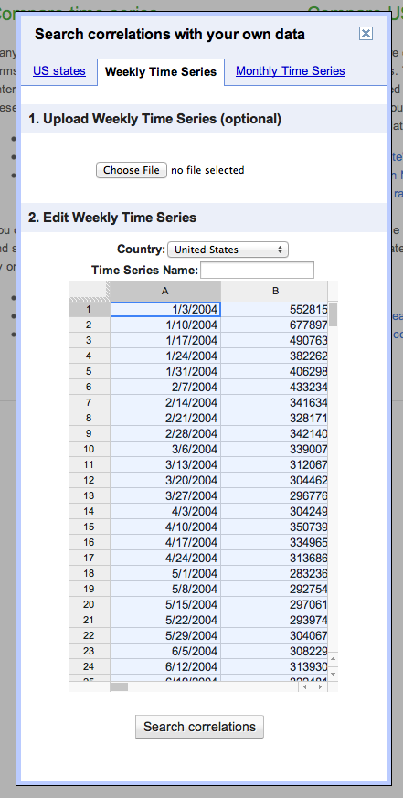
So, let's walk through the process for predicting the present with Google Trends and Google Correlate using the initial unemployment claims data as an example. The first step, is to head over to the US Department of Labor site to get the data. Google Correlate only goes back to January 2004, so there's no use getting data from before then. If you choose the spreadsheet option, you should get an excel file that looks something like this:
We'll use the not seasonally adjusted (N.S.A.) claims numbers since the search volume numbers used in Google Correlate are also not seasonally adjusted. Highlight the first two columns of the data and hit copy. Next, open Google Correlate and hit the "Enter Your Own Data" button (you will have to sign in with a Google account). There are two ways to enter your data, you can either upload a file or cut and paste your data into the spreadsheet columns in the pop window. In my experience, the cut and past method is much more reliable. Highlight the two columns of the spreadsheet in the popup and hit delete to remove the dates that are already there, then hit paste to paste the data from the unemployment claims spreadsheet. You should have something that looks like this:
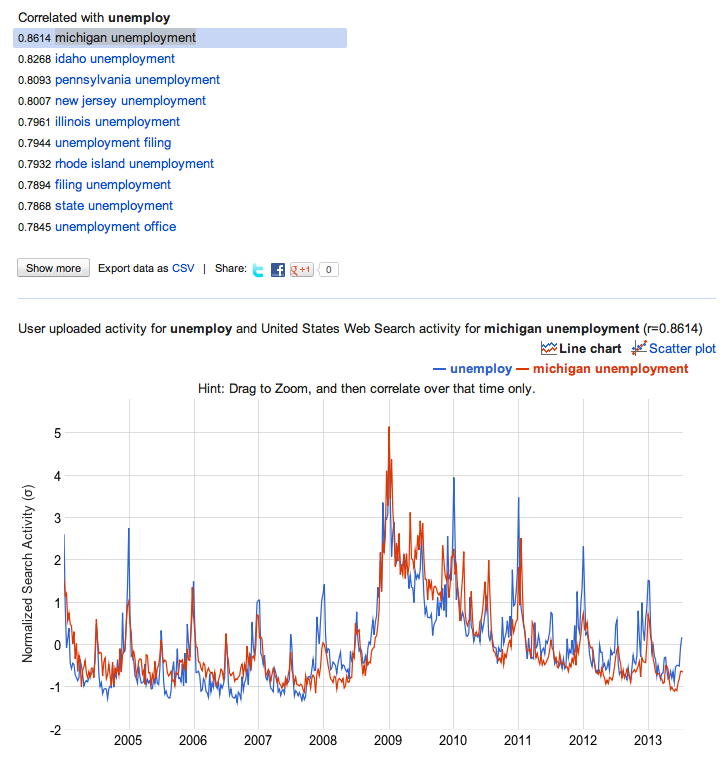
Give your time series a title where it says "Time Series Name:" and then click Search Correlations. (If you're using Safari, you may have to click a button that says "Leave Page" a few times. If you're using Internet Explorer, don't, Google Correlate and IE don't work well together.) On the next page you'll see a list of the terms for which the search volume correlates most highly with the unemployment claims data along with the graph showing the time series we entered and the search volume for the most highly correlated search term. In my case this is searches for "michigan unemployment."
Looking at the graph, we can see that the correlation is pretty high (you can also see the correlation coefficient and look at a scatter plot comparing the two series to get a better sense for this).
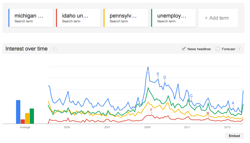
You can download data directly from Google Correlate, but you won't get the most recent week's search volume (I'm not sure why this is). So, instead, we are going to take what we've learned from Google Correlate, and go back over to Google Trends to actually get the search volume data to put in our regression. We'll get data for the top three most correlated search terms — michigan unemployment, idaho unemployment, and pennsylvania unemployment — as well is "unemployment filing" since that may pick up events that don't happen to affect those three states. After entering the search terms at Google Trends, you should see something like this:
To download the data, click the gear button in the upper right hand corner and select "Download as CSV."
Ok, now we have all the data we need to run our regression. At this point you can run the regression in whatever software you like. I'm going to walk through the steps using STATA, because that's the standard statistical package for Kellogg students. Before bringing the data into STATA, I'm going to put it together in a single csv file. To do this, open a new spreadsheet, cut and paste the search data downloaded from Google Trends and then cut and past a single column of the original unemployment claims data alongside the search data so that the weeks match up. Note that the actual days won't match up because Google uses the first Sunday to represent a given week, while the claims data is released on Thursdays. You will have to change the week labels from the Google Trends dates from a week range to a single day. You should also convert the claims data to a number format (no commas), or else STATA will treat it like a string. You can see a sample of the data I used in this Google Doc.
Here is a snapshot of my STATA code
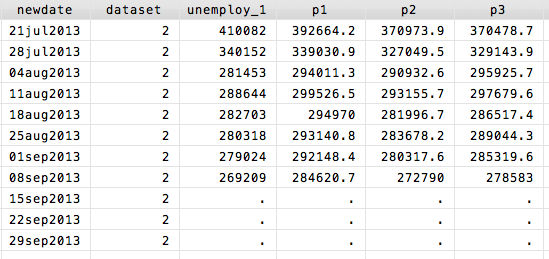
I bring the data in using insheet, and then reformat the date variable. I also add a new variable "dataset" which I will use to separate the sample that I fit the regression to from the sample for my out of sample testing of the model fit. In this case, I just split the dataset right in two. You can think of dataset 1 as being "the past" and dataset 2 "the future" that we're trying to predict. I then run my two regressions only using dataset 1 and predict the unemployment claims based on the fitted models. Finally, I measure the error of my predictions by looking at the absolute percentage error, which is just the absolute difference between the actual unemployment and my forecast divided by the actual unemployment level. The collapse command averages these errors by dataset. I can see my results in the Data Editor:
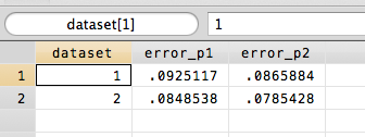
Finally, let's make a forecast for the unemployment claims numbers that have yet to come out. To do this, we want to go back and fit the model to all of the data (not just dataset 1). When we look at the results, we see that the full model prediction (p3) for the next unemployment claims number on 9/14 is 278583, a little bit lower than what we would have predicted using the standard time series regression (p1=284620).
In this case, if we go back to the Department of Labor website, we can check because the 9/14 number actually is out, it just wasn't put into the dataset we downloaded:

My NICO colleague (and office mate) Dirk Brockmann has done some very cool work on identifying where an epidemic began by looking at how it has spread through airline networks. Centuries ago the spread of disease was constrained by geography (like the spread of obesity appears to be today). If you look at a map of where the disease has spread to over time, you could easily trace it back to it's origin — the epidemic just spreads out like ripples in a pond. But today, diseases hitch a ride on the air travel network, so where the disease spreads fastest has little to do with physical geography. What Dirk figured out though is that geography is just another sort of network. If we arrange the airline network in the right way, with the origin of an epidemic at the center, we will again see the contagion spreading out like ripples in a pond. Check out this article in The Atlantic explaining the research.
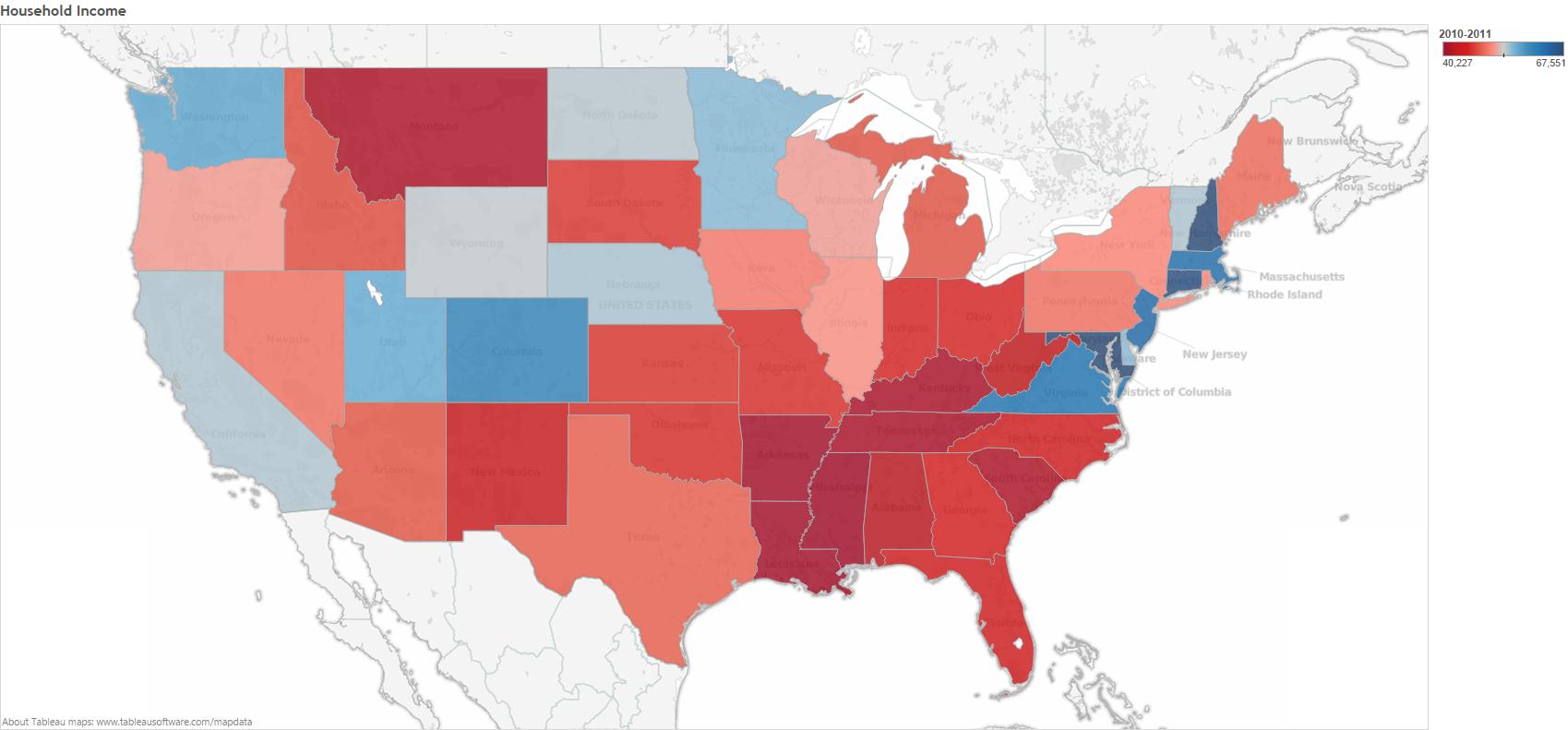
Today on Slate there is a nice little GIF (that originally appeared on The Atlantic) that shows how obesity rates have changed over time by state. Slate seems to suggest that the geographic progression of obesity rates might indicate some sort of social contagion. But, ss many others (and here) before me have pointed out, we have to be very careful when trying to draw inferences about social contagion. If we take a look at a map of household income by state, we see that there is a lot of overlap between the poorest states and those with the highest obesity rates.
There are lot's of potential causal connections here. For example, income might affect the types of stores and restaurants available, which in turn affects obesity rates. For a more careful look at some data on the social contagion of obesity, have a look at our paper that examines obesity rates, screen time, and social networks in adolescents.
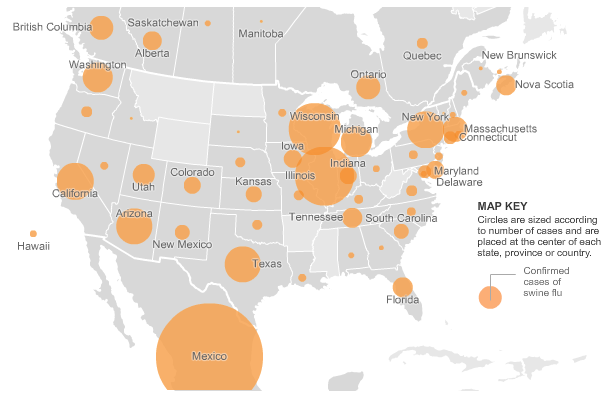
As a side note, it's interesting to compare the map of the "obesity epidemic" to a map of something we know spreads through person to person contagion, like the swine flu (image from the New York Times).
Unlike the obesity epidemic, swine flu jumps all over the place, which obviously has to do with air travel.
Scott Page's FREE online course on complex systems and modeling is starting up again today on Coursera. The first round of the course was awesome (highly recommended here), and I am sure this one will be too. This time around Scott has also added some new features to the Model Thinking course, a Twitter account and a Facebook page.
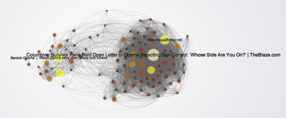
Last week the website of The Atlantic had a nice network visualization of the top tweets linking to articles on gun politics. You should go check out their site where the network visualization is interactive, but here is a static picture so you get the idea.
Each node in this network is one of the top 100 most tweeted weblinks on gun politics during the week from Sunday 2/17 to Sunday 2/24. The creator of the network visualization collected all of the tweets that mentioned terms like "gun rights," "gun control," "gun laws," etc. and then looked for the most popular links in those tweets. (One thing I wonder about is how they dealt with shortened URLs. Since tweets are limited to 140 characters or less, when most people post a link on Twitter they shorten the URL using a service like bit.ly. This means that two people that are ultimately linking to the same article might post different URLs. Many news services have a built in "Tweet this" button, which may give the same shortened URL to everyone who clicks it, so those articles would get many consistent links, where articles or posts without a "Tweet this" button might have many links pointing to them, but all with different URLs coming from each time a person shortened the link individually. All of this is just a technical aside though, because I am a 100% sure the main point of the network visualization, which I haven't even gotten to yet, would still show up.)
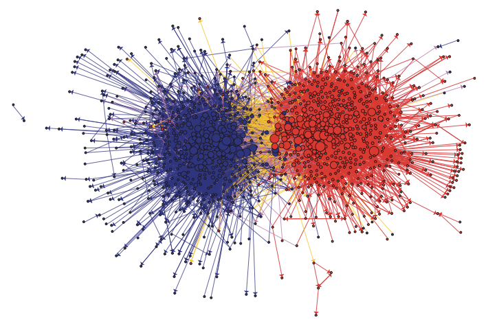
The edges in the network visualization connect two pages if the same Twitter account posted links to both pages. The point is that we see two very distinct clusters with lots of edges within the clusters and not too many between them. Of course, taking a loser look at the network visualization we see that one of the groups consists of pro gun control articles and the other contains anti gun control pages. The network science term for this phenomenon is homophily i.e. nodes are more likely to connect to other nodes that are similar to them. Homophily shows up in lots and lots of networks. Political network visualizations almost always exhibit extreme homophily. For example, take a look at this network of political blogs created by Lada Adamic and Natalie Glance (they have generously made the data available here).
Or, take a look at this network of senators created by a group in the Human-computer Interaction Lab at the University of Maryland.
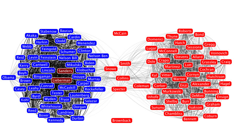
Here, the nodes are senators and two senators are connected if they voted the same way on a threshold number of roll call votes.
Homophily shows up in other types of social networks as well, not only political networks. For example, take a look at this network of high school friendships from James Moody's paper "Race, school integration, and friendship segregation in America," American Journal of Sociology 107, 679-716 (2001).
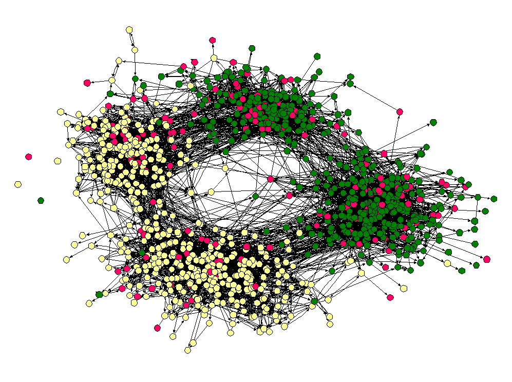
Here the nodes are students in a high school and two nodes are connected if one student named the other student as friend (the data was collected as part of the Add Health study). The color of the nodes corresponds to the race of the students. As we can see, "yellow" students are much more likely to be friends with other yellow students and "green" students are more likely to connect to other green students. (Interestingly, the "pink" students, who are in the vast minority seem to be distributed throughout the network. I once heard Matt Jackson say that this is the norm in many high schools — if there are two large groups and one small one, the members of the small group end up identifying with one or the other of the two large groups.)
Homophily is actually a more subtle concept than it appears at first. The thorny issue, as is often the case, is causality. Why do similar nodes tend to be connected to one another? The problem is so deeply ingrained in the concept of homophily that it sometimes leads to ambiguity in the use of the term itself. Some people use the word homophily to refer to the observation that nodes in a network are more likely to connect to similar nodes in the network than we would expect due to chance. In this case, there is no mention of the underlying reason why similar nodes are connected to one another, just that they are. When other people use the term homophily, they mean the tendency for nodes in a network to select similar nodes in the network to form connections with. To keep the distinction clear, some people even refer to the former definition as observed homophily.
To understand the difference it helps to think about other reasons why we might see similar nodes preferentially connected to one another. The casual stories fall into three basic categories: influence, network dynamics, and exogenous covariates. For many people, the influence story is the most interesting. In this explanation, we imagine that the network of connections already exists, and then nodes that are connected to one another affect each other's characteristics so that network neighbors end up being similar to one another. For example, in a series of papers looking at a network of friends, relatives, and geographic neighbors from the Framingham Heart study, Christakis and Fowler argue that network neighbors influence one another's weight, tendency to smoke, likelihood to divorce, and depression. While not everyone is convinced by Christakis and Fowler's evidence for a contagion effect, we can all agree that in their data obese people are more likely to be connected to other obese people, smokers tend to be friends with smokers, people that divorce are more likely to be connected to others that divorce, and depressed folks are more likely to be connected to other depressed people than we would expect due to chance.
In the network dynamics story, nodes form or break ties in a way that shows a preference for a particular attribute. Our intuition is that liberal blogs like to link to other liberal blogs more than they like to link to conservative blogs. This is what some people take as the definition of homophily. Since the word literally means "love of the same" this makes some sense.
But, just because we see observed homophily doesn't mean people are preferentially linking to other people that are like them. This is reassuring when we see homophily on dimensions like race as in the high school friendship network above. Clearly, the students are not influencing the race of their friends, but this doesn't mean the fact that we observe racial homophily doesn't imply the students are racist — there could be what we call an exogenous covariate that is leading to the observation of homophily. For example, it could be that these students leave in a racially segregated city and students are more likely to be friends with other students that live close to them. In this case, students prefer to be friends with other students that live near them, and living near one another just happens to increase the likelihood that the students share the same race. One particularly tricky covariate is having a friend in common. Another common observation in social networks is what is called triadic closure. In lay terms, triadic closure means that two people with a friend in common are likely to be friends with each other — the triangle closes instead of remaining an open like a V. It could be that, in the high school friendship network, there is a sight tendency for some students to choose others of their same race as friends; either because of another variable like location or because of an actual racial bias, but the appearance of racial homophily could be significantly amplified by triadic closure. If one student chooses two friends that are of the same race, triadic closure is likely to result in third same race tie. It turns out that, at least in some cases where scholars have been able to untangle these various stories, triadic closure and homophily on other covariates explains a lot of observed racial homophily (see e.g. Wimmer and Lewis or Kossinets and Watts).
So, what about the gun control network? In this case, we can rule out influence, since the articles had to already exist and have a stance on gun control before someone can tweet a link to them. That is, the "state" of the node as pro or anti gun control precedes the formation of a tie connecting them in the Atlantic's network. But as far as the other explanations go, it's probably a mix. An obvious exogenous covariate is source. If I read news on the website of MSNBC and you go to the Fox website, I'm more likely to tweet links to pro gun control articles and your more likely to to tweet anti gun control links, even if we are both just tweeting links to every gun control article we read. Undoubtedly though, many people are using Twitter as a way to spread information that supports their own political opinions, so someone that is pro gun control will tweet pro gun control links and vice versa. This however doesn't mean that gun control advocates aren't reading 2nd amendment arguments and gun rights supporters aren't reading what the gun control folks have to say — it just means that they aren't broadcasting it to the rest of the world when they do.
Along with a team of researchers led by epidemiologist David Shoham from Loyola University, I recently published a paper in PLoS One examining the social contagion of obesity. As many of you know, this is a hotly debated topic of research that was kicked off by work of James Fowler and Nicholas Christakis published in the New England Journal of Medicine. (See this post for my two cents on the debate.) The central criticism of this research surrounds the issue of separating friendship selection from influence, which in some sense was laid to rest by Cosma Shalizi and Andrew Thomas.
One alternative approach is to use a "generative model," which is exactly what my coauthors and I do. Specifically, we use the SIENA program developed by Tom Snijders and colleagues. Essentially, this model assumes that people make choices about their friendships and behavior just like economists and marketers assume people make choices about where to live or what car to buy.
In our paper, we apply the model to data from two high schools from the AddHeath study. We use the model to understand social influences on body size, physical activity, and "screen time" (time spent watching TV, playing video games, or on the computer). In short, here's what we find: