
Anyone interested in applying tools from economics to studying networks or tools from network science to studying economics is invited to the satellite symposium on Economics in Networks to be held in conjunction with NetSci 2012 at Northwestern University in Evanston on Tuesday, June 19. We have a great line-up of speakers and registration is free.
Students in my Kellogg MBA and EMBA Social Dynamics and Networks classes do a lot of work using the network analysis and visualization software package Gephi. As with any unfamiliar software, there are often a few bumps along the road. I thought it would be helpful to compile a Gephi FAQ, so I scanned through my old emails looking for Gephi questions and have posted some of the most common ones here along with their answers.
Q1. How can I filter the network so that I only see the largest connected component?
A. In the statistics window, click the run button next to connected components. Then, switch to the filters window. Select the Attributes folder, then the Partition folder. Then drag the "Component ID (Node)" filter down to the Queries window where it says "Drag filter here". You can select which component(s) you want to see by clicking on the check boxes next to the component numbers where it says "Partition (Component ID) Settings" You can see what fraction of the nodes belong to each component as a percentage next to each component number, so if you only want to see the largest connected component, chose the one with the highest percentage. Then click Filter.
Q2. When I try to export my graph as a pdf, Gephi clips the node labels so that I can't see all of them. How do I fix this?
A. When Gephi exports the image, it only pays attention to nodes and links, not the labels, when it decides where to clip the image. As a result, sometimes labels near the edge of the image get clipped off. To make sure you get the full image, after you have clicked the export button, look for the Options... button at the bottom of the Export popup window. Click it and then increase the margins. Click OK and proceed to export your image. If the labels are still clipped, go back and increase the margins again until the full labels appear.
Q3. I imported a graphml data file and I'm trying to use eignevector centrality (PageRank, HITS, …) to identify important nodes, but when I try to run the eigenvector centrality calculation from the Statistics window nothing happens. How do I fix this?
A. The problem is that the graphml file that you imported already has (empty) columns corresponding to the measures that you want to calculate and Gephi won't overwrite them. To fix this, you first have to delete those columns. Go into the data laboratory tab and delete any of the columns that have to do with measures of centrality like eigenvector centrality, closeness centrality, betweeness centrality, page rank, anything that looks like that. Once you have done that go back to the overview window and then run the calculation that you want under the statistics tab. If the little window pops up with the graphs, then everything is working, if it doesn't then you need to go back to the data laboratory and delete some more columns.
Q4. I imported a node attribute that I want to use to resize my nodes, but it isn't showing up under the ranking tab. How do I fix this?
A. The most likely problem is that the node attribute is identified as the wrong type of data — probably a String, when it needs to be a numeric type such as BigInteger. The easiest way to fix this is to click Duplicate column in the data laboratory and then be sure to select a numeric type (e.g. BigInteger or BigDecimal) for the duplicated column. Once you're done you can delete the original node attribute column. The duplicated numeric column should now be accessible in the rankings window.
Q5. I'm trying to import an adjacency matrix that I have in a csv file, but I keep getting the java runtime error “java.lang.RuntimeException: java.lang.NullPointerException” What do I do?
A. For some reason, when importing an adjacency matrix Gephi expects a csv file with semicolon separators, not commas. Just open your csv file using a simple text editor like NotePad or TextEdit and then use the Find/replace command to change all of the commas to semicolons.
Q6. I have a network in which there are different types of nodes (e.g. doctors and patients) and I would like to color the different types using different colors. How do I do this?
A. You need to import a new node attribute that gives the type for each node. To add a node attribute, create a spreadsheet with one column labeled Id that contains a list of all of the names of the nodes in your network. Be sure these are the same names that appear under the ID column in the Data Laboratory in Gephi. Then add additional columns to the spreadsheet that give the node attributes for each node. For example, you might have a column called "type" with entries like "doctor" or "patient" that tells whether the corresponding node is a doctor or a patient. Once you have created your spreadsheet, export it as a csv. Now, go back to Gephi with your existing network file open. Under Data Laboratory, select Import Spreadsheet, and choose Nodes Table. Make sure that the button “Force Nodes to be Created as New Ones” is not checked. and import the spreadsheet. This should add a new column to the nodes table in the data laboratory. Then, using the partition tab, you can color the nodes according to this attribute.
Q7. I'm trying to import an adjacency matrix from a csv file, but I'm getting the error "java.lang.RuntimeException: java.lang.Exception: Inconsistent number of matrix lines compared to the number of labels” What do I do?
A. One thing to try is removing any extra spaces from your csv file. Sometimes these trip up the import. Open the csv file using a simple text editor like NotePad or TextEdit, and then use find/replace to remove any spaces. Save the adjacency matrix and then try importing it again.
Q8. I'm trying to import an edge list, but I just get a bunch of nodes with no edges. What's going wrong?
A. Make sure that when you're importing the edge list from the data laboratory that you select "Edges Table" in the drop down menu and not "Nodes Table." Otherwise it just thinks your bringing in a list of nodes.
Q9. I want to add labels to my network, but when I click the little black T, no labels show up (or the label isn't what I want it to be). How do I get the (right) labels?
A. You need to feel Gephi which column you want it to use for the labels. By default, Gephi uses the data in the column "Labels." To change which column is used, from the over view screen, click the small triangle in the lower right hand corner of the Graph window, which will reveal an extra settings pane. Then choose the Labels tab. On the far right hand side of this window, click "Configure…" then put a check mark next to any of the attributes that you would like to show up as labels. Alternatively, in the Data Laboratory, you can just copy the column that you want to use as labels in to the labels column.
Q10. When I try and import an edge list, Gephi says I need Source and Target columns, but I already have Source and Target columns. What's going on?
A. There are probably extra spaces after the words Source and Target in your column headers. If you delete these spaces you should be able to import the edge list.
In the last post we explored how to use NodeXL to collect a Twitter user's network data. Now, I'll describe how to collect data on a trending topic.
To get started, follow steps 0 and 1 here to setup a Twitter account and download the NodeXL software. Then, to download the network data, click on Import and select From Twitter Search Network… In the first dialog box, enter the search term that you want to look for. Any account that recently posted a tweet containing this phrase will end up being a node in your network. In the book, "Analyzing Social Media Networks with NodeXL," there is some good advice on choosing an appropriate trending topic to look at:
"First, the search phrase has to concern a recent event. Though Twitter has been around for several years, the volume of information being produced every second is so huge that the search interface has limits on how many tweets it will return for a given query, or how old tweets can be. Searching for "2008 Election" may in theory produce a valuable set of tweets about the election cycle, but in practice those tweets are too far back in time for the search interface to collect them efficiently. The second criterion is that the search phrase has to relate to a piece of news, promotion, event, and so on that is u contagious" (i.e., Twitter users who see the message will, at least in principle, want to pass it on to their followers). A search phrase like "Thanksgiving" is a trending topic on Twitter (shortly before and on Thanksgiving) but lacks a contagious property-there is no need to pass on the message because a large fraction of the population already knows about it, so tweets about Thanksgiving are independent events rather than the sign of a "Thanksgiving meme" spreading throughout the Twitter population."
One good way to do this is look through the recent tweets of a popular user for something that you think would be sufficiently interesting that other people would retweet the message. For example, in the network below, I gathered data on tweets containing the phrase "Who Googled You?" This Twitter meme originated with Pete Cashmore, of @mashable, and links to a Mashable article that describes a way to find out who has been searching for you on Google. The article generated a flurry of interest and many other people tweeted links to the article, generally repeating the original article title, "Who Googled You?" Since this meme spread from person to person, it was a good candidate for visualizing as a Twitter search network. 
You can select what relationships you want to use to define the edges of your network by selecting any combination of the following choices:
Follows relationship — two accounts are connected if one account follows the other.
"Replies-to" relationship in tweet — two accounts are connected if one account replies to the other in its tweet.
"Mentions" relationship in tweet — two accounts are connected if one account mentions the other account in its tweet.
As discussed in the previous post, because of Twitter rate limits, it is advisable to limit your request to a fixed number of people. Unless you are especially patient, I recommend starting with just 300 people.
Once you download the data using NodeXL, I like to export it as a graphml file and then visualize it in Gephi. In this example, I did a few things to make the visualization more meaningful, which I describe below.
Before getting started with manipulating the network in Gephi, it is a good idea to go into the Data Laboratory and delete some of the columns that NodeXL created. You should delete anything having to do with the color or size of the nodes or edges, or centrality measures such as PageRank and eigenvector centrality. These columns are generally empty, but unless you delete them, Gephi won't overwrite them when you ask it to calculate these measures, so you won't be able to calculate and make use of them in your analysis. For some general tips on using Gephi, check out the FAQ here.
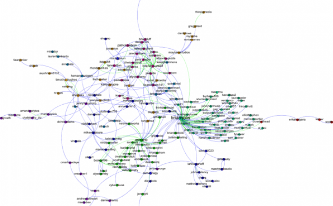
First, I filtered out all of the accounts except those that belong to the largest connected component of the network. This makes the network much more readable, and allows us to focus only on those nodes involved in a large cascade. After trying a few options, I choose the Force Atlas layout algorithm to arrange the nodes. For Twitter networks, I have found Force Atlas to generally give the best layout. Usually, I have to increase the repulsion strength from the default setting of 200 to 2000 or more. Then I resized the nodes according to their degree so we can get a sense for who the most important nodes in the network are. I also tried sizing the nodes by PageRank and eigenvector centrality for comparison. For the most part these different centrality measures didn't make much difference, although one account, @darrenmcd, appears significantly more important according to PageRank or Eigenvector centrality than degree centrality. The Twitter accounts @briansois and @armano standout as the most influential in the network. I colored the nodes according to which community they belong to as identified using Gephi's implementation of the Girvan-Newman modularity based clustering algorithm, and I colored the edges according to the type of relationship between the Twitter accounts. Blue edges are "followed" relationships, green edges are "mentions" and purple edges are "replies to." We can see that almost all of the links to @armano mention the relationship explicitly, and about half of those to @briansois do.

NodeXL is a freely available Excel template that makes it super easier to collect Twitter network data. Once you have the Twitter network data, you can visualize the network with Gephi. Here's how to do it.
Step 0: Start a Twitter account
If you don’t have a Twitter account, the first thing you need to do is go to https://twitter.com/ and start one. Besides the fact that having an account will make getting data faster, it’s good for you to have a little Twitter experience before you dive into the exercise. Once you’ve started an account, you’ll want to follow some people. Here are few suggestions to get you started:
@pjlamberson — of course
@KelloggSchool — self explanatory
@gephi — you know you’re a social dynamics dork when ... you follow @gephi on Twitter
@James_H_Fowler — professor of political science at UCSD and author of seminal studies of social contagion in social networks
@noshir — Noshir Contractor, Northwestern network scientist
@erikbryn — Sloan prof. with lot’s of stuff on economics of information
@jeffely — Northwestern economics / Kellogg prof. and blogger: http://cheaptalk.org/
@RepRules — Kellogg prof. Daniel Diermeier
@sinanaral — Stern prof. who did the active/passive viral marketing study and other cool network research
@duncanjwatts — Duncan Watts research scientist and Yahoo, big time social networks scholar
@ladamic — Michigan prof. who did the viral marketing study and made the political blogs network
And don’t forget to post a tweet! If you are a serious Twitter beginner, check out Twitter 101.
Step 1: Getting the Software
We will be using the software NodeXL to gather the data from Twitter. Besides downloading the data, you can also use NodeXL to visualize and analyze network data, but I prefer to export the data and use another program like Gephi to do the visualization and analysis. NodeXL is an Excel template, but it unfortunately only runs on Excel for Windows. You can download it at: http://nodexl.codeplex.com/ Once you have downloaded and installed the software, open it up by selecting NodeXL Excel Template in the NodeXL folder under All Programs.
Once the program is open, select the NodeXL ribbon.
Step 2: Getting the Data
Now we want to get some Twitter network data. We’re going to collect data on people that follow a person, company, or product, or if you want you can use yourself (this will only be interesting if you have a healthy Twitter presence).

Click on Import and select From Twitter User’s Network. You’ll want to authorize NodeXL to access your Twitter account by selecting the radio button at the bottom and following the onscreen instructions. Once your account is authorized, you should find a company or product on Twitter that you’re interested in (you can do this inside Twitter via a browser). Enter that Twitter username in the dialog box labeled "Get the Twitter network of the user with this username:" For example, if you wanted to collect data on my Twitter account (@pjlamberson) you would enter "pjlamberson" (you don't need the @). For the remaining choices in the pop-up window, select the following options:
Add a vertex for each: Both
Add an edge for each: Followed/following relationship
Levels to include: 1.5
Limit to XXX people — This is a key variable to set and really depends on your level of patience (see Warning: Twitter Rate Limiting below). If this is your first time, I suggest limiting to 200 people. With Twitter's new rate limits, even 200 people will take several hours to collect.
Click OK and wait for the data to download. This may take a while. Be sure that computer is set so that it does not go to sleep during the data collection.
Warning: Twitter Rate Limiting
Twitter limits the number of times per hour fifteen minutes that you can query the API (Application Programming Interface). You may be tempted to request more data — for example the level 2.0 network — or request one set, change your mind and request another etc... This can quickly put you up against the rate limit and you will have to wait an hour before any more data can be downloaded. NodeXL will automatically pause when you reach the Twitter rate limit and wait for an hour to begin downloading data again. If you have time to let your computer run all night (or for several days), then you can increase the limit to more people. However, if you do this you should set your computer so that it does not go to sleep.
Step 3: Exporting the Data
Once you have the data, you can either analyze it within NodeXL or export it to analyze using another program. For example, if you want to analyze the data using Gephi, click on Export and choose the GraphML format. This will create a file that Gephi can open.
Step 4: Visualizing and Analyzing the Network with Gephi
Now that we have the data, we want to create a visualization in Gephi. To open the network data in Gephi, just choose Open from the File menu and select the file that you exported from NodeXL. Initially the network will be a bit of a mess.

To get a better (and more useful) picture we will do four things — size the nodes by eigenvector centrality, color the nodes using a network community finding algorithm, add labels, and change the layout.
Sizing the nodes by Eigenvector Centrality
Eigenvector centrality is one measure of how important a node in a network is (network scientists use the word "centrality" to mean network importance). The simplest measure of centrality is degree centrality: the degree centrality of a node is the number of links that connect to that node divided by the number of nodes in the network minus one (we divide by n-1 because this is the maximum number of connections any node can have and thus rescales degree centrality to lie between 0 and 1). Eigenvector centrality not only takes into account the number of connections a given node has (its degree) but also the "importance" of the nodes on the other ends of those connections.
To size the nodes by eigenvector centrality, we first have to calculate the eigenvector centrality for all of the nodes. One minor annoyance is that NodeXL created an empty column for eigenvector centrality and until we delete that column, Gephi won't be able to do the calculation. To get rid of this column, click on the Data Laboratory tab at the top of Gephi. This will take you to a spreadsheet view of the network data. At the bottom of the window you will see a series of buttons that allow you to manipulate this spreadsheet. Click the "Delete Column" button and choose "Eigenvector Centrality." Now, go back to the Overview view by clicking Overview at the top left of the window. In the Statistics panel, click the Run button next to Eigenvector Centrality (if the Statistics panel is not showing, select it under the Window menu). Click Ok from the pop window that appears. A graph should appear showing the distribution of eigenvector centrality across the nodes in your network. You can just close this window.
Then go to the Ranking panel and select the symbol that looks like a little red diamond (this symbol is used to mean size in Gephi, I have no idea why). From the drop down menu that says "---Choose a rank parameter" select "Eigenvector Centrality." You can adjust the Min/Max size range for the nodes (I use 10 and 50) and then click the Apply button.

The nodes should now be resized so that the largest nodes have the highest eigenvector centrality.
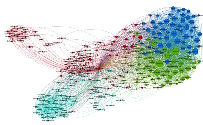
Coloring the Nodes with a Community Finding Algorithm
One of the most interesting things you can look at in a Twitter network are different communities of Twitter accounts. We're going to use a "Modularity based community finding algorithm" to group the network nodes so that the groups have lots of connections within the groups but relatively few between groups.
The first step is to hit the Run button next to Modularity in the Statistics pane. Click OK on the pop-up window and then close the distribution graph that appears. Now, go to the Partition window and hit the refresh button (it looks like two little green arrows pointing in a circle). Choose "Modularity Class" from the "---Choose a partition parameter" drop down menu. Notice that there are several other ways that you can group the nodes (e.g. by time zone) that you may want to come back and explore later. Gephi will show you the different communities it has identified along with the percentage of nodes that belong to each of those communities. For example, Gephi split my Twitter network into four communities. The largest community consist of 38.54% of the nodes and the smallest community contains 18.94% of the nodes.

If you click the Apple button, Gephi will color the communities in the network. If you want to change the colors, just click on the color square in the Partition window. Here's what my network looks like now:

Adding Labels
The next step is to add labels to our network so that we can identify different accounts. This will help us to understand who the important nodes in our network are and what ties together the nodes within the different communities. To show the labels, click the black T at the bottom of the Graph pane. You can resize the labels with the right slider at the bottom of the graph pane. At the moment you probably will have a hard time reading the labels because they overlap one another, but we will fix that in a second.
Using a layout algorithm to rearrange the nodes
To reposition the nodes into a more useful arrangement we will use one of Gephi's built-in layout algorithms. I find that the Force Atlas algorithm works well for Twitter network, but you should play around with the other algorithms as well to find one that works best for the particular network that you have collected. You can select the algorithm from the drop down menu in the Layout pane, and try changing the various layout specific parameters to see what works best. Here's what I'm using:

Hit the Run button to run the algorithm. If your network has a lot of nodes/links (or if your computer is slow), it may take awhile for the algorithm to move them around. Once you've found a nice arrangement, use the "Label Adjust" layout algorithm to move the nodes so that the labels don't cover one another up. Here's what i have now:

The only thing left to do is go over to the Preview window where Gephi will render a nice image for you once you click the Refresh button. You can make final adjustments such as hiding/showing labels and adjusting the label sizes in the Preview Settings Pane. You may have to iterate back and forth a bit between the Overview layout and the Preview to get everything just right.
Here's my finished product:

Bo Olafsson, a Kellogg student that took Social Dynamics and Networks with me this past fall quarter, put together a nice slideshow explaining how a little known Icelandic band, Of Monsters and Men, became a huge US success without ever visiting the country. Check it out:
How an unknown Icelandic band became a huge success in the US without even visiting
View more presentations from Bo Olafsson
Interestingly, Bo's slides have become a mini viral phenomenon themselves garnering press attention in both Iceland and the US:
- Vísir (Icelandic News): Rýnt í vinsældir Of Monsters and Men
- Iceland Review (Icelandic Tourism Magazine - German version): Der erstaunliche Aufstieg Of Monsters and Men
- Iceland Review (Icelandic Tourism Magazine - English verison): Of Monsters and Men Slideshow
- Paste Magazine (US Culture Magazine): How Of Monsters and Men Became The Next Big Thing
- Rjóminn (Icelandic Music blog): Ameríkuævintýri Ævintýri Of Monsters and Men greint í þaula
It seems like we hear a new story every week: a video, or a rumor, or a song, or a commercial has "gone viral," spreading across the web like wildfire, racing to the top of the most tweeted list, and grabbing headlines in real old fashioned news media. These memes can be disgusting (like the Domino's pizza video), controversial (like the recent Kony 2012 video), and entertaining ("Friday" ?). They can be disasters for companies (see Domino's above), or marketing campaigns that reach hundreds of thousand, or even millions, of viewers for relatively little investment (1300 foot drop, the Old Spice Guy). Given the potential impact of these "memes," there is a lot of interest in what exactly determines whether or not a video, or a message, or a rumor goes viral. Here's a simple model that explains why some things do and some things don't.
Let's consider the example of a YouTube video. Suppose that on average, every person that views the video tells c of their friends about it per day (c stands for contacts), and suppose that some fraction i of the people that hear about the video actually watch it and start telling other people about it themselves (i stands for infectivity, and captures something like how interesting the video is.) Finally, suppose that on average, each person that is actively spreading word of the video does so for d days before they get bored and stop telling people about the video (d stands for duration).
To keep things simple, suppose that there are a total of N people in the population, and every one of these people is either actively spreading the video, or not actively spreading the video, but susceptible to becoming a video spreader. Let I denote the number of people currently spreading (i.e. infected) and S the number of people that are susceptible, but not currently spreading the video. So, I+S=N.
To see if the video goes viral or not, we just have to compare the rate at which people are becoming infected to the rate at which people are discontinuing sharing the video. It helps to think of a bath tub — the level of water in the bath tub represents the number of people spreading the video. The rate that water flows in through the faucet is the rate at which new people are becoming infected with the video spreading virus; the rate at which water drains out is the rate at which people are stopping spreading the video. If the rate at which water flows in is higher than the rate at which it drains out, the tub will keep filling up. On the other hand, if the drain is more open than the faucet, the bath tub will never fill up.
So, we have to figure out the rate at which new people are starting to spread the video and the rate at which people currently sharing the video are stopping. The second one is easier. If I people are currently sharing the video and each one of them shares it for d days on average, then each day we expect I/D people to stop spreading the video. For the first rate, we have I people actively sharing the video. On average, each one of them shares the video with c contacts per day, resulting in a total of cI contacts for the whole population. But, not all of these contacts results in a new person sharing the video. First, some of these people will already be sharing the video. The probability that a given person is not currently sharing the video is S/N, the fraction of "susceptible" people in the population. So, we expect cIS/N instances in which a person shares the video with someone that is currently spreading the video. Given such a contact, we said that a fraction i of these will result in a new person sharing the video. Putting it all together, the rate at which new people are becoming infected with the video sharing virus is ciIS/N.
Now we have to compare our two rates. The video will go viral if ciIS/N>I/d. Dividing both sides by I and multiplying both sides by d, this becomes, cidS/N>1. Finally, we can make life a little simpler by assuming that initially almost no one knows about the video, so the number of susceptible people S and the total population N are about the same. Then S/N is approximately 1, so the equation simplifies to just cid>1.
This simple equation tells us whether or not the video will go viral. It says if the average number of contacts, times the infectivity, times the duration is greater than one, the video will spread, otherwise it will die out. Right at cid=1 there is a tipping point; crossing this threshold causes a discontinuous jump in the future.
This model makes a lot of assumptions that don't really hold (big ones are that people have roughly the same # of contacts on average, and the people basically interact at random), but it gives us a basic understanding of the process. Even in more complicated models, where we make fewer simplifying assumptions, there is typically a similar tipping point, and increasing either contacts, infectivity, or duration increases the chance of crossing that threshold.
So, there you have it — everything you need to go viral: a network with enough contacts (c); a product, or message, that sounds interesting enough to be infectious (i), and with enough staying power so that people keep telling their friends about it for a long time (d).
While I've been teaching Social Dynamics and Networks at Kellogg, I've amassed a collection of links to interesting videos on social dynamics. Here they are:
Duncan Watts TEDx talk on "The Myth of Common Sense"
Nicholas Christakis TED talk on "The hidden influence of social networks"; TED talk on "How social networks predict epidemics."
James Fowler talking about social influence on the Colbert Report.
Sinan Aral TEDx talk on "Social contagion"; at PopTech 2010 on "Social contagion"; at Nextwork on "Social contagion"; at the International Conference on Weblogs and Social Media on "Content and causality in social networks."
Scott E. Page on "Leveraging Diversity", and at TEDxUofM on "Putting Milk Crates on the Internet."
Eli Pariser TED talk on "Beware online 'filter bubbles'"
Freakonomics podcast on "The Folly of Prediction"
Damon Centola on "Network Contagion."
Jure Leskovec on "The Web as a Laboratory for Studying Humanity"
There are several good videos of talks from the Web Science Meets Network Science conference at Northwestern: Duncan Watts, Albert-Laszlo Barabasi, Jure Leskovec, and Sinan Aral.
The "Did You Know?" series of videos has some incredible information about, well, information. More info here.
in Contagion / Crowdsourcing / Innovation / Networks / Prediction / Research / Social Media / Tipping Points
0 comments
The Wall Street Journal recently ran an interesting article about the rise of "Big Data" in business decision making. The author, Dennis Berman, makes the case for using big data by pointing out that human decision making is prone to all sorts of errors and biases (referencing Daniel Kahneman's fantastic new book, Thinking, Fast and Slow). There's anchoring, hindsight bias, availability bias, overconfidence, loss aversion, status quo bias, and the list goes on and on. Berman suggests that big data — crunching massive data sets looking for patterns and making predictions — may be the solution to overcoming these flaws in our judgement.
I agree with Berman that big data offers tremendous opportunities, and he's also right to emphasize the ever increasing speed with which we can gather and analyze all that data. But you don't need terabytes of data or a self-organizing fuzzy neural network to improve your decisions. In many cases, all you need is a simple model.
Consider this example from the classic paper, "Clinical versus Actuarial Judgement" by Dawes, Faust and Meehl (1989). Twenty-nine judges with varying ranges of experience were presented with the scores of 861 patients on the Minnesota Multiphasic Personality Inventory (MMPI), which scores patients on 11 different dimensions and is commonly used to diagnose psychopathologies. The judges were asked diagnosis the patients as either psychotic or neurotic and their answers were compared with diagnoses from more extensive examinations that occurred over a much longer period of time. On average the judges were correct 62% of the time, and the best individual judge correctly diagnosed 67% of the patients. But known of the judges performed as well as the "Goldberg Rule". The Goldberg Rule is not a fancy model based on reams of data — it's not even a simple linear regression. The rule is just the following simple formula: add three specific dimensions from the test, subtract two others and compare the result to 45. If the answer is greater than 45 the diagnosis is neurosis, if it less, then psychosis. The Goldberg Rule correctly diagnosed 70% of the patients.
It's impressive that this simple non-optimal rule beat every single individual judge, but Dawes and company didn't stop there. The judges were provided with additional training on 300 more samples in which they were given the MMPI scores and the correct diagnosis. After the training, still no single judge beat the Goldberg Rule. Finally, the judges were given not just the MMPI scores, but also the prediction of the Goldberg Rule along with statistical information on the average accuracy of the formula, and still the rule outperformed every judge. This means that the judges were more likely to override the rule based on their personal judgement when the rule was actually correct than when it was incorrect.
This is just one of many studies that have shown time and time again that simple models outperform individual judgement. In his book, "Expert Political Judgement," Phillip Tetlock examined 28,000 forecasts of political and economic outcomes by experts and concludes, “It is impossible to find any domain in which humans clearly outperformed crude extrapolation algorithms, less still sophisticated statistical ones.”
And the great thing is, you don't have to be a mathematician or statistician to benefit from the decision making advantage of models. As Robyn Dawes has shown, even the wrong model typically outperforms individual judgement. So the next time you face an important decision before you fire up the supercomputer, write down the factors that you think are the most important, assign them weights and add them up. Even something as simple as making a pro and con list and adding the pros and subtracting the cons is likely to result in a better decision. As Dawes writes, “The whole trick is to know what variables to look at and then know how to add.”
Computers are awesome, but they don't know how to do much on their own; you have to train them. Crowdsourcing turns out to be a great way to do this. Suppose you would like to have an algorithm to measure something — like whether a tweet about a movie is positive or negative. You might want to know this so you can count positive and negative tweets about a particular movie and use that information to predict box office success (like Asur and Huberman do in this paper). You could try and think of all of the positive and negative words that you know and then only count tweets that include those words, but you'd probably miss a lot. You could categorize all of the tweets yourself, or hire a student to do it, but by the time you finished the movie would be on late night cable TV. You need a computer algorithm so you can pull thousands of tweets and count them quick, but a computer just doesn't know the difference between a positive tweet and negative tweet until you train it.
That's where the crowd comes in. People can easily judge the tone of a tweet, and you don't have to be an expert to do it. So, what you can do is gather a pile of tweets — say a few thousand — put them up on Amazon Mechanical Turk, and let the crowd label them as positive or negative. At a few cents per tweet you can do this for something in the ballpark of a hundred bucks. Now that you have a pile of labeled tweets, you can train the computer. There's lots of fancy terms for it — language model classifiers, self organizing fuzzy neural networks, ... — but basically, you run a regression. The independent variable is stuff the computer can measure, like how many times certain words appear, and the dependent variable is whether the tweet is positive or negative. You estimate the regression (a.k.a train the classifier) on the tweets labeled by the crowd, and now you have an algorithm that can label new tweets that the crowd hasn't labeled.When the next movie is coming out, you harvest the unlabeled tweets and feed them through the computer to see how many are positive and negative.
This is exactly how Hany Farid at Dartmouth trained his algorithm for detecting how much digital photographs have been altered. On it's own the computer can measure lots of fancy statistical features of the image, but judging how significant the alteration of the image is requires a human. So, he gave lots of pairs of original and altered images to people on MTurk and had them rate how altered the images were. Then he essentially let the computer figure out what image characteristics for the altered images correlate with high alteration scores (but in a much fancier way then just a regular regression). Now, he has a trained algorithm that can read in photographs where we don't have the original and predict how altered the image is.
Yesterday I talked with Scott E. Page from the University of Michigan and Santa Fe Institute and he pointed me to an amazing opportunity. He will be teaching a free online course on complex systems and modeling. The course is called Model Thinking and will start in mid to late January. Scott has a short video introduction to the course on the site.

This seems almost too good to be true. Scott is a fantastic teacher — I have been lucky to co-teach course with him at the University of Michigan and in the ICPSR summer program. He's the author of The Difference, Diversity and Complexity, and Complex Adaptive Systems: An Introduction to Computational Models of Social Life. He's a member of the American Academy of Arts and Sciences. The list goes on and on. He is a super clear thinker and has an infectious enthusiasm for modeling and complex systems.

I would recommend this course to anyone who isn't on the verge of finding a cure for cancer or solving world hunger, because otherwise whatever your doing probably won't be more impactful than taking this course.