Twitter

Crowdsourcing Web Data with Amazon Mechanical Turk Example

The amount of data available on the web is astounding, and if you have the computer programming skills you can often write simple "web scrapping" code to automatically harvest that data. But what if you don't have the computer programming skills? You could spend a lot of time learning those skills, or you could hire someone else to write the code for you, but these options cost time and money. A faster and cheaper solution is to use crowdsourcing. In this post I will walk through an example of using Amazon Mechanical Turk for collecting data from the web.

In this example I have a list of Twitter IDs and I want to find the Twitter account name associated with each of those IDs. Every Twitter account has a unique ID number that never changes, but the Twitter account name, or "handle," is the more commonly used way of identifying a Twitter user. For example, my Twitter ID is 16016329 and my Twitter account name is @pjlamberson. (You can find your Twitter ID here.) You could use this same procedure to have workers look up any data on the web — for example, to collect online reviews, telephone numbers, addresses, or any other type of online data.

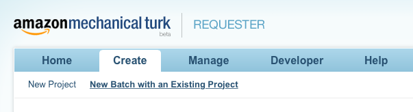
The first thing to do is go to Amazon Mechanical Turk and click on Get Started on the Get Results side of the screen. Click Create an Account and register as a Requester. Once you're back to the main requester screen click Create, then click New Project.

create

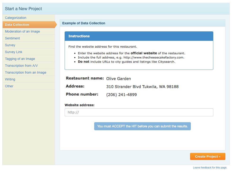
There are many types of tasks (aka HITs=Human Intelligence Tasks) that Amazon Mechnical Turk workers (aka "Turkers") can do. In this example, we are going to use the Data Collection task. So, click on Data Collection and then click Create Project.

datacollection


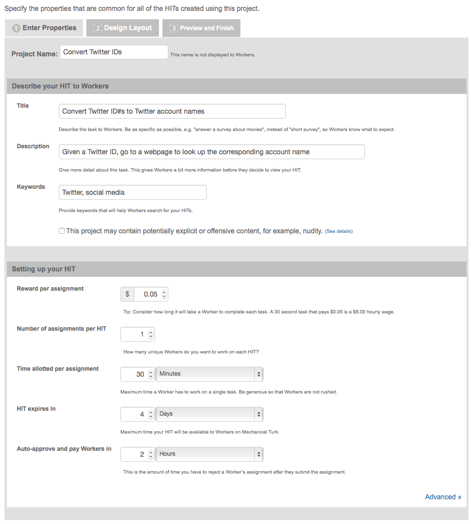
On the next screen you enter the properties for your project including how much you want to pay per HIT and how many people you want to complete each task. You can see the properties I chose below, but you may want to change your properties if you expect your task to take longer or if you want multiple workers to complete each HIT to ensure higher quality data.

When you're finished specifying your project properties, click on Design Layout.

For my data collection task I have a spreadsheet full of Twitter IDs. You can see a sample of the spreadsheet at: http://bit.ly/mTurkData

For each row in the spreadsheet, I need the Turker to go to the web address https://twitter.com/intent/user?user_id=XXXXXXXXXXX where XXXXXXXXXXX is replaced with the Twitter ID in that row of the spreadsheet. The corresponding instructions for this task to the Turker are shown below.

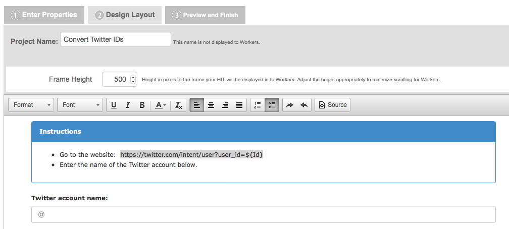
To refer to the variable ID that shows up in my spreadsheet I use the syntax ${Id}. The name of the variable Id matches the header of the corresponding column in my spreadsheet. Mechanical Turk will automatically create one HIT for each row of my spreadsheet. If I have multiple variables that change for each HIT, you can have multiple columns in the spreadsheet and refer to a column with column header "ColumnX" with ${ColumnX} in your instructions. For each HIT, the placeholder ${ColumnX} will be replaced with the content of the variable ColumnX from the spreadsheet from a given row of your spreadsheet.

The HTML source code for the HIT design shown above is available at http://bit.ly/mTurkSource If you click on the Source button on your Design Layout page, you can replace the example source code with this to reproduce my HIT.

Once you have entered your instructions to the Turkers, hit Preview. If the instructions look like you want them to (note the variable placeholder will still be just a placeholder until you upload your spreadsheet later), hit Finish.

Now you need to upload the spreadsheet containing the variables that change for each HIT and open up the job to the Turkers. To do this click Publish Batch and then click Choose File. Your spreadsheet should be in csv format, have one row for each HIT, and one column for each variable that changes from HIT to HIT. In my case, there is just the one variable, Id. Once you have selected your file, click Upload.

Now you will see a preview of your HITs with the variable(s) filled in with values from your spreadsheet. In my case, I have this:

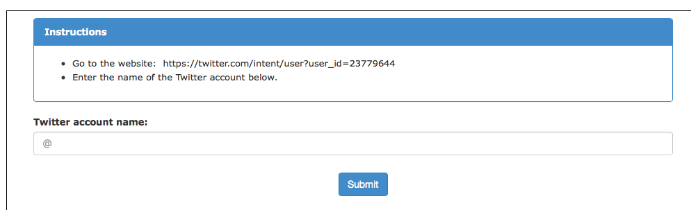
Now, instead of ${Id} showing up in the web address, the first Twitter Id from my spreadsheet, 23779644, has been substituted. By clicking on Next HIT, you can see the other HITs that have been created using the data from the spreadsheet. Take a look at a few to make sure everything looks like you want to and then click Next.

On the next page you will see how much your batch of HITs is going to cost, which is a combination of the per HIT fee you set to pay the Turkers and the fee Amazon charges you to use the service. You may need to add funds to your account through Amazon payments in order to pay for the work. Once you have done that click Publish HITs and wait for the magic to happen.

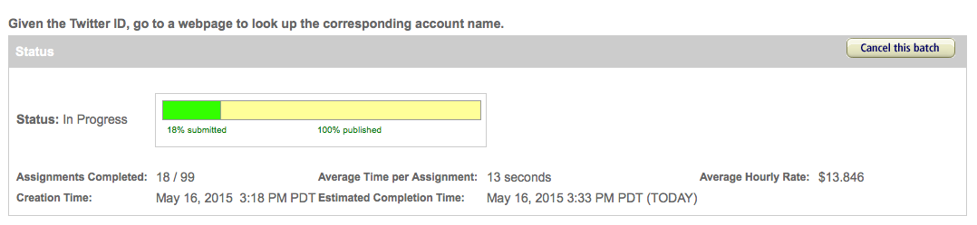
This is the fun part. While you surf the web aimlessly, go grab a coffee, play solitaire, or get some really important work done, the tasks you posted are being completed by members of the thousands of Turkers that you are connected to through the platform. It's as if you're the CEO of a major company with a massive workforce waiting to do your bidding at a moments notice. You can watch the progress the Turkers are making on the results page.

In short order your tasks will be complete and you can see what the Turkers came up with by clicking the Results button. Here is a portion of my results:

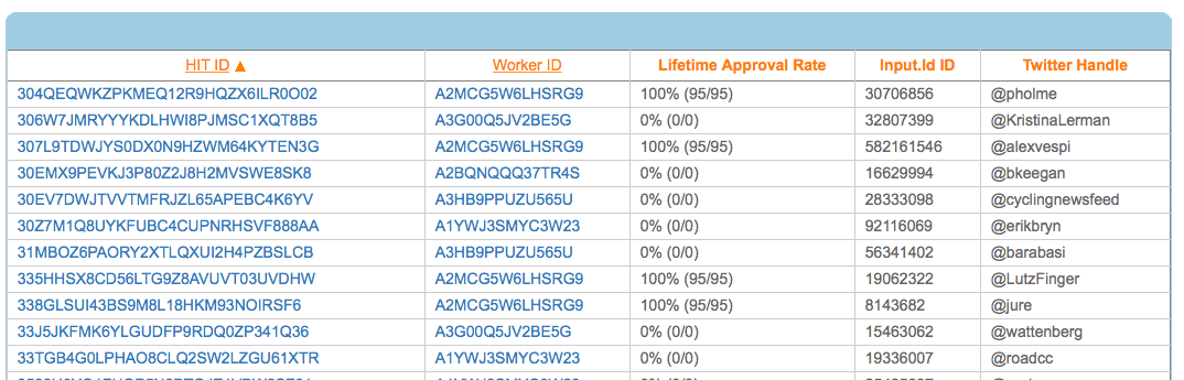
If you're satisfied with the results you can approve them so that the Turkers get paid, or if a Turker did not do a satisfactory job you can reject the work. If you do nothing, the HITs will automatically be approved after a set time that you specified when setting up the HITs. To download the results just click on Download CSV and then right click and select Download linked file... on the here link and you're all set!

#socialDNA at Kellogg

One of the cool things about the Social Dynamics and Network Analytics (Social-DNA) course that I teach at Kellogg is that there are lots of new research articles, news stories, magazine articles, and blog entries coming out all of the time that are relevant to the course content. To help facilitate conversation about these current events, this quarter we're introducing #socialDNA on Twitter. Anytime you come across something relevant to the course topics (which you can read more about here), tweet about it with the hashtag #socialDNA. We're asking all of the current students to tweet a #socialDNA tweet at least once during the quarter (just retweeting someone else's #socialDNA tweet doesn't count!) We also hope that former Social DNA students will get involved too and this will provide a way for alumni of the course to stay connected with the latest Social Dynamics research and current events.

If you don’t have a Twitter account, the first thing you need to do is go to https://twitter.com/ and start one. Once you’ve started an account, you’ll want to follow some people. Here are few suggestions to get you started:
@pjlamberson — of course
@KelloggSchool — self explanatory
@SallyBlount — Dean of Kellogg School of Management
@gephi — you know you’re a social dynamics dork when … you follow @gephi on Twitter
@NICOatNUNorthwestern Institute on Complex Systems (NICO)
@James_H_Fowler — professor of political science at UCSD and author of seminal studies of social contagion in social networks
@noshir — Noshir Contractor, Northwestern network scientist
@erikbryn — Sloan prof. with lot’s of stuff on economics of information
@jeffely — Northwestern economics / Kellogg prof. and blogger: http://cheaptalk.org/
@RepRules — Kellogg prof. Daniel Diermeier
@sinanaral — Stern prof. who did the active/passive viral marketing study and other cool network research
@duncanjwatts — Duncan Watts research scientist and Yahoo, big time social networks scholar
@ladamic — Michigan prof. who did the viral marketing study and made the political blogs network

And don’t forget to post a tweet! If you are a serious Twitter beginner, check out Twitter 101.

Gun Control and Homophily in Social Networks

Last week the website of The Atlantic had a nice network visualization of the top tweets linking to articles on gun politics. You should go check out their site where the network visualization is interactive, but here is a static picture so you get the idea. Homophily in the network of gun politics tweets

Each node in this network is one of the top 100 most tweeted weblinks on gun politics during the week from Sunday 2/17 to Sunday 2/24. The creator of the network visualization collected all of the tweets that mentioned terms like "gun rights," "gun control," "gun laws," etc. and then looked for the most popular links in those tweets. (One thing I wonder about is how they dealt with shortened URLs. Since tweets are limited to 140 characters or less, when most people post a link on Twitter they shorten the URL using a service like bit.ly. This means that two people that are ultimately linking to the same article might post different URLs. Many news services have a built in "Tweet this" button, which may give the same shortened URL to everyone who clicks it, so those articles would get many consistent links, where articles or posts without a "Tweet this" button might have many links pointing to them, but all with different URLs coming from each time a person shortened the link individually. All of this is just a technical aside though, because I am a 100% sure the main point of the network visualization, which I haven't even gotten to yet, would still show up.)

The edges in the network visualization connect two pages if the same Twitter account posted links to both pages. The point is that we see two very distinct clusters with lots of edges within the clusters and not too many between them. Of course, taking a loser look at the network visualization we see that one of the groups consists of pro gun control articles and the other contains anti gun control pages. The network science term for this phenomenon is homophily i.e. nodes are more likely to connect to other nodes that are similar to them. Homophily shows up in lots and lots of networks. Political network visualizations almost always exhibit extreme homophily. For example, take a look at this network of political blogs created by Lada Adamic and Natalie Glance (they have generously made the data available here).

Homophily in political blogsIn this network the nodes are blogs about politics and two blogs are connected if there is a hyperlink from one blog to another. Blue blogs are liberal blogs and red blogs are conservative.

Or, take a look at this network of senators created by a group in the Human-computer Interaction Lab at the University of Maryland.

Homophily in the Senate

Here, the nodes are senators and two senators are connected if they voted the same way on a threshold number of roll call votes.

Homophily shows up in other types of social networks as well, not only political networks. For example, take a look at this network of high school friendships from James Moody's paper "Race, school integration, and friendship segregation in America," American Journal of Sociology 107, 679-716 (2001).

Homophily in high school friendships

Here the nodes are students in a high school and two nodes are connected if one student named the other student as friend (the data was collected as part of the Add Health study). The color of the nodes corresponds to the race of the students. As we can see, "yellow" students are much more likely to be friends with other yellow students and "green" students are more likely to connect to other green students. (Interestingly, the "pink" students, who are in the vast minority seem to be distributed throughout the network. I once heard Matt Jackson say that this is the norm in many high schools — if there are two large groups and one small one, the members of the small group end up identifying with one or the other of the two large groups.)

Homophily is actually a more subtle concept than it appears at first. The thorny issue, as is often the case, is causality. Why do similar nodes tend to be connected to one another? The problem is so deeply ingrained in the concept of homophily that it sometimes leads to ambiguity in the use of the term itself. Some people use the word homophily to refer to the observation that nodes in a network are more likely to connect to similar nodes in the network than we would expect due to chance. In this case, there is no mention of the underlying reason why similar nodes are connected to one another, just that they are.  When other people use the term homophily, they mean the tendency for nodes in a network to select similar nodes in the network to form connections with. To keep the distinction clear, some people even refer to the former definition as observed homophily. 

To understand the difference it helps to think about other reasons why we might see similar nodes preferentially connected to one another. The casual stories fall into three basic categories: influence, network dynamics, and exogenous covariates. For many people, the influence story is the most interesting. In this explanation, we imagine that the network of connections already exists, and then nodes that are connected to one another affect each other's characteristics so that network neighbors end up being similar to one another. For example, in a series of papers looking at a network of friends, relatives, and geographic neighbors from the Framingham Heart study, Christakis and Fowler argue that network neighbors influence one another's weight, tendency to smoke, likelihood to divorce, and depression. While not everyone is convinced by Christakis and Fowler's evidence for a contagion effect, we can all agree that in their data obese people are more likely to be connected to other obese people, smokers tend to be friends with smokers, people that divorce are more likely to be connected to others that divorce, and depressed folks are more likely to be connected to other depressed people than we would expect due to chance.

In the network dynamics story, nodes form or break ties in a way that shows a preference for a particular attribute. Our intuition is that liberal blogs like to link to other liberal blogs more than they like to link to conservative blogs. This is what some people take as the definition of homophily. Since the word literally means "love of the same" this makes some sense.

But, just because we see observed homophily doesn't mean people are preferentially linking to other people that are like them. This is reassuring when we see homophily on dimensions like race as in the high school friendship network above. Clearly, the students are not influencing the race of their friends, but this doesn't mean the fact that we observe racial homophily doesn't imply the students are racist — there could be what we call an exogenous covariate that is leading to the observation of homophily. For example, it could be that these students leave in a racially segregated city and students are more likely to be friends with other students that live close to them. In this case, students prefer to be friends with other students that live near them, and living near one another just happens to increase the likelihood that the students share the same race.   One particularly tricky covariate is having a friend in common. Another common observation in social networks is what is called triadic closure. In lay terms, triadic closure means that two people with a friend in common are likely to be friends with each other — the triangle closes instead of remaining an open like a V. It could be that, in the high school friendship network, there is a sight tendency for some students to choose others of their same race as friends; either because of another variable like location or because of an actual racial bias, but the appearance of racial homophily could be significantly amplified by triadic closure. If one student chooses two friends that are of the same race, triadic closure is likely to result in third same race tie. It turns out that, at least in some cases where scholars have been able to untangle these various stories, triadic closure and homophily on other covariates explains a lot of observed racial homophily (see e.g. Wimmer and Lewis or Kossinets and Watts).

So, what about the gun control network? In this case, we can rule out influence, since the articles had to already exist and have a stance on gun control before someone can tweet a link to them. That is, the "state" of the node as pro or anti gun control precedes the formation of a tie connecting them in the Atlantic's network. But as far as the other explanations go, it's probably a mix. An obvious exogenous covariate is source. If I read news on the website of MSNBC and you go to the Fox website, I'm more likely to tweet links to pro gun control articles and your more likely to to tweet anti gun control links, even if we are both just tweeting links to every gun control article we read. Undoubtedly though, many people are using Twitter as a way to spread information that supports their own political opinions, so someone that is pro gun control will tweet pro gun control links and vice versa. This however doesn't mean that gun control advocates aren't reading 2nd amendment arguments and gun rights supporters aren't reading what the gun control folks have to say — it just means that they aren't broadcasting it to the rest of the world when they do.

Gephi FAQ

Students in my Kellogg MBA and EMBA Social Dynamics and Networks classes do a lot of work using the network analysis and visualization software package Gephi. As with any unfamiliar software, there are often a few bumps along the road. I thought it would be helpful to compile a Gephi FAQ, so I scanned through my old emails looking for Gephi questions and have posted some of the most common ones here along with their answers.

Q1. How can I filter the network so that I only see the largest connected component?

A. In the statistics window, click the run button next to connected components. Then, switch to the filters window. Select the Attributes folder, then the Partition folder. Then drag the "Component ID (Node)" filter down to the Queries window where it says "Drag filter here". You can select which component(s) you want to see by clicking on the check boxes next to the component numbers where it says "Partition (Component ID) Settings" You can see what fraction of the nodes belong to each component as a percentage next to each component number, so if you only want to see the largest connected component, chose the one with the highest percentage. Then click Filter.

Q2. When I try to export my graph as a pdf, Gephi clips the node labels so that I can't see all of them. How do I fix this?

A. When Gephi exports the image, it only pays attention to nodes and links, not the labels, when it decides where to clip the image. As a result, sometimes labels near the edge of the image get clipped off. To make sure you get the full image, after you have clicked the export button, look for the Options... button at the bottom of the Export popup window. Click it and then increase the margins. Click OK and proceed to export your image. If the labels are still clipped, go back and increase the margins again until the full labels appear.

Q3. I imported a graphml data file and I'm trying to use eignevector centrality (PageRank, HITS, …) to identify important nodes, but when I try to run the eigenvector centrality calculation from the Statistics window nothing happens. How do I fix this?

A. The problem is that the graphml file that you imported already has (empty) columns corresponding to the measures that you want to calculate and Gephi won't overwrite them. To fix this, you first have to delete those columns. Go into the data laboratory tab and delete any of the columns that have to do with measures of centrality like eigenvector centrality, closeness centrality, betweeness centrality, page rank, anything that looks like that.  Once you have done that go back to the overview window and then run the calculation that you want under the statistics tab. If the little window pops up with the graphs, then everything is working, if it doesn't then you need to go back to the data laboratory and delete some more columns.

Q4. I imported a node attribute that I want to use to resize my nodes, but it isn't showing up under the ranking tab. How do I fix this?

A. The most likely problem is that the node attribute is identified as the wrong type of data — probably a String, when it needs to be a numeric type such as BigInteger. The easiest way to fix this is to click Duplicate column in the data laboratory and then be sure to select a numeric type (e.g. BigInteger or BigDecimal) for the duplicated column. Once you're done you can delete the original node attribute column. The duplicated numeric column should now be accessible in the rankings window.

Q5. I'm trying to import an adjacency matrix that I have in a csv file, but I keep getting the  java runtime error “java.lang.RuntimeException: java.lang.NullPointerException” What do I do?

A. For some reason, when importing an adjacency matrix Gephi expects a csv file with semicolon separators, not commas. Just open your csv file using a simple text editor like NotePad or TextEdit and then use the Find/replace command to change all of the commas to semicolons.

Q6. I have a network in which there are different types of nodes (e.g. doctors and patients) and I would like to color the different types using different colors. How do I do this?

A. You need to import a new node attribute that gives the type for each node. To add a node attribute, create a spreadsheet with one column labeled Id that contains a list of all of the names of the nodes in your network. Be sure these are the same names that appear under the ID column in the Data Laboratory in Gephi. Then add additional columns to the spreadsheet that give the node attributes for each node. For example, you might have a column called "type" with entries like "doctor" or "patient" that tells whether the corresponding node is a doctor or a patient. Once you have created your spreadsheet, export it as a csv. Now, go back to Gephi with your existing network file open. Under Data Laboratory, select Import Spreadsheet, and choose Nodes Table. Make sure that the button “Force Nodes to be Created as New Ones” is not checked. and import the spreadsheet. This should add a new column to the nodes table in the data laboratory. Then, using the partition tab, you can color the nodes according to this attribute.

Q7. I'm trying to import an adjacency matrix from a csv file, but I'm getting the error "java.lang.RuntimeException: java.lang.Exception: Inconsistent number of matrix lines compared to the number of labels” What do I do?

A. One thing to try is removing any extra spaces from your csv file. Sometimes these trip up the import. Open the csv file using a simple text editor like NotePad or TextEdit, and then use find/replace to remove any spaces. Save the adjacency matrix and then try importing it again.

Q8. I'm trying to import an edge list, but I just get a bunch of nodes with no edges. What's going wrong?

A. Make sure that when you're importing the edge list from the data laboratory that you select  "Edges Table" in the drop down menu and not "Nodes Table." Otherwise it just thinks your bringing in a list of nodes.

Q9. I want to add labels to my network, but when I click the little black T, no labels show up (or the label isn't what I want it to be). How do I get the (right) labels?

A. You need to feel Gephi which column you want it to use for the labels. By default, Gephi uses the data in the column "Labels." To change which column is used, from the over view screen, click the small triangle in the lower right hand corner of the Graph window, which will reveal an extra settings pane. Then choose the Labels tab. On the far right hand side of this window, click "Configure…" then put a check mark next to any of the attributes that you would like to show up as labels. Alternatively, in the Data Laboratory, you can just copy the column that you want to use as labels in to the labels column.

Q10. When I try and import an edge list, Gephi says I need Source and Target columns, but I already have Source and Target columns. What's going on?

A. There are probably extra spaces after the words Source and Target in your column headers. If you delete these spaces you should be able to import the edge list.

Visualizing Contagious Twitter Memes with NodeXL and Gephi

In the last post we explored how to use NodeXL to collect a Twitter user's network data. Now, I'll describe how to collect data on a trending topic.

To get started, follow steps 0 and 1 here to setup a Twitter account and download the NodeXL software. Then, to download the network data, click on Import and select From Twitter Search Network… In the first dialog box, enter the search term that you want to look for. Any account that recently posted a tweet containing this phrase will end up being a node in your network.  In the book, "Analyzing Social Media Networks with NodeXL," there is some good advice on choosing an appropriate trending topic to look at:

"First, the search phrase has to concern a recent event. Though Twitter has been around for several years, the volume of information being produced every second is so huge that the search interface has limits on how many tweets it will return for a given query, or how old tweets can be. Searching for "2008 Election" may in theory produce a valuable set of tweets about the election cycle, but in practice those tweets are too far back in time for the search interface to collect them efficiently. The second criterion is that the search phrase has to relate to a piece of news, promotion, event, and so on that is u contagious" (i.e., Twitter users who see the message will, at least in principle, want to pass it on to their followers). A search phrase like "Thanksgiving" is a trending topic on Twitter (shortly before and on Thanksgiving) but lacks a contagious property-there is no need to pass on the message because a large fraction of the population already knows about it, so tweets about Thanksgiving are independent events rather than the sign of a "Thanksgiving meme" spreading throughout the Twitter population."

One good way to do this is look through the recent tweets of a popular user for something that you think would be sufficiently interesting that other people would retweet the message. For example, in the network below, I gathered data on tweets containing the phrase "Who Googled You?" This Twitter meme originated with Pete Cashmore, of @mashable, and links to a Mashable article that describes a way to find out who has been searching for you on Google. The article generated a flurry of interest and many other people tweeted links to the article, generally repeating the original article title, "Who Googled You?" Since this meme spread from person to person, it was a good candidate for visualizing as a Twitter search network. Untitled

You can select what relationships you want to use to define the edges of your network by selecting any combination of the following choices:

Follows relationship — two accounts are connected if one account follows the other.
"Replies-to" relationship in tweet — two accounts are connected if one account replies to the other in its tweet.
"Mentions" relationship in tweet — two accounts are connected if one account mentions the other account in its tweet.

As discussed in the previous post, because of Twitter rate limits, it is advisable to limit your request to a fixed number of people. Unless you are especially patient, I recommend starting with just 300 people.

Once you download the data using NodeXL, I like to export it as a graphml file and then visualize it in Gephi. In this example, I did a few things to make the visualization more meaningful, which I describe below.

Before getting started with manipulating the network in Gephi, it is a good idea to go into the Data Laboratory and delete some of the columns that NodeXL created. You should delete anything having to do with the color or size of the nodes or edges, or centrality measures such as PageRank and eigenvector centrality. These columns are generally empty, but unless you delete them, Gephi won't overwrite them when you ask it to calculate these measures, so you won't be able to calculate and make use of them in your analysis. For some general tips on using Gephi, check out the FAQ here.

First, I filtered out all of the accounts except those that belong to the largest connected component of the network. This makes the network much more readable, and allows us to focus only on those nodes involved in a large cascade. After trying a few options, I choose the Force Atlas layout algorithm to arrange the nodes. For Twitter networks, I have found Force Atlas to generally give the best layout. Usually, I have to increase the repulsion strength from the default setting of 200 to 2000 or more. Then I resized the nodes according to their degree so we can get a sense for who the most important nodes in the network are. I also tried sizing the nodes by PageRank and eigenvector centrality for comparison. For the most part these different centrality measures didn't make much difference, although one account, @darrenmcd, appears significantly more important according to PageRank or Eigenvector centrality than degree centrality. The Twitter accounts @briansois and @armano standout as the most influential in the network. I colored the nodes according to which community they belong to as identified using Gephi's implementation of the Girvan-Newman modularity based clustering algorithm, and I colored the edges according to the type of relationship between the Twitter accounts. Blue edges are "followed" relationships, green edges are "mentions" and purple edges are "replies to." We can see that almost all of the links to @armano mention the relationship explicitly, and about half of those to @briansois do.

WhoGoogledYou

Collecting and Visualizing Twitter Network Data with NodeXl and Gephi

NodeXL is a freely available Excel template that makes it super easier to collect Twitter network data. Once you have the Twitter network data, you can visualize the network with Gephi. Here's how to do it.

Step 0: Start a Twitter account

If you don’t have a Twitter account, the first thing you need to do is go to https://twitter.com/ and start one. Besides the fact that having an account will make getting data faster, it’s good for you to have a little Twitter experience before you dive into the exercise. Once you’ve started an account, you’ll want to follow some people. Here are few suggestions to get you started:
@pjlamberson — of course
@KelloggSchool — self explanatory
@gephi — you know you’re a social dynamics dork when ... you follow @gephi on Twitter
@James_H_Fowler — professor of political science at UCSD and author of seminal studies of social contagion in social networks
@noshir — Noshir Contractor, Northwestern network scientist
@erikbryn — Sloan prof. with lot’s of stuff on economics of information
@jeffely — Northwestern economics / Kellogg prof. and blogger: http://cheaptalk.org/
@RepRules — Kellogg prof. Daniel Diermeier
@sinanaral — Stern prof. who did the active/passive viral marketing study and other cool network research
@duncanjwatts — Duncan Watts research scientist and Yahoo, big time social networks scholar
@ladamic — Michigan prof. who did the viral marketing study and made the political blogs network

And don’t forget to post a tweet! If you are a serious Twitter beginner, check out Twitter 101.

Step 1: Getting the Software

We will be using the software NodeXL to gather the data from Twitter. Besides downloading the data, you can also use NodeXL to visualize and analyze network data, but I prefer to export the data and use another program like Gephi to do the visualization and analysis. NodeXL is an Excel template, but it unfortunately only runs on Excel for Windows. You can download it at: http://nodexl.codeplex.com/ Once you have downloaded and installed the software, open it up by selecting NodeXL Excel Template in the NodeXL folder under All Programs.

Once the program is open, select the NodeXL ribbon.

Step 2: Getting the Data

Now we want to get some Twitter network data. We’re going to collect data on people that follow a person, company, or product, or if you want you can use yourself (this will only be interesting if you have a healthy Twitter presence).

Click on Import and select From Twitter User’s Network. You’ll want to authorize NodeXL to access your Twitter account by selecting the radio button at the bottom and following the onscreen instructions. Once your account is authorized, you should find a company or product on Twitter that you’re interested in (you can do this inside Twitter via a browser). Enter that Twitter username in the dialog box labeled "Get the Twitter network of the user with this username:" For example, if you wanted to collect data on my Twitter account (@pjlamberson) you would enter "pjlamberson" (you don't need the @). For the remaining choices in the pop-up window, select the following options:

Add a vertex for each: Both
Add an edge for each: Followed/following relationship
Levels to include: 1.5
Limit to XXX people — This is a key variable to set and really depends on your level of patience (see Warning: Twitter Rate Limiting below). If this is your first time, I suggest limiting to 200 people. With Twitter's new rate limits, even 200 people will take several hours to collect.

Click OK and wait for the data to download. This may take a while. Be sure that computer is set so that it does not go to sleep during the data collection.

Warning: Twitter Rate Limiting

Twitter limits the number of times per hour fifteen minutes that you can query the API (Application Programming Interface). You may be tempted to request more data — for example the level 2.0 network — or request one set, change your mind and request another etc... This can quickly put you up against the rate limit and you will have to wait an hour before any more data can be downloaded. NodeXL will automatically pause when you reach the Twitter rate limit and wait for an hour to begin downloading data again. If you have time to let your computer run all night (or for several days), then you can increase the limit to more people. However, if you do this you should set your computer so that it does not go to sleep.

Step 3: Exporting the Data

Once you have the data, you can either analyze it within NodeXL or export it to analyze using another program. For example, if you want to analyze the data using Gephi, click on Export and choose the GraphML format. This will create a file that Gephi can open.

Step 4: Visualizing and Analyzing the Network with Gephi

Now that we have the data, we want to create a visualization in Gephi. To open the network data in Gephi, just choose Open from the File menu and select the file that you exported from NodeXL. Initially the network will be a bit of a mess.

To get a better (and more useful) picture we will do four things — size the nodes by eigenvector centrality, color the nodes using a network community finding algorithm, add labels, and change the layout.

Sizing the nodes by Eigenvector Centrality

Eigenvector centrality is one measure of how important a node in a network is (network scientists use the word "centrality" to mean network importance). The simplest measure of centrality is degree centrality: the degree centrality of a node is the number of links that connect to that node divided by the number of nodes in the network minus one (we divide by n-1 because this is the maximum number of connections any node can have and thus rescales degree centrality to lie between 0 and 1). Eigenvector centrality not only takes into account the number of connections a given node has (its degree) but also the "importance" of the nodes on the other ends of those connections.

To size the nodes by eigenvector centrality, we first have to calculate the eigenvector centrality for all of the nodes. One minor annoyance is that NodeXL created an empty column for eigenvector centrality and until we delete that column, Gephi won't be able to do the calculation. To get rid of this column, click on the Data Laboratory tab at the top of Gephi. This will take you to a spreadsheet view of the network data. At the bottom of the window you will see a series of buttons that allow you to manipulate this spreadsheet. Click the "Delete Column" button and choose "Eigenvector Centrality." Now, go back to the Overview view by clicking Overview at the top left of the window. In the Statistics panel, click the Run button next to Eigenvector Centrality (if the Statistics panel is not showing, select it under the Window menu). Click Ok from the pop window that appears. A graph should appear showing the distribution of eigenvector centrality across the nodes in your network. You can just close this window.

Then go to the Ranking panel and select the symbol that looks like a little red diamond (this symbol is used to mean size in Gephi, I have no idea why). From the drop down menu that says "---Choose a rank parameter" select "Eigenvector Centrality." You can adjust the Min/Max size range for the nodes (I use 10 and 50) and then click the Apply button.

The nodes should now be resized so that the largest nodes have the highest eigenvector centrality.

Coloring the Nodes with a Community Finding Algorithm

One of the most interesting things you can look at in a Twitter network are different communities of Twitter accounts. We're going to use a "Modularity based community finding algorithm" to group the network nodes so that the groups have lots of connections within the groups but relatively few between groups.

The first step is to hit the Run button next to Modularity in the Statistics pane. Click OK on the pop-up window and then close the distribution graph that appears. Now, go to the Partition window and hit the refresh button (it looks like two little green arrows pointing in a circle). Choose "Modularity Class" from the "---Choose a partition parameter" drop down menu. Notice that there are several other ways that you can group the nodes (e.g. by time zone) that you may want to come back and explore later. Gephi will show you the different communities it has identified along with the percentage of nodes that belong to each of those communities. For example, Gephi split my Twitter network into four communities. The largest community consist of 38.54% of the nodes and the smallest community contains 18.94% of the nodes.

If you click the Apple button, Gephi will color the communities in the network. If you want to change the colors, just click on the color square in the Partition window. Here's what my network looks like now:

Adding Labels

The next step is to add labels to our network so that we can identify different accounts. This will help us to understand who the important nodes in our network are and what ties together the nodes within the different communities. To show the labels, click the black T at the bottom of the Graph pane. You can resize the labels with the right slider at the bottom of the graph pane. At the moment you probably will have a hard time reading the labels because they overlap one another, but we will fix that in a second.

Using a layout algorithm to rearrange the nodes

To reposition the nodes into a more useful arrangement we will use one of Gephi's built-in layout algorithms. I find that the Force Atlas algorithm works well for Twitter network, but you should play around with the other algorithms as well to find one that works best for the particular network that you have collected. You can select the algorithm from the drop down menu in the Layout pane, and try changing the various layout specific parameters to see what works best. Here's what I'm using:

Hit the Run button to run the algorithm. If your network has a lot of nodes/links (or if your computer is slow), it may take awhile for the algorithm to move them around. Once you've found a nice arrangement, use the "Label Adjust" layout algorithm to move the nodes so that the labels don't cover one another up. Here's what i have now:

The only thing left to do is go over to the Preview window where Gephi will render a nice image for you once you click the Refresh button. You can make final adjustments such as hiding/showing labels and adjusting the label sizes in the Preview Settings Pane. You may have to iterate back and forth a bit between the Overview layout and the Preview to get everything just right.

Here's my finished product:

Training Computers with Crowds

Computers are awesome, but they don't know how to do much on their own; you have to train them. Crowdsourcing turns out to be a great way to do this. Suppose you would like to have an algorithm to measure something — like whether a tweet about a movie is positive or negative. You might want to know this so you can count positive and negative tweets about a particular movie and use that information to predict box office success (like Asur and Huberman do in this paper). You could try and think of all of the positive and negative words that you know and then only count tweets that include those words, but you'd probably miss a lot. You could categorize all of the tweets yourself, or hire a student to do it, but by the time you finished the movie would be on late night cable TV. You need a computer algorithm so you can pull thousands of tweets and count them quick, but a computer just doesn't know the difference between a positive tweet and negative tweet until you train it.

That's where the crowd comes in. People can easily judge the tone of a tweet, and you don't have to be an expert to do it. So, what you can do is gather a pile of tweets — say a few thousand — put them up on Amazon Mechanical Turk, and let the crowd label them as positive or negative. At a few cents per tweet you can do this for something in the ballpark of a hundred bucks. Now that you have a pile of labeled tweets, you can train the computer. There's lots of fancy terms for it — language model classifiers, self organizing fuzzy neural networks, ... — but basically, you run a regression.  The independent variable is stuff the computer can measure, like how many times certain words appear, and the dependent variable is whether the tweet is positive or negative. You estimate the regression (a.k.a train the classifier) on the tweets labeled by the crowd, and now you have an algorithm that can label new tweets that the crowd hasn't labeled.When the next movie is coming out, you harvest the unlabeled tweets and feed them through the computer to see how many are positive and negative.

This is exactly how Hany Farid at Dartmouth trained his algorithm for detecting how much digital photographs have been altered.  On it's own the computer can measure lots of fancy statistical features of the image, but judging how significant the alteration of the image is requires a human. So, he gave lots of pairs of original and altered images to people on MTurk and had them rate how altered the images were.  Then he essentially let the computer figure out what image characteristics for the altered images correlate with high alteration scores (but in a much fancier way then just a regular regression).  Now, he has a trained algorithm that can read in photographs where we don't have the original and predict how altered the image is.

A Gephi Visualization of Gephi on Twitter

This is a visualization of Twitter accounts that follow and are followed by @gephi that I made using ... Gephi. I collected the data using NodeXL. Two accounts are linked in the network if one follows the other on Twitter. Nodes are sized according to their degree. The modularity clustering algorithm finds 8 different groups among the accounts.  The blue group in the upper left, where I live, contains most of the network science crowd: @duncanjwatts, @ladadimc, @barabasi, @davidlazer, etc... The green group in the lower right seem to be data/visualization folks. I filtered out all of the nodes with degree less than four, before which there is a large contingent of accounts that followed @gephi, but with no other connections in the network.

Why Google Ripples will be a lot less cool than it sounds.

Google + now has a new feature, Ripples, that allows you to see a network visualization of the diffusion of a post (see the Gizmodo article here).  The pictures are cool, but the original post has to be public, and then it has to be shared by one Google+ user to other Google+ users.  But, the chance of interesting ripples happening very often are pretty slim; here's why.

Bakshy, Hofman, Mason, and Watts looked at exactly this kind of cascade on Twitter, which is a great platform for this kind of research for several reasons.  First, everything is effectively public, so there are none of the privacy issues of Facebook, and we don't have to limit ourselves to looking at just the messages that people choose to make public like we do on Google +.  Second, "retweeting" messages is an established part of Twitter culture, so we expect to find cascades. Finally, since tweets are limited to 140 characters, links are often shortened using services like bit.ly.  This means that if I create a link to a New York Times article and you create a link to the same page independently, those links will be different, so the researchers can tell the difference between a cascade that my post creates and one that yours creates.

Some of the cascades that Bakshy et al. found are shown in this figure.

They looked at 74 million chains like these initiated by more than 1.6 million Twitter users during two months in 2009.  A lot of interesting things came out of the study, but the most important one for Google Ripples is that 98 percent of the URLs were never reposted.  That's not good for Ripples.  The latest number puts the entire Google plus user population at only 43.6 million users, and since only a small fraction of these users' posts will be public posts, even if people share other people's posts on Google+ as frequently as the retweet links on Twitter (which is unlikely), we still can't expect to see many Ripples that look like anything but a lonely circle.

Northwestern's Defeat to the Illini as Seen on Twitter

The title says it all.  Here's the link.