
Collecting and Visualizing Twitter Network Data with NodeXl and Gephi
NodeXL is a freely available Excel template that makes it super easier to collect Twitter network data. Once you have the Twitter network data, you can visualize the network with Gephi. Here's how to do it.
Step 0: Start a Twitter account
If you don’t have a Twitter account, the first thing you need to do is go to https://twitter.com/ and start one. Besides the fact that having an account will make getting data faster, it’s good for you to have a little Twitter experience before you dive into the exercise. Once you’ve started an account, you’ll want to follow some people. Here are few suggestions to get you started:
@pjlamberson — of course
@KelloggSchool — self explanatory
@gephi — you know you’re a social dynamics dork when ... you follow @gephi on Twitter
@James_H_Fowler — professor of political science at UCSD and author of seminal studies of social contagion in social networks
@noshir — Noshir Contractor, Northwestern network scientist
@erikbryn — Sloan prof. with lot’s of stuff on economics of information
@jeffely — Northwestern economics / Kellogg prof. and blogger: http://cheaptalk.org/
@RepRules — Kellogg prof. Daniel Diermeier
@sinanaral — Stern prof. who did the active/passive viral marketing study and other cool network research
@duncanjwatts — Duncan Watts research scientist and Yahoo, big time social networks scholar
@ladamic — Michigan prof. who did the viral marketing study and made the political blogs network
And don’t forget to post a tweet! If you are a serious Twitter beginner, check out Twitter 101.
Step 1: Getting the Software
We will be using the software NodeXL to gather the data from Twitter. Besides downloading the data, you can also use NodeXL to visualize and analyze network data, but I prefer to export the data and use another program like Gephi to do the visualization and analysis. NodeXL is an Excel template, but it unfortunately only runs on Excel for Windows. You can download it at: http://nodexl.codeplex.com/ Once you have downloaded and installed the software, open it up by selecting NodeXL Excel Template in the NodeXL folder under All Programs.
Once the program is open, select the NodeXL ribbon.
Step 2: Getting the Data
Now we want to get some Twitter network data. We’re going to collect data on people that follow a person, company, or product, or if you want you can use yourself (this will only be interesting if you have a healthy Twitter presence).

Add a vertex for each: Both
Add an edge for each: Followed/following relationship
Levels to include: 1.5
Limit to XXX people — This is a key variable to set and really depends on your level of patience (see Warning: Twitter Rate Limiting below). If this is your first time, I suggest limiting to 200 people. With Twitter's new rate limits, even 200 people will take several hours to collect.
Click OK and wait for the data to download. This may take a while. Be sure that computer is set so that it does not go to sleep during the data collection.
Warning: Twitter Rate Limiting
Twitter limits the number of times per hour fifteen minutes that you can query the API (Application Programming Interface). You may be tempted to request more data — for example the level 2.0 network — or request one set, change your mind and request another etc... This can quickly put you up against the rate limit and you will have to wait an hour before any more data can be downloaded. NodeXL will automatically pause when you reach the Twitter rate limit and wait for an hour to begin downloading data again. If you have time to let your computer run all night (or for several days), then you can increase the limit to more people. However, if you do this you should set your computer so that it does not go to sleep.
Step 3: Exporting the Data
Once you have the data, you can either analyze it within NodeXL or export it to analyze using another program. For example, if you want to analyze the data using Gephi, click on Export and choose the GraphML format. This will create a file that Gephi can open.
Step 4: Visualizing and Analyzing the Network with Gephi
Now that we have the data, we want to create a visualization in Gephi. To open the network data in Gephi, just choose Open from the File menu and select the file that you exported from NodeXL. Initially the network will be a bit of a mess.

To get a better (and more useful) picture we will do four things — size the nodes by eigenvector centrality, color the nodes using a network community finding algorithm, add labels, and change the layout.
Sizing the nodes by Eigenvector Centrality
Eigenvector centrality is one measure of how important a node in a network is (network scientists use the word "centrality" to mean network importance). The simplest measure of centrality is degree centrality: the degree centrality of a node is the number of links that connect to that node divided by the number of nodes in the network minus one (we divide by n-1 because this is the maximum number of connections any node can have and thus rescales degree centrality to lie between 0 and 1). Eigenvector centrality not only takes into account the number of connections a given node has (its degree) but also the "importance" of the nodes on the other ends of those connections.
To size the nodes by eigenvector centrality, we first have to calculate the eigenvector centrality for all of the nodes. One minor annoyance is that NodeXL created an empty column for eigenvector centrality and until we delete that column, Gephi won't be able to do the calculation. To get rid of this column, click on the Data Laboratory tab at the top of Gephi. This will take you to a spreadsheet view of the network data. At the bottom of the window you will see a series of buttons that allow you to manipulate this spreadsheet. Click the "Delete Column" button and choose "Eigenvector Centrality." Now, go back to the Overview view by clicking Overview at the top left of the window. In the Statistics panel, click the Run button next to Eigenvector Centrality (if the Statistics panel is not showing, select it under the Window menu). Click Ok from the pop window that appears. A graph should appear showing the distribution of eigenvector centrality across the nodes in your network. You can just close this window.
Then go to the Ranking panel and select the symbol that looks like a little red diamond (this symbol is used to mean size in Gephi, I have no idea why). From the drop down menu that says "---Choose a rank parameter" select "Eigenvector Centrality." You can adjust the Min/Max size range for the nodes (I use 10 and 50) and then click the Apply button.

The nodes should now be resized so that the largest nodes have the highest eigenvector centrality.
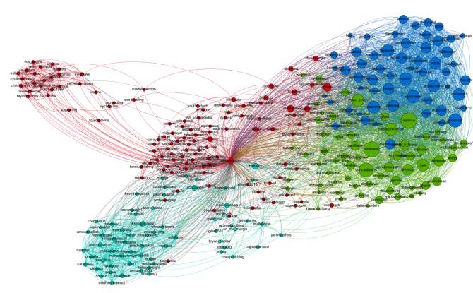
Coloring the Nodes with a Community Finding Algorithm
One of the most interesting things you can look at in a Twitter network are different communities of Twitter accounts. We're going to use a "Modularity based community finding algorithm" to group the network nodes so that the groups have lots of connections within the groups but relatively few between groups.
The first step is to hit the Run button next to Modularity in the Statistics pane. Click OK on the pop-up window and then close the distribution graph that appears. Now, go to the Partition window and hit the refresh button (it looks like two little green arrows pointing in a circle). Choose "Modularity Class" from the "---Choose a partition parameter" drop down menu. Notice that there are several other ways that you can group the nodes (e.g. by time zone) that you may want to come back and explore later. Gephi will show you the different communities it has identified along with the percentage of nodes that belong to each of those communities. For example, Gephi split my Twitter network into four communities. The largest community consist of 38.54% of the nodes and the smallest community contains 18.94% of the nodes.

If you click the Apple button, Gephi will color the communities in the network. If you want to change the colors, just click on the color square in the Partition window. Here's what my network looks like now:

Adding Labels
The next step is to add labels to our network so that we can identify different accounts. This will help us to understand who the important nodes in our network are and what ties together the nodes within the different communities. To show the labels, click the black T at the bottom of the Graph pane. You can resize the labels with the right slider at the bottom of the graph pane. At the moment you probably will have a hard time reading the labels because they overlap one another, but we will fix that in a second.
Using a layout algorithm to rearrange the nodes
To reposition the nodes into a more useful arrangement we will use one of Gephi's built-in layout algorithms. I find that the Force Atlas algorithm works well for Twitter network, but you should play around with the other algorithms as well to find one that works best for the particular network that you have collected. You can select the algorithm from the drop down menu in the Layout pane, and try changing the various layout specific parameters to see what works best. Here's what I'm using:

Hit the Run button to run the algorithm. If your network has a lot of nodes/links (or if your computer is slow), it may take awhile for the algorithm to move them around. Once you've found a nice arrangement, use the "Label Adjust" layout algorithm to move the nodes so that the labels don't cover one another up. Here's what i have now:

The only thing left to do is go over to the Preview window where Gephi will render a nice image for you once you click the Refresh button. You can make final adjustments such as hiding/showing labels and adjusting the label sizes in the Preview Settings Pane. You may have to iterate back and forth a bit between the Overview layout and the Preview to get everything just right.
Here's my finished product:

[...] Post navigation ← Previous [...]
[...] Gathering a Twitter user's network data with NodeXL | Social … We will be using the software NodeXL to gather the data from Twitter. Besides downloading the data, you can also use NodeXL to visualize and analyze network data, but I prefer to export the data and use another program … Gathering a Twitter user's network data with NodeXL | Social … [...]
[...] http://social-dynamics.org/gathering-a-twitter-users-network-data-with-nodexl/ [...]
It appears to only work with Excel 2007. Is there an Excel 2010 version?
It should work with either 2007 or 2010, but it's Windows only. All the compatibility info is here.
[...] from playing around with this. Not sure any higher significance beyond once again pointing out that most interesting freeware [...]
Hey I know this is off topic but I was wondering if you knew
of any widgets I could add to my blog that automatically tweet my newest twitter updates.
I've been looking for a plug-in like this for quite some time and was hoping maybe you would have some experience with something like
this. Please let me know if you run into anything.
I truly enjoy reading your blog and I look forward to your
new updates.
Hi James,
I write my blog with wordpress and use the Jetpack plugin to automatically post my blog posts to Twitter. But I don't have something that automatically posts my tweets to the blog.
PJ
Hi pj,
Wonderful article. However i was wondering if I could collect and analyze a Twitter network formed from a hashtag. Can I use the above procedure fr analyzing a product's hashtag on Twitter? If Yes, then what will be the changes in some of the steps.
Yes, you can. Just enter a hash tag in the search term box. One caveat - since I wrote this post, Twitter changed their rate limits so data collection with NodeXL is even slower than before. Start with a small network!
Wow that was unusual. I just wrote an very long comment but after I clicked submit
my comment didn't appear. Grrrr... well I'm not writing all that over again. Regardless, just wanted to say fantastic blog!
Hi,
I was just wondering what the timeframe is on the collected data? My date column is just filled with XXXX. The tweets that come up after entering a selected search word, are they from the past week, or from today?
Thanks!
Hi,
I was just wondering what the timeframe is on the collected data? My date column is just filled with XXXX. The tweets that come up after entering a selected search word, are they from the past week, or from today?
Thanks!
Hi Ellis,
Good question. I'm not really sure. I would try checking wight he NodeXL guys. You can tweet to them at @nodexl, or post on their discussion board.
http://nodexl.codeplex.com/discussions
Good luck!
Hi. Great post. I've noticed that nodexl has changed since you made this post. Is it still possible to make graphs like these? I've had problems trying. If I just look for my network the connections between my followers are not accounted for (A is tied to me. B is tied to me. B is also tied to A but this relationship does not show up). Thanks for any suggestions.
Hi Ricky, Yes, they have made a few changes, but you should still be able to do it (I can't say for sure though because I haven't used the latest version). The biggest hurdle is that Twitter changed their rate limits, so it takes WAY longer to download the data unless you limit yourself to collecting much smaller networks. There should be an option to get the ties between A and B that you mention.
Hi. Great post. I've noticed that nodexl has changed since you made this post. Is it still possible to make graphs like these? I've had problems trying. If I just look for my network the connections between my followers are not accounted for (A is tied to me. B is tied to me. B is also tied to A but this relationship does not show up). Thanks for any suggestions. n
Hi Ricky - be sure you are selecting the "1.5 network" option to get the ties between A and B that you mention. Also, Twitter's rate limits have tightened up, so data collection is much slower. You may need to aim for an even smaller network unfortunately. Good luck!
Wow PJ, you don't know how useful I hace found your blog. I just finished a research project on twitter, but We did all the information retrieval, manually!!! So I heard on a congress about this softwares you are writing about and I got all excited! Interesting data visualized in a colorful and even beautiful way. I deeply thank you for sharing your knowledge like this. I live in Guayaquil (Ecuador South América) in case you might get curious about my work. Greetings form the hot Guayaquil!
[…] I used various layout algorithms (ForceAtlas) to display and organize the networks. I found this webpage very helpful to get […]
I don's see the "levels to include" option in the pop-up menu when I select import. The only options I see are: "Twitter users I'm interested in", "The twitter users in this Twitter list", "Basic network", "Basic network plus friends and followers", Import only the Twitter users I'm interested in" and then two options based on whether you've authorized NodeXL and an option to limit the number of tweets per user and a check-box for "Expand URLs in recent tweets". Am I in the wrong import window? Using Excel 13 on a windows machine.
Thanks!
Hi Alex, This post was written using an older version of NodeXL. The options "Basic network" or "Basic network plus friends and followers" should correspond to what used to be the "levels to include" option. Good luck!
Thank you for having this blog as I have found the information valuable. However after exploring NodeXL I don't believe I've got enough of a tech'background to figure out how to gather data for a specific area, within a specif time frame and in English only. Is there an on-line course/tutorial offered on how to mine the web using various applications?
You might check out Lada Adamic's course on coursera: https://www.coursera.org/instructor/~267.
And for NodeXL specifically there is a nice instructional book, Analyzing Social Media Networks with NodeXL: Insights from a Connected World, http://www.amazon.com/Analyzing-Social-Media-Networks-NodeXL/dp/0123822297
thank you - I will check these out
Dear Mr Lamberson
I really have to say thank you for your tutorial!
I am a student at the Universty of St. Gallen, Switzerland, aming to write my Bachelor's Thesis about the Twitter-behaviour of German-speaking ISIL-sympathizers. I want to adapt your tutorial on the topic, a follower/following-network.
Unfortunately, I'm struggeling with the new update of NodeXL. In the old one there is, as you mentioned:
"For the remaining choices in the pop-up window, select the following options:
Add a vertex for each: Both
Add an edge for each: Followed/following relationship
Levels to include: 1.5
Limit to XXX people"
In the new Update of NodeXL, those options aren't there anymore. You only can choose between: "Basic Network" and "Basic Network plus Friends and Followers".
What do I have to choose? Or should i downgrade my version of NodeXL (running on Excel 2007)?
I tried both options, but when I imported the data to gephi, no connections between the nodes where visible. The modularity filter pointed out that there is just one community (which is impossible).
Many thanks in advance!
Yours sincerely
Philipp Ladner
Hey Philipp,
I kind of encounter the same problem as you mentioned in your comment in December 2014. Now NodeXL doesn't let me select 'Levels to include: 1.5' and 'Limit to XXX people'. Could you please tell me how you solve this problem? Thanks in advance!
Best,
April
[…] http://social-dynamics.org/twitter-network-data/ […]
[…] http://social-dynamics.org/twitter-network-data/ […]
Hi ! I am interested in analyzing data from twitter for my master's thesis. I was wandering if there is any webinar or online courses for that.
[…] gesendet werden. Social Media Data Collection NodeXL, Office-Plugin für Twitter-Netzwerke z.B. http://social-dynamics.org/twitter-network-data/, YouTube Data Tools, Sammlung von Tools zur Generierung von YouTube […]
[…] Collecting and Visualizing Twitter Network Data with NodeXl and Gephi […]
[…] NodeXL, Office Plugin für Twitter-Netzwerke z.B. http://social-dynamics.org/twitter-network-data/, […]